Dear user group,
I have recently returned to my data , after writing it up my thesis (6 months ago), and now am in plans to prepare it for publications. I updated the Brainstorm to the latest version and ran some new analyses following the procedures that I followed before and outlined in the tutorial pages.
This involved creating the stats map for my comparisons of interest on the source level (this generated the source 'stat' file) then applying the threshold (using the Process tab) to that result so that I can average t-values across time for the purposes of visualisations in the articles .
My problem is as follows: after applying the threshold and acquiring the new thresholded source map, they appeared different.
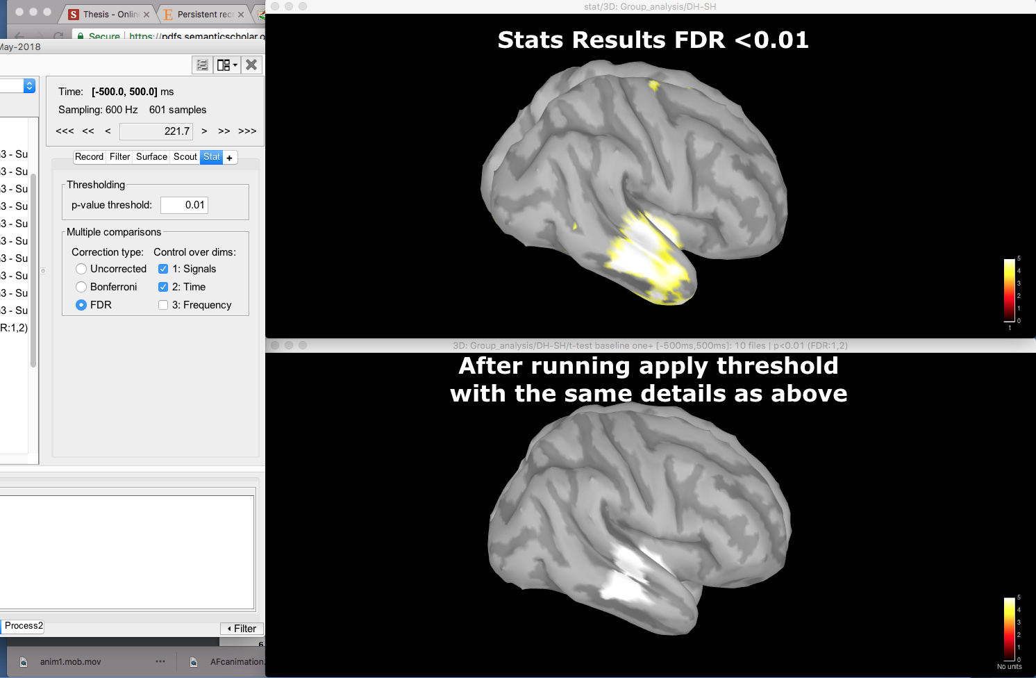
I found this odd, as I have done this procedure several times and never had issues. Then I played around with the range settings in figure options, and noticed that there is something strange going on with ranges where it is just showing the maximum value and not anything below.
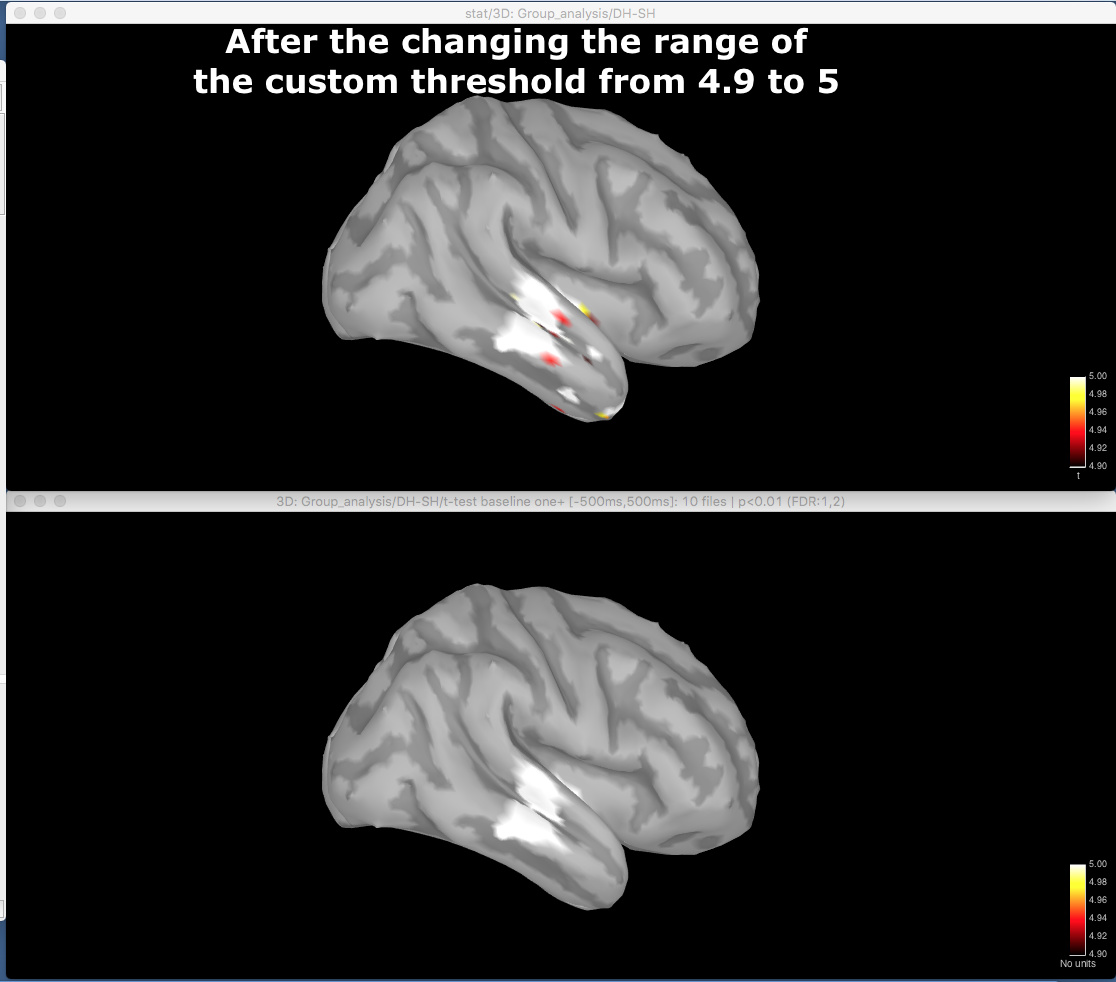
After changing the custom range to [4.9, 5] (it was [0 , 5], see previous figure cbar), I achieved very similar maps, suggesting this maybe the case.
The most likely explanation is that I am something wrong and cant exactly replicate the steps I took previously during write up. But I am worried that it could be a legitimate bug too. Can anyone help me figure this one out?
Kind Regards,
Miguel