Would you mind to tell me how to overlay multiple PSDs between subjects? (I searched the forum, but could not find a related posting. It might be very obvious to everyone else... )
I have 15 subjects, each has three scouts. Using the scout time series (mean before, 10s), I computed PSDs and averaged over trials. Thus, I have three average PSDs per subject. I would like to overlay the PSDs for all subjects -- 45 lines on one figure.
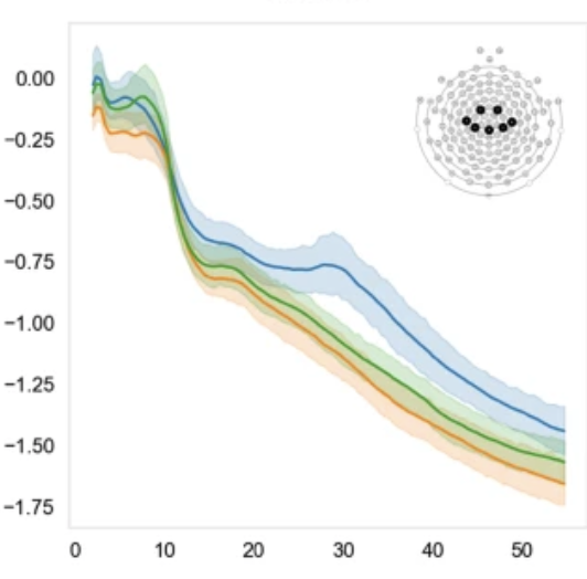
Thank you for the comment! I have an additional question which is related to the previous one. If we have 2 groups of participants and, thus, 2 averaged PSD maps (one per group) have can we visualise it on the one map? I mean we have one line for the first group and one line for the second, can we present it on the one figure? Like in the photo.
I tried to do it in Brainstorm, but did not find how.
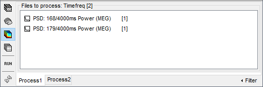
Select the files you want to compare in Process1.
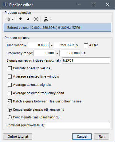
Run the process "Extract > Extract values" with the option "Concatenate signals". Select only the names of the channels you want to display.
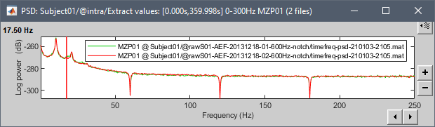
It will generate one new file with all the selected signals.