Hello,
When displaying statistical value in Brainstorm, we can set a p-value threshold, putting all the value bellow that threshold to 0.
It works well:
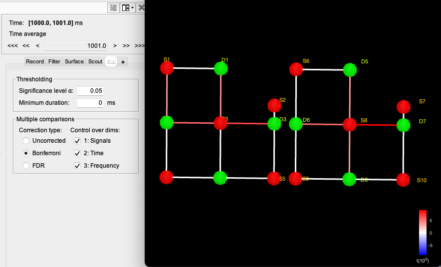
However, I feel that the colorbar might be a bit misleading as it is still showing a continius gradient from white to red, when all the value bellow the threshold are white.
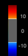
When we apply a threshold on source data, the colormap it is a bit better as we can see the threshold applied :
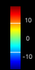
However, I feel that a colorbar like this: might be more informative:
Edit; it seems that what I am proposing has been done in 2019: Threshold colormap according to t-test for better color dynamic by thomas-vincent · Pull Request #162 · brainstorm-tools/brainstorm3 · GitHub so I don't know why it doesn't display here. (might still be a good idea to apply it too for source image, and in general everytime we apply a threshold)
Thanks a lot
Edouard