Hey there,
I computed a permutation test between two conditions for the wpli.
When opening up the statistical results as an image there are more significant results than when opening them up as a graph. Also the scales/values are different. Am I missing something?
Thanks for reporting this possible issue. Please post screenshots to illustrate your point. Make sure all data thresholds in the main window panels are set to the same value for each figure.
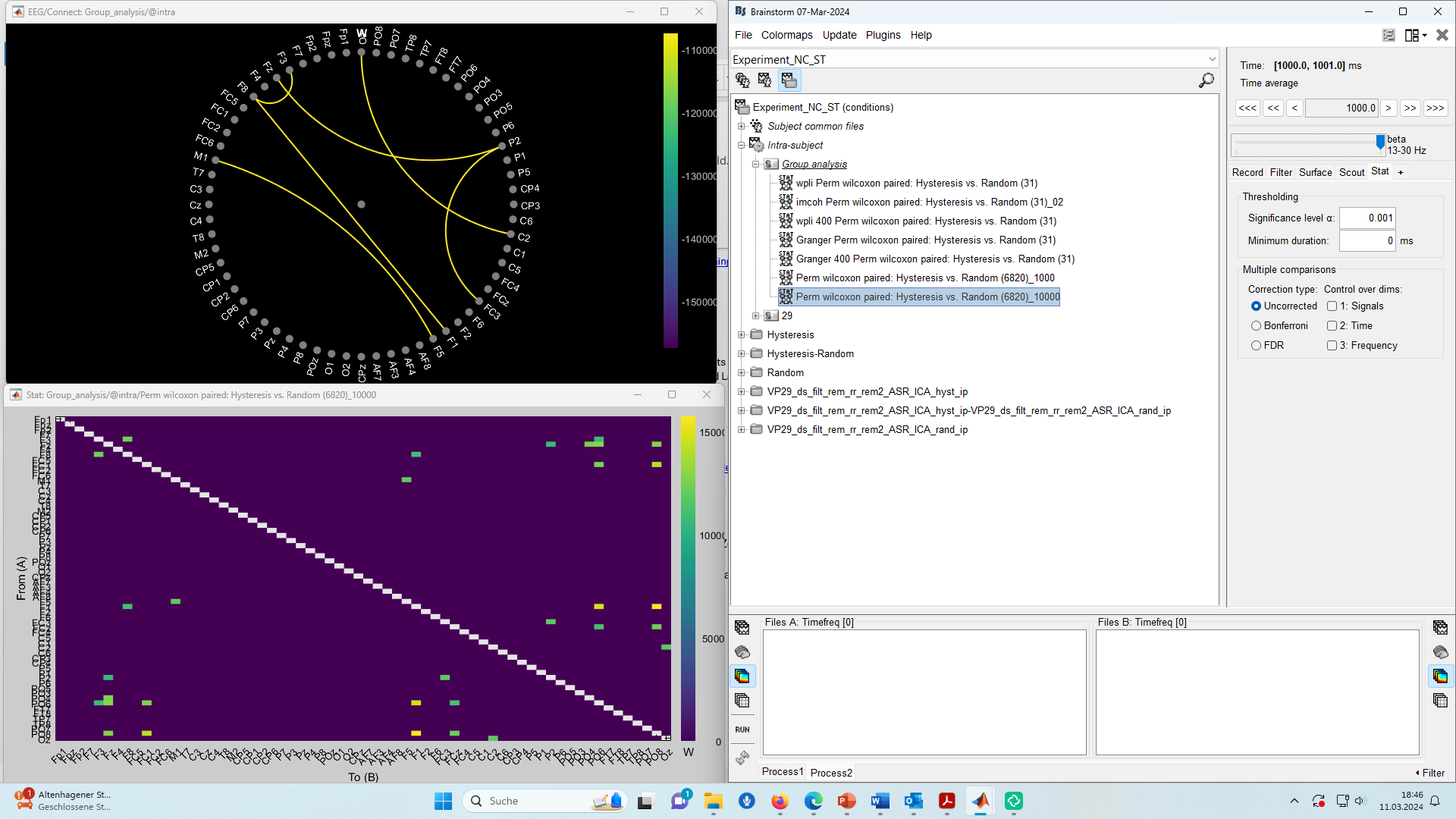
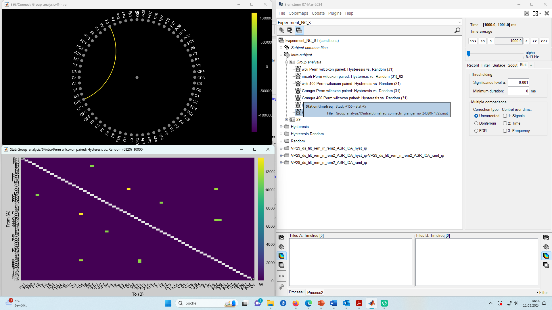
It seems the option Absolute values is being used in the colormaps in the connectivity matrices