I have been using imaginary coherence as implemented in Brainstorm to compute the coherence between a custom scout to the remaining scouts as found in the Desikan-Killiany atlas (thus trying to run something similar to a seed connectivity analysis), and then comparing this functional connectivity between two groups using the independent-samples t test permutation framework.
With the current dataset I have, I am running into something I haven't seen with my previous work with comparing coherence between two groups in Brainstorm. The resulting p-matrix is entirely significant (except diagonal elements of course). As in every scout to scout element is significantly higher for one group, with this being found across all frequency bands. There is thus no region or frequency specificity.
More odd is that as I change the uncorrected p-value threshold, all elements remain significant until I go to a value of approximately just below 0.001, in which they ALL then become non-significant. The fact that there is no gradual decrease in the number of regions which remain significant as I change the threshold gives me another reason to be concerned with these results.
Can anyone recommend or suggest what may be going on or what I can do to sanity check as to what is happening? I've played with the imaginary coherence parameters, but I keep coming across the same results, and I'm quite hesitant to believe them as they are being presented.
Can anyone recommend or suggest what may be going on or what I can do to sanity check as to what is happening?
Start by computing a simple difference of averages, and spend some time understanding its meaning. If all the values are the same everywhere, then the p-values will be equally significant everywhere.
More odd is that as I change the uncorrected p-value threshold
Don't forget to correct for multiple comparisons...
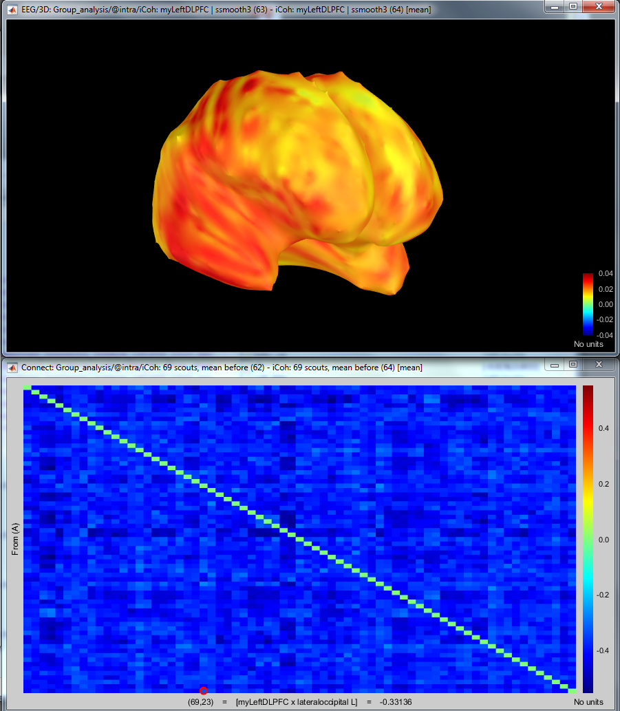
I have now run 2 analyses, but the results are very different. Both involve the exact same defined left DLPFC scout, but one analysis is looking at N x N coherence with the D-K atlas, and the other analysis is with the 1 x N coherence, with the coherence being calculated between the left DLPFC scout and the 15002 vertices.
Below is the mean difference maps of both results, with the top being for the 1 x N analysis, and the bottom being the N x N analysis:
For the matrix, only the bottom row (the left DLPFC scout to region) is of interest, but notice how it is all blue, indicating group 2 has greater coherence than group 1 across all regions. However, the opposite is show in the 1 x N analysis, where group 1 has greater coherence than group 2 (all this is for the same frequency band). Furthermore, the coherence values with the N x N analysis are largely different (in the context of imaginary coherence data), whereas the differences seem to be more reasonable and region specific in the 1 x N analysis.
Any suggestions as to how to further proceed in getting to the bottom of this issue?
Understanding the meaning of the values you report here would require a review of your entire processing pipeline. It is not really possible to judge if any of this in meaningful without looking at the source maps, the recordings, understanding the contents of the experiment and the expected results.
Unfortunately, providing individual tutoring is not in the scope of this forum.
Computing connectivity measures from MEG or EEG recordings is a difficult task, especially at the source level. Results are often unstable and difficult to interpret. If you want to keep going in this direction, you may need to train yourself in advanced signal processing and Matlab programming, so that you can test everything yourself and understand the values you obtain.