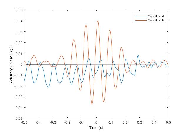
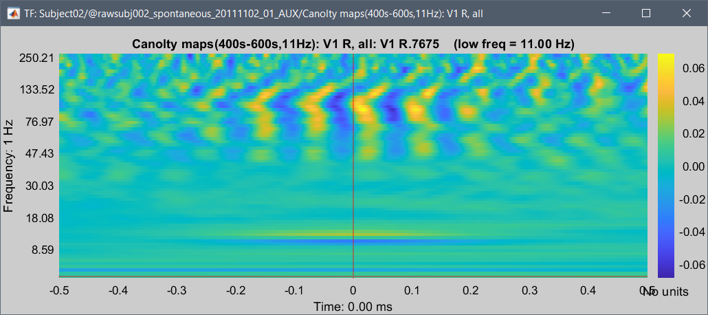
I am struggling here with Canolty maps a little bit. As you can see in the figure, I exported the Canolty map (low frequency: alpha / higher frequency: gamma) TF matrix from brainstorm and plotted in Matlab for one region.
However, I am not sure what are the units for the y-axis because power and magnitude can't be negative and here we can see negative values. But in the PAC tutorial, it was mentioned that Canolty is a type of time-frequency decomposition so I assume that it is some kind of power but then how come it is negative? I named the label of y-axis as an arbitrary unit cause I wasn't sure.
Also, as we see in the figure, the PAC seems to be stronger for condition B while it seems weaker for condition A. But since condition A is more on the negative side would it be correct to say that gamma is suppressed with the phase of alpha? Since I am a bit confused about the y-axis, it is hard for me to interpret the graph. Any comments or suggestions would be greatly appreciated.
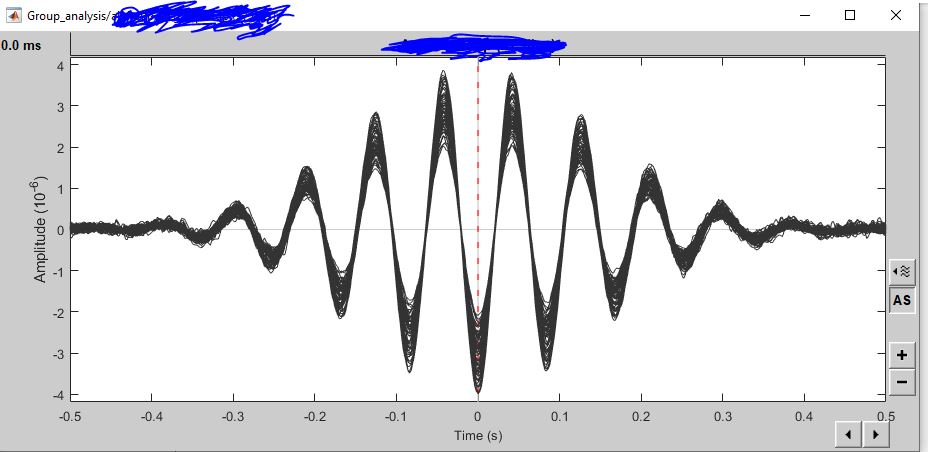
What you seem to have plotted here is the "Canolty ERP": the signal filtered around 10Hz, and epoched/averaged around the peaks of the filtered data. This is would be therefore in the same units as the original signal, and your conditional A may simply have less alpha, or more "phase resets"...
Can you please post screen captures of the files in the database explorer, and of the figures you get when you double-click on the them?
No. I am not plotting Canolty ERPs here. I understand that when running the Canolty in Brainstorm we get low-frequency ERP signal and TFR decomposition. By aligning this low-frequency ERP with TFR (Canolty maps) we can see the amplitude variations of high-frequency oscillations related to the low-frequency phase.
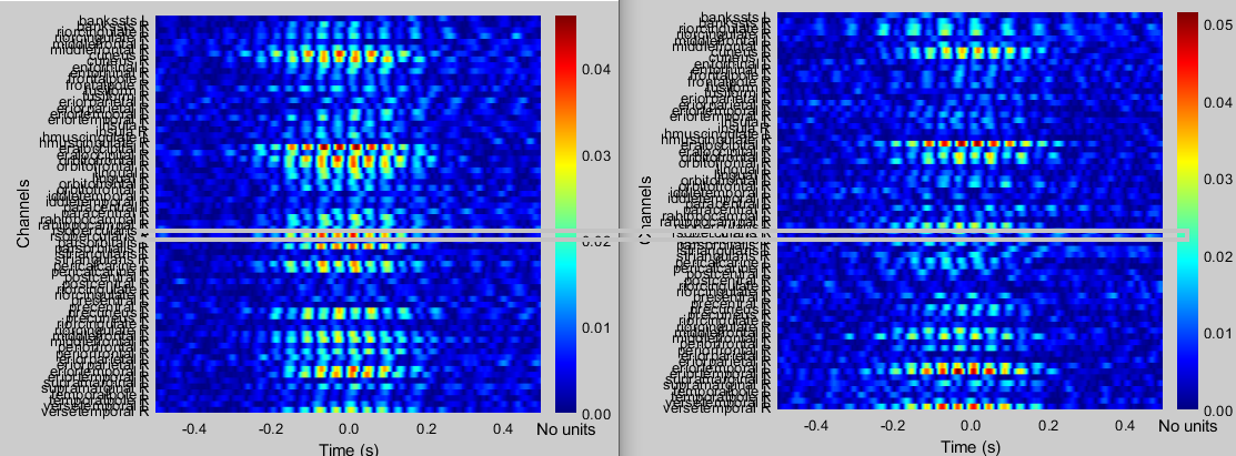
What I am plotting here is the one channel extracted out of the actual Canolty maps (TFR decomposition). For example, the grey box below indicates the channel I am plotting in MATLAB. Right now in Brainstorm 'absolute value' is ticked so we can only see values from 0 - positive. However, when I export and plot in MATLAB I can see negative values as well, as I showed in the previous post. Thus, I am slightly confused about the units.
Hello:
The time series in your first post are not power plots but indeed event related signals with respect to the trough of the slow oscillation expressing the greatest PAC strength. The maps in your second post above take negative values because they show z-scored power measures of the faster oscillations coupled to the slow component in question. They are z-scored with respect to the mean and standard deviation of the 1-s epoch you are looking at.
The maps in your second post above take negative values because they show z-scored power measures of the faster oscillations coupled to the slow component in question. They are z-scored with respect to the mean and standard deviation of the 1-s epoch you are looking at.
Indeed, see the code computing these maps for more information:
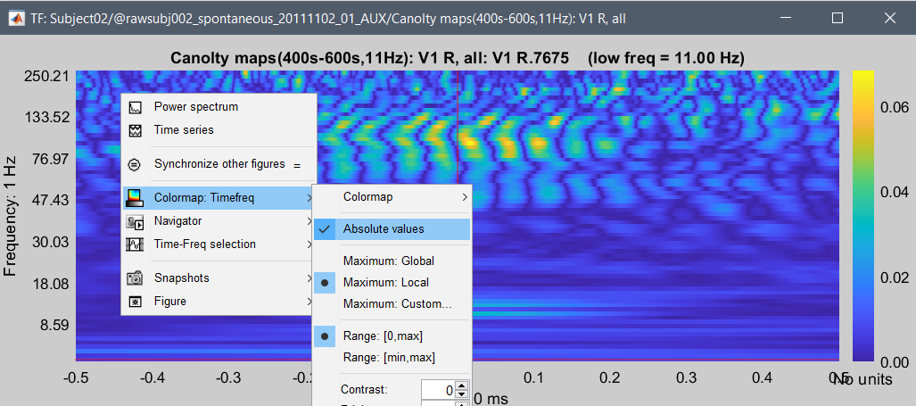
You can configure the colormap of the TF figure so that it shows the positive and negative values in the figure: