Dear Francois,
Thanks for responding.
No. I am not plotting Canolty ERPs here. I understand that when running the Canolty in Brainstorm we get low-frequency ERP signal and TFR decomposition. By aligning this low-frequency ERP with TFR (Canolty maps) we can see the amplitude variations of high-frequency oscillations related to the low-frequency phase.
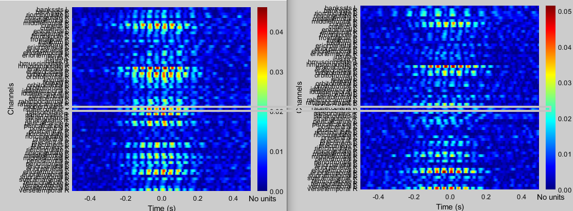
What I am plotting here is the one channel extracted out of the actual Canolty maps (TFR decomposition). For example, the grey box below indicates the channel I am plotting in MATLAB. Right now in Brainstorm 'absolute value' is ticked so we can only see values from 0 - positive. However, when I export and plot in MATLAB I can see negative values as well, as I showed in the previous post. Thus, I am slightly confused about the units.
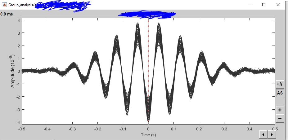
I think you asked for this picture. I am posting here. These are low-frequency ERP epoched at troughs of low frequency.
Many thanks!