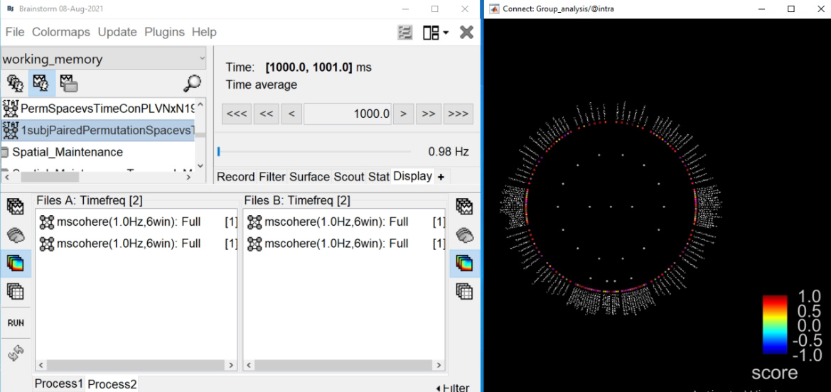
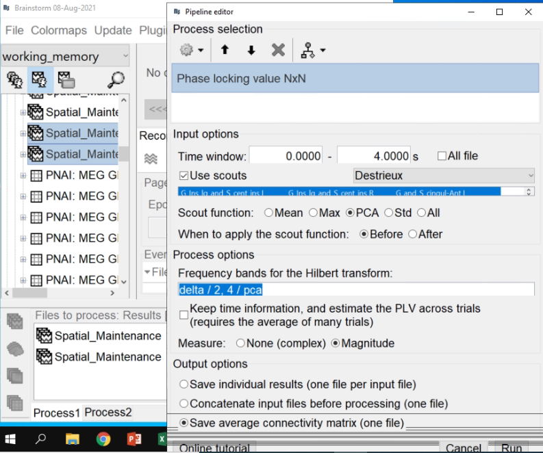
I did the PLV NxN connectivity analysis between two conditions for different freq bands.
The file selection in your last screen capture is unexpected, but I guess this is only for illustration purposes.
You are computing the average PLV across trials for one subject, and then you are expecting to run a permutation t-test across subjects, is this correct?
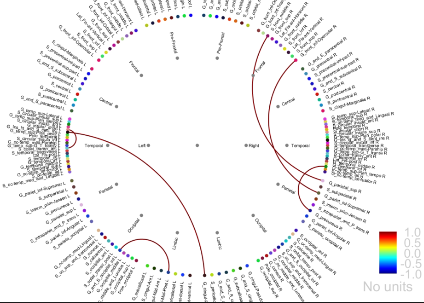
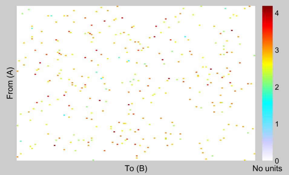
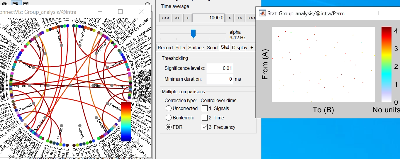
As far as I understand the scale for NxN ranges b/w 0 and 1 as in the chord plot.
Only for the original PLV values.
When displaying the results of the t-test, it shows the t statistic, not the original PLV. Therefore there is no reason, expect if you enforce it in the colormap options, for the values to be limited between -1 and +1.
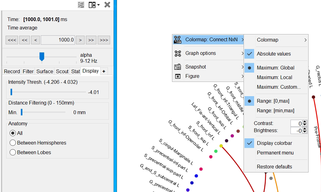
For the graph plot, note that you have an extra slider in the Display tab to remove links from the graph. Ideally, when displaying statistics results, this should be set to the minimal value, so that you can see all the connections that statistically significant.
Could you please clarify the scale in adjacency matrix?
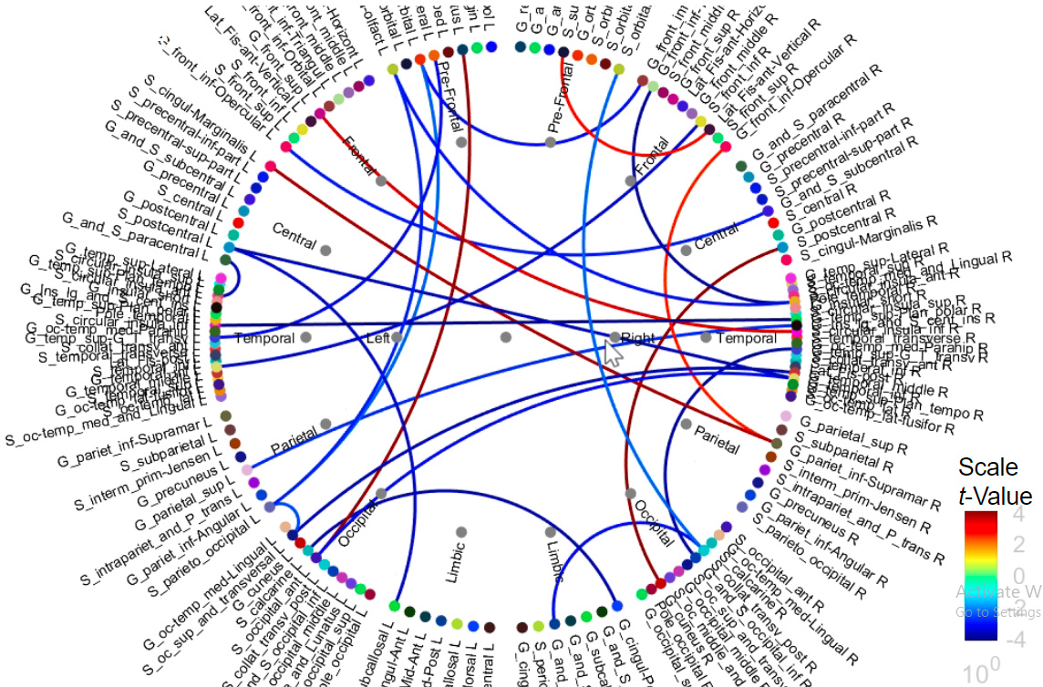
These are the t-statistics, obtained with p-values < the threshold defined in the Stat tab.
How can similar results be represented from chord plot and adj. matrix?
Set the slider in the Display tab to the minimal value, reset the options of the colormap in the two figures.
You should see the same values with a similar colormap.
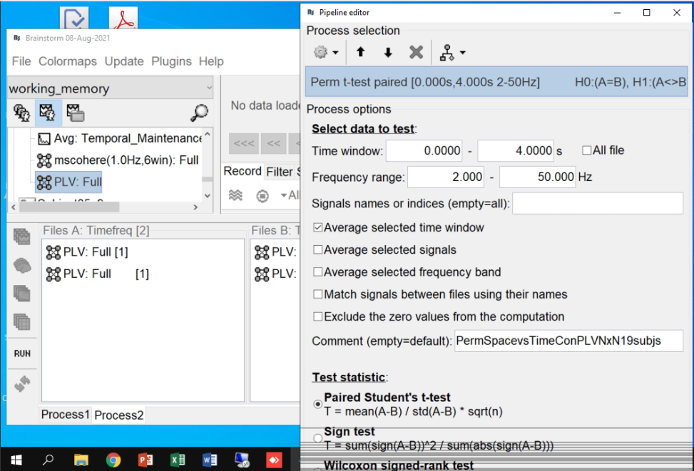
How can I access the values of adj. matrix into matlab?
https://neuroimage.usc.edu/brainstorm/Tutorials/Statistics#On_the_hard_drive