Hi,
I am getting very different looking PAC plots (phase for lower frequency and amplitude for higher frequency) for 2 conditions.
After defining at which lower frequency effect looks stronger, I was trying to get Canolty plots (time-frequency plot and phase of selected lower frequency). Those 2 conditions look very similar on Canolty maps.
I wonder if it is normal to have this discrepancy?
Is it true that PAC reflects coupling between lower frequency phase and higher frequency amplitude, whereas Canolty map is a phase locking plot showing coupling between lower and higher frequency phase?
Thanks
I am getting very different looking PAC plots (phase for lower frequency and amplitude for higher frequency) for 2 conditions.
Please post screen captures showing:
- A meaningful representation of your input signals, together with their location in the database explorer
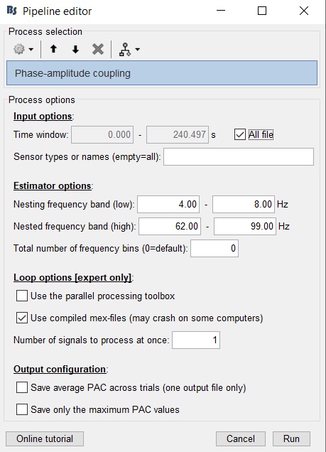
- The options window of the PAC process
- The PAC comodulogram and "Canolty plots" you refer to
Is it true that PAC reflects coupling between lower frequency phase and higher frequency amplitude, whereas Canolty map is a phase locking plot showing coupling between lower and higher frequency phase?
No: "Canolty maps" are phase-locking plots that show the power of the high frequency components, not their phase.
@Samiee @Sylvain @eflorin
Thanks Francois.
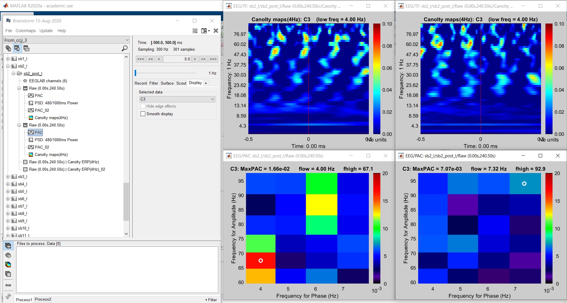
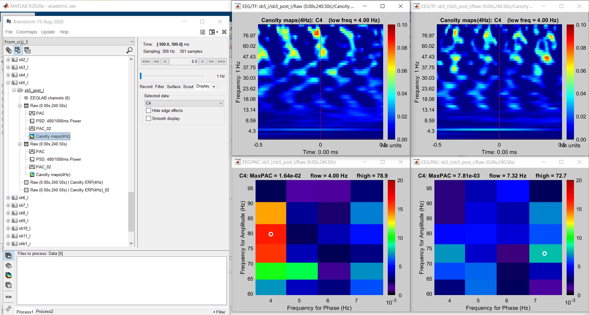
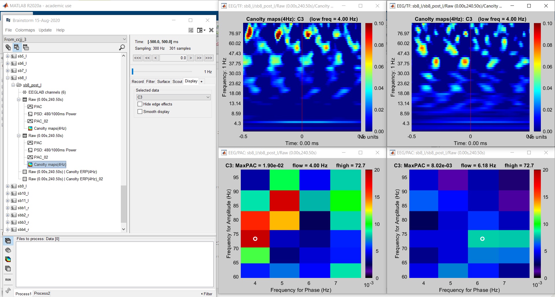
Bellow are the figures for PAC calculation and results for 3 subjects (sb3 looks better):
Sb1
Sb2
Sb3
There is probably nothing wrong with these plots. I disagree with your statement that "Those 2 conditions look very similar on Canolty maps". There are very different for the two conditions in all three subjects, and I'm not sure you should try to relate their differences to the differences you observe in the comodulograms.
Note that these are methods that are quite sensitive to the fine tuning of the input parameters and the duration of the data in input, and therefore can easily show a lot of variability. However, if you used the same amount of data for the two conditions, selected at the same latencies with respect to your event of interest, you should be happy to see such differences, shouldn't you?
Another recommendation: don't try to overinterpret the data of individual subjects, this is only the group-level non-parametric statistics that will tell you what is significantly different between your two conditions.
You could also try the second generation of PAC tools developed by @Samiee in Brainstorm:
https://neuroimage.usc.edu/brainstorm/Tutorials/TutPac#Time-resolved_PAC_estimation_with_tPAC
Thanks Francois, I will consider your recommendations.