Hello!
I have a question also for this topic.
I have 3 different subjects,
and each subject has 1 folder (name "A) with about 40 Coherence NxN Fc matrices,
and 3 additional folders (Names "B", "C" and "D") with each of these folders having about 20 Coherence NxN Fc matrices.
I calculated three independent permutation-t tests
to compare statistically each folder CohNxN Fc matrices; B, C and D with folder A CohNxN Fc matrices.
Now all 3 subjects have each 3 statistical tests that I would like to display as graphs (Fc circle graph)
Only one of these 3 subjects will open Fc graphs,
two subjects tell this same error when I try to display any of the statistical Perm-t test graph.
Error using diag
First input must be 2-D.
Error in figure_connect>LoadConnectivityData (line 1158)
Error in figure_connect>LoadFigurePlot (line 1613)
Error in figure_connect (line 27)
Error in view_connect (line 236)
Error in tree_callbacks>@(h,ev)view_connect(filenameRelative,'GraphFull') (line 1743)
What could possibly help, as all three subjects were handled with similar method,
but only one displays the independent permutation t-test Fc graphs.
And we just noticed that the Coherence Fc maps in one subject that display "successfully"
is not updating properly. If we change FDR to Bonferroni, nothing happens.
We found that changing frequence band slider updates the whole display correctly.
In addition the Intensity Treshold slider brings new Positive t-value connections to the map even though
we move the slider in the negative axis (for example from -9 to -11)
We will check this as soon as possible, thanks!
By the way we are using the precompiled version of Brainstorm without Matlab.
But as we update our Brainstorm manually with "brainstorm_200225" -file
in the Download section should be ok?
T & H
Hello!
The latest update solved our big problem with the two subjects that didn't display at all, thank you!
Still some "positive"-value (yellow-coloured) links appear in the Functional Connectivity map when we move the Intensity Treshold -slider inside the negative area of the parameter.
Does it has something to do with the Magnitude-square -option that we have used in these matrices?
Or is this possibly because of Coherence NxN with magnitude-square option gives always only positive connectivity values, as its "^2"?
If so, what kind of tool would possibly give negative values("blue lines") to Functional Connectivity graph?
T & H
I'm not sure what kind of file you are referring to. If this is the example file you sent me: this is the result of a t-test, ie. a comparison between two conditions. The t-statistic is somewhat similar to a difference of averages, so it is normal that you obtain positive and negative values. https://neuroimage.usc.edu/brainstorm/Tutorials/Statistics
Still some "positive"-value (yellow-coloured) links appear in the Functional Connectivity map when we move the Intensity Treshold -slider inside the negative area of the parameter.
If you put this slider at -4 in a range of -10 to +10, it would remove anything below -4, therefore it is normal to see both positive and negative values.
I don't recommend you use this threshold slider for filtering the graph when display the result of statistical tests. Use only the "stat" tab and adjust the p-value threshold and correction of multiple comparisons instead. This is what really tells you what is significantly different in your difference.
I'm writing clarification to our last post. Termu will send you more detailed screen captures tomorrow (if needed).
This issue was related to the example file that termu send you. As you mentioned:
That is what we expected. However, our problem is that we do not get any negative values visible to the connectivity chart. We have checked that colormap range is [min,max], we have tried to lower the critical p value from 0.05 to 0.5 and we have changed the multiple comparison correction to uncorrected. We have checked all the frequency bands, but no negative scores can be found. Do we miss something obvious?
In addition, as you wrote:
We understand, that it could be possible that we just do not have any negative values present in our data. What concerns us is, that when we move the intensity slider, let's say from -4 to -8, we see new lines appearing to connectivity chart. However, these lines have positive score values. Should it be so, that these new lines should have negative scores in the range from -8 to -4?
Is this coherence connectivity score always positive? This would somehow explain what we see. But why the unit under the colorbar and the slider is still the connectivity score even after the t-test is done? In examples of statistical test on sources, the colorbar unit is the t-value. Should this be the case also with connectivity charts after statistical tests?
So you mean, that we should keep the slider bar always on the most left side (at the minimum score) of the slider to visualize all statistically meaningful connections?
Thank you in advance! Sorry for the basic level of these questions.
Hi Francois
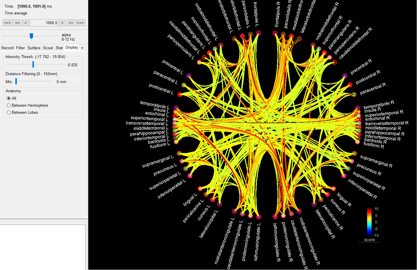
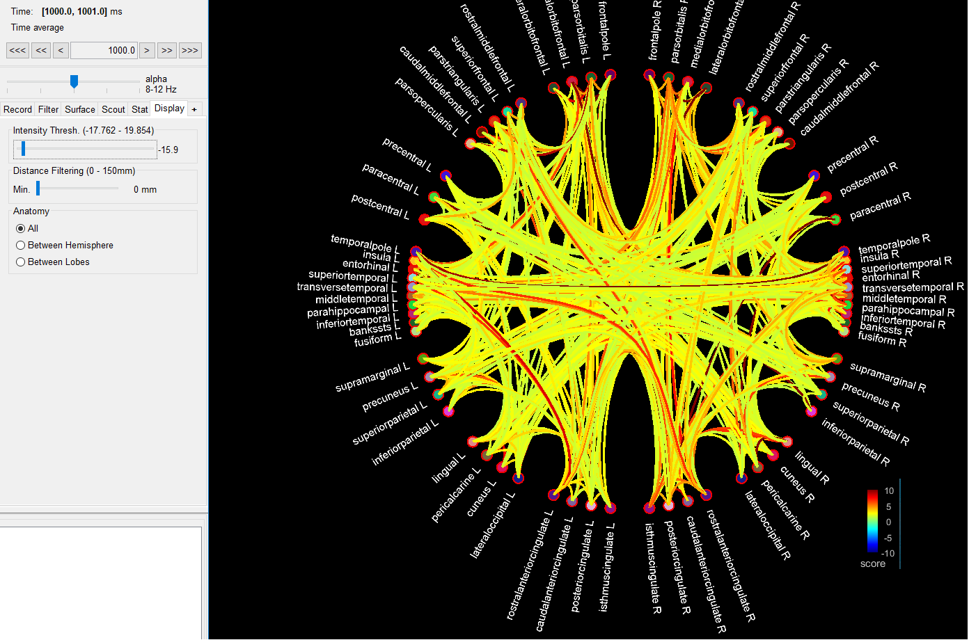
Here are some screenshots from the issue.
Statistical comparison is with "Uncorrected" and p<0.2, Colourbar is [-10,10].
As the Intensity Treshold slider moves from -0.8 (upper picture) to -16 (2nd picture).
Only positive links appear.
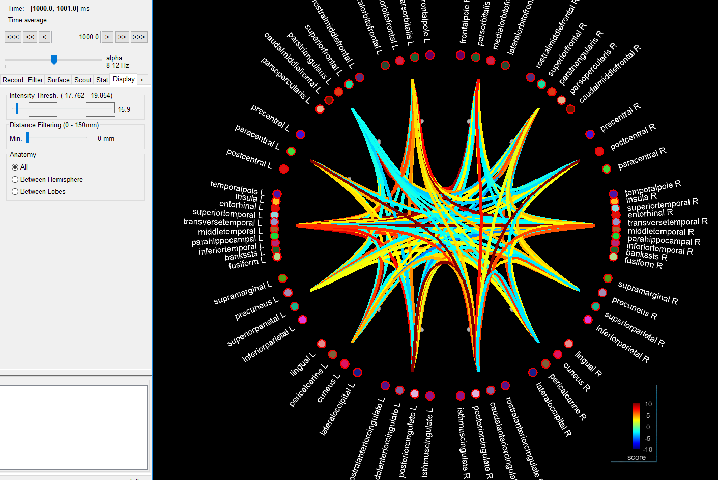
In the last picture, we activated in the Graph Options the "Display region Max" option,
and now we got some blue links also visible.
Hopefully these pictures help!
T & H
Yes, we had missed this. We should have figured this out also by our selves, sorry for that. We were misled by the threshold slider and this display region option.
We will install the updated software and we will double check the results by using the image display as you suggested.