Dear Brainstorm Team,
I kindly need some help on how to correctly use the t test against zero process on my dataset.
I have a big dataset of 1288 SEEG contacts for 100 trials. I obtain this dataset combining together the electrodes from 20 patients and creating a “fake patient” that I imported in brainstorm.
In brainstorm I segmented the data around the event [-200;500ms] and then I did a time-frequency analysis (Morlet) using the brainstorm process, saving individual time-frequency maps for each trial. Then I did a z-score transformation relative to baseline (always taking into account the edge effect), obtaining individual z-score maps for each trial.
What I want to do is to identify the responsive leads comparing the gamma band power in each post-stimulus bin against the zero.
To do so I selected the z-score maps in the Process 1 tab and run the process Test>Parametric Test against zero: I run a One-sample Student t-test and selected “Average selected frequency band” and “Match signals between files using their names”. My goal is to compute a 1 sample t test to determine the time bin significance across population of responsive leads.
This is what I get, which is great, but I have a question about the time series visualization.
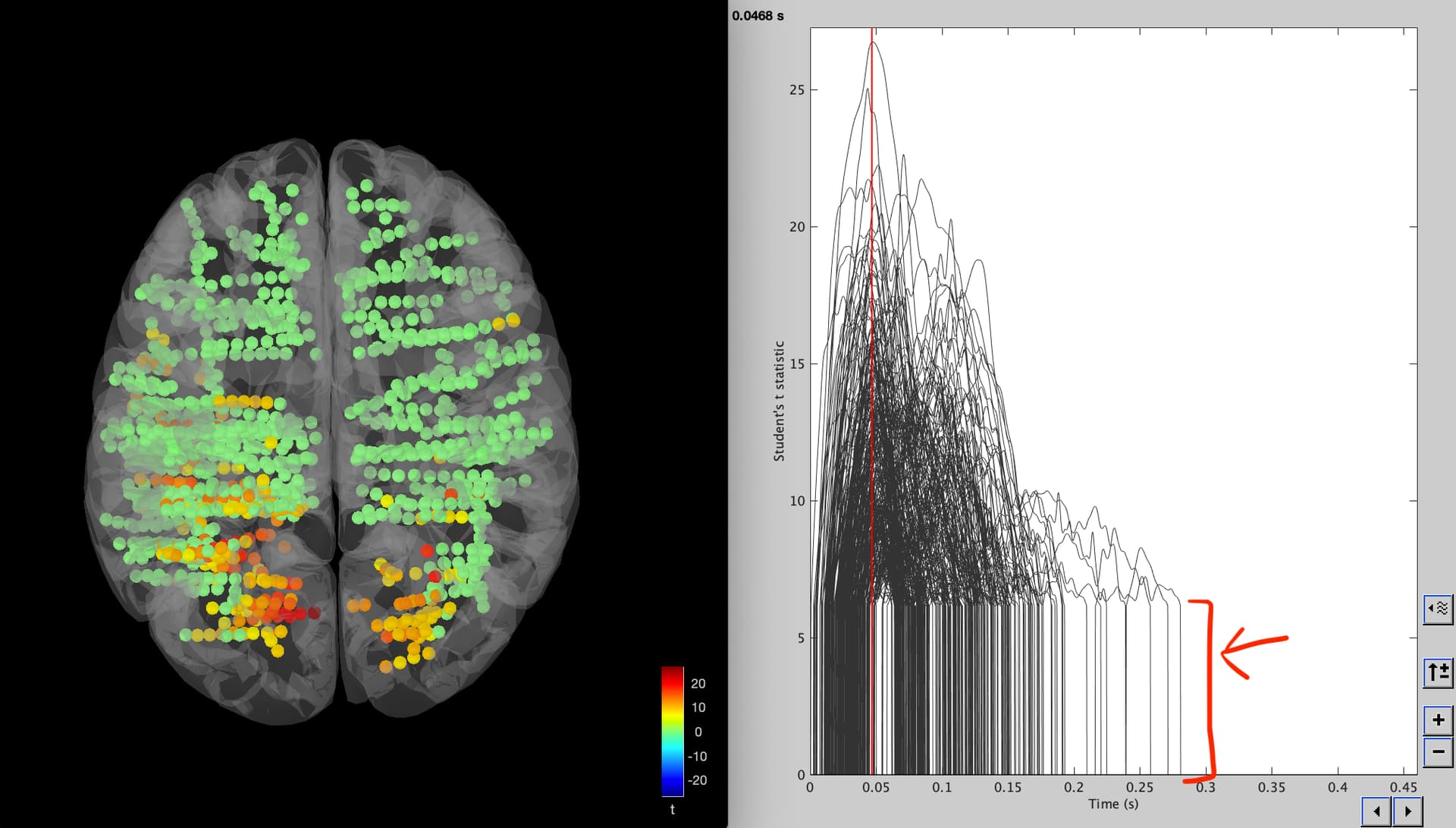
How come there is a steep increase (red arrow) with all the time series starting at 5 or something instead of zero? It changes when I play with the significance threshold and the correction for multiple comparison, so I guess it is something related to that, but I cannot understand what it is.
Is there a way to change the visualization or am I missing something?
I would also like to map all the significant leads at any time (if a contact is significant at any time=1 else 0) and the delay between responses following stimulation as the first significant bin of activation. Is there a way to do this in brainstorm? These are things I could do in Matlab, but it would be lovely to use the brainstorm machinery to visualize the results. Could I do that using the script generator?
Thank you very much
Francesca Talami