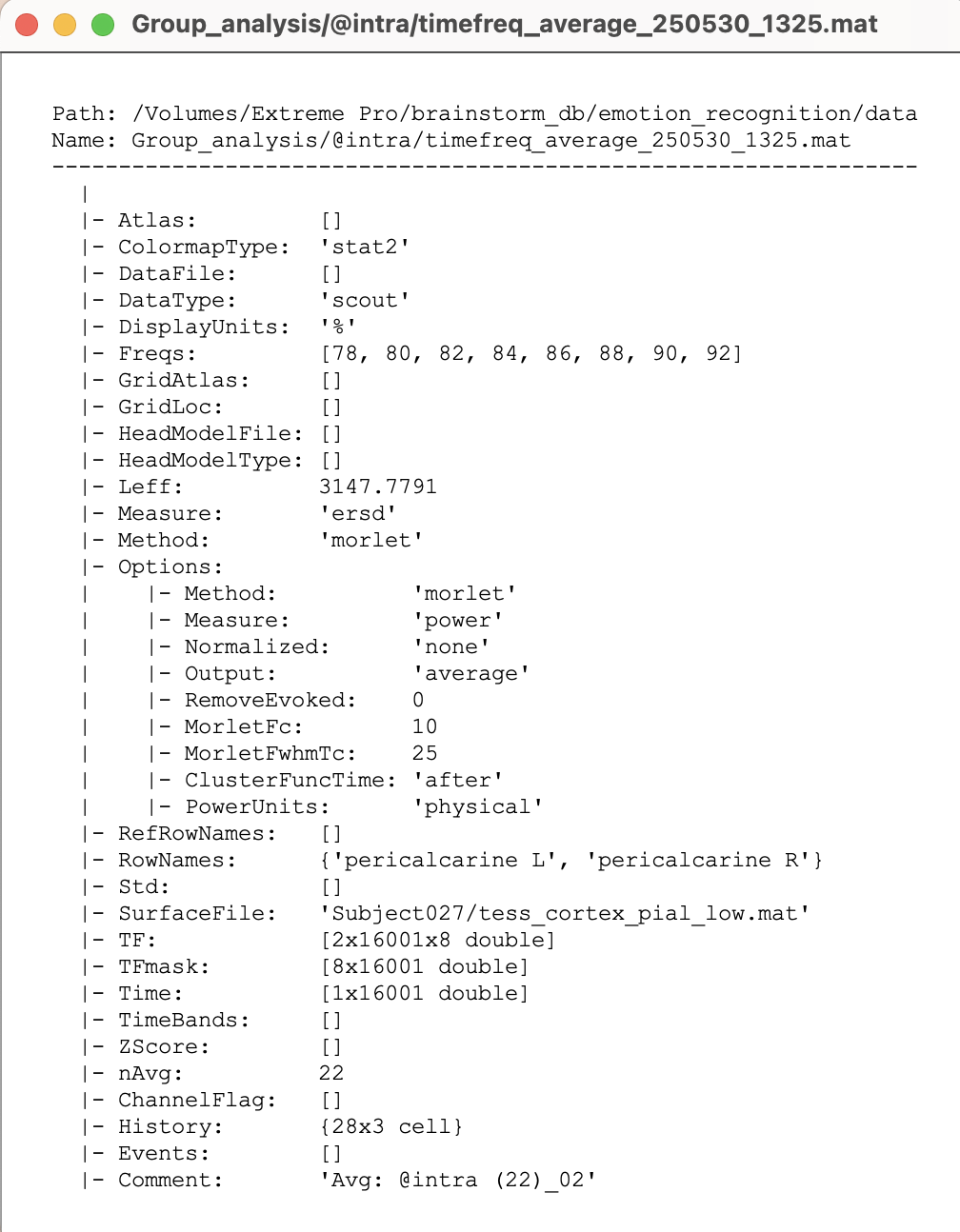
I'm wondering what the scaling bar on the right side of TF map represents.
(I calculated each subject's average TF map based on Densikan-Killany atlas, and then calculated the average TF map of all subjects. The following picture is the average TF map of 1 scout of all subjects.)
The shared plot suggested that the data was normalized with respect to the baseline, likely the segment before 0 s.
Which tutorial are you making reference here?
This depends on how it was obtained. You can check the History of such a file to verify if a normalization was applied, which type and with which parameters.
Right-click on the file, then File > View file history and look for an entry (maybe the last one) that indicates if the process_baseline_norm was applied.
In the figure that is linked, the TF map was compute on simulated data, that it self has No units (see scale bar in the time series plot), thus it TF is also unitless.
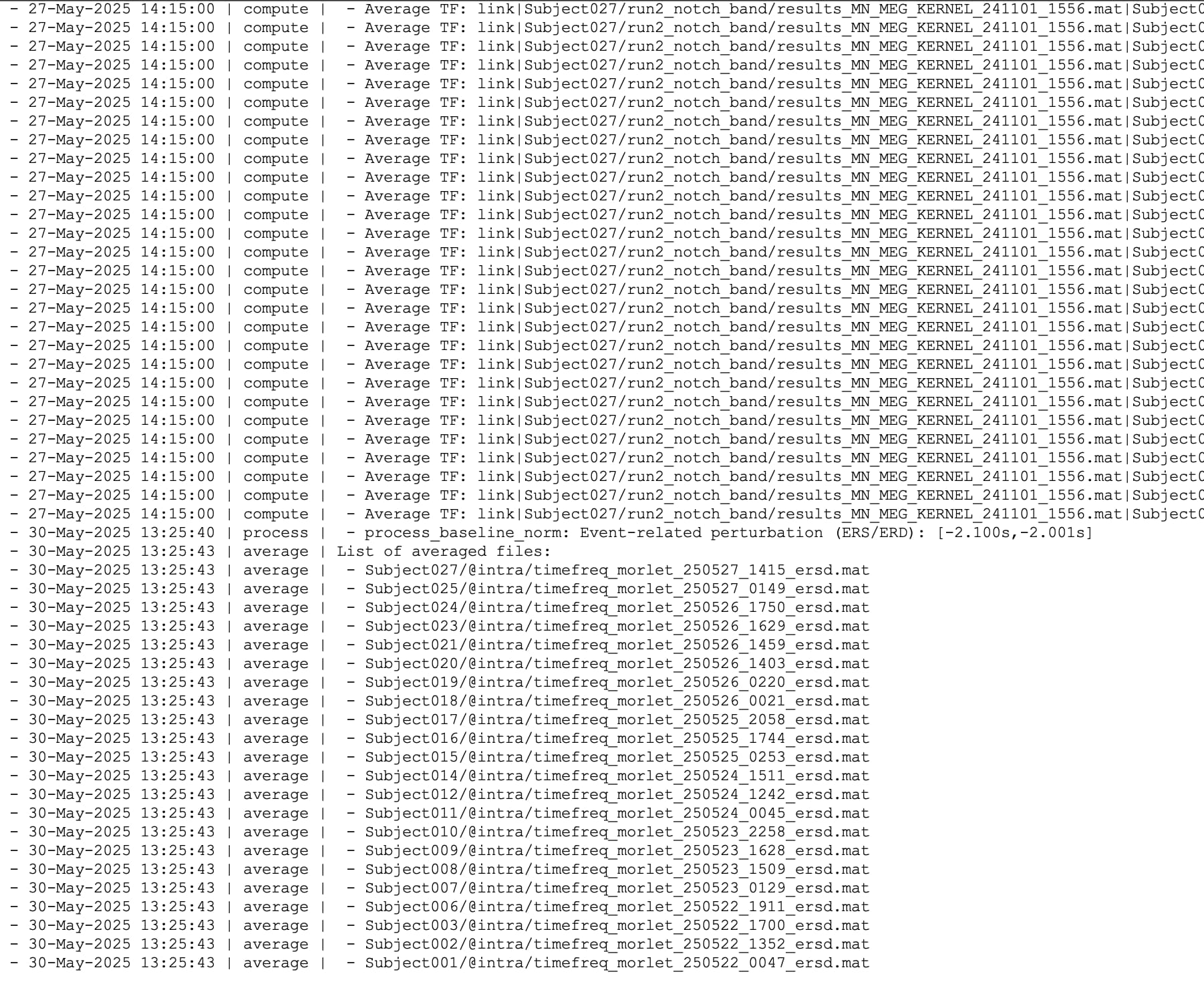
As you normalized using Event-related perturbation approach:
The percentage (%) indicates the deviation from the mean over the baseline, in percents: (x-mean)/mean*100
Thank you for the instruction!
One last question, can I average the TF map between subjects without normalization first? The steps I used now are normalization and then average.
A type of normalization is needed when performing across-subject averages. This is to avoid biases in the average due to factors such as the power of the signals.