Hi,
After running a repeated measures t-test for comparing the power of several frequency bands, I project the solution back to the cortex. I’m not sure how to interpret the values (colors) that appear on the cortex. Are they t values? The thing is that depending on the order I select the dimensions to correct (signal first and then frequency or frequency first and then signal), the colors (values) on the image change. More specifically, if I start correcting for frequency and then for signal I get significant values (colors on the cortex), but if I start correcting for signal and for frequency, the image shows no significant values.
Am I doing something wrong?
Best
Jose
Hi Jose,
After running a repeated measures t-test for comparing the power of several frequency bands, I project the solution back to the cortex. I'm not sure how to interpret the values (colors) that appear on the cortex.
If you see the "stat" tab in the Brainstorm figure when you open the file and "stat" icon text on top of the icon of the file: the values displayed should be t-values. You can edit the colormap to represent them with an appropriate colormap.
However, I'm not sure what you did before. What is the sequence of operations that you executed? Did you do anything manually on the files, not using the Brainstorm interface? What do you mean by "project the solution back on the cortex"?
The thing is that depending on the order I select the dimensions to correct (signal first and then frequency or frequency first and then signal), the colors (values) on the image change. More specifically, if I start correcting for frequency and then for signal I get significant values (colors on the cortex), but if I start correcting for signal and for frequency, the image shows no significant values.
There could be some bug in the interface, some graphic events are skipped by Matlab/Java on some systems...
Can you check what is displayed in the Matlab command window?
Each time you change the options in the stat panel, you should see the average corrected p-value and the number of multiple comparisons that was taken into account.
Is the difference you observe between the two selection orders also visible there (different number of tests)?
Thanks
Francois
One additional technical note:
When you click on the check box “signals” or “frequency”, you should wait until the update of the figure is completed (ie. until the progress bar disappears) before clicking on any other button.
Click on “signals”, wait, then click on “frequency”, wait.
Does it really give something different than: Click on “frequency”, wait, then click on “signals”, wait?
(if you start in both cases from a configuration where none of the checkboxes are selected)
Hi Francois,
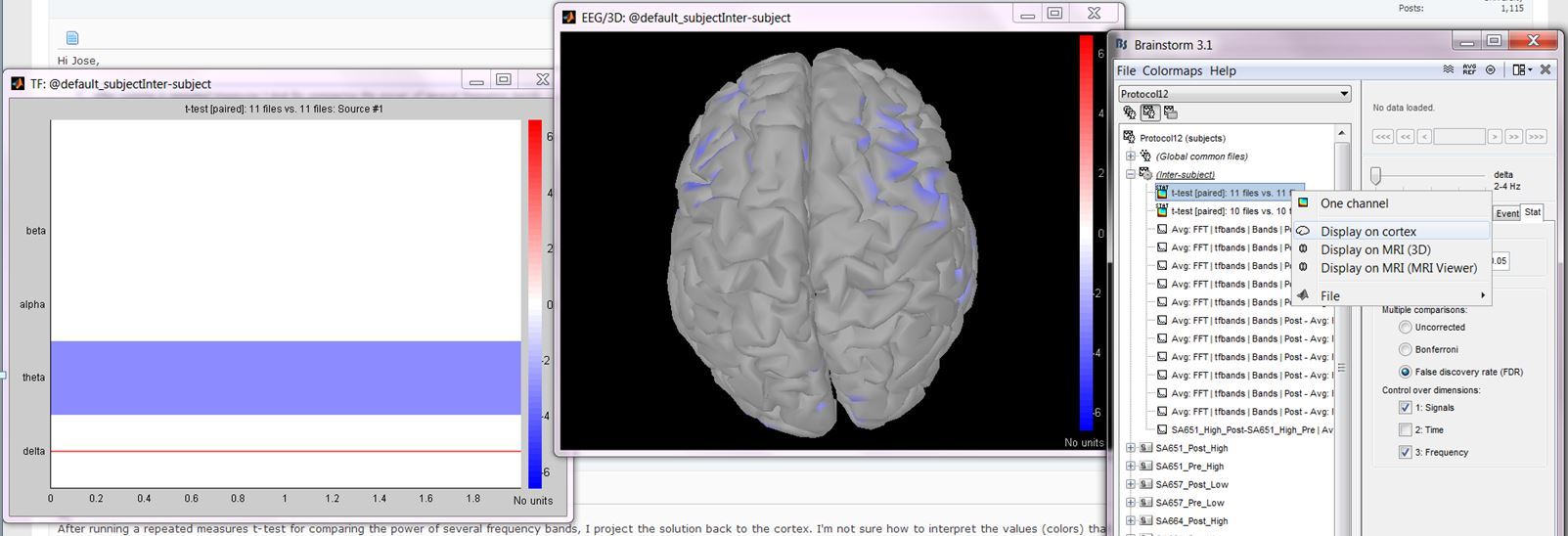
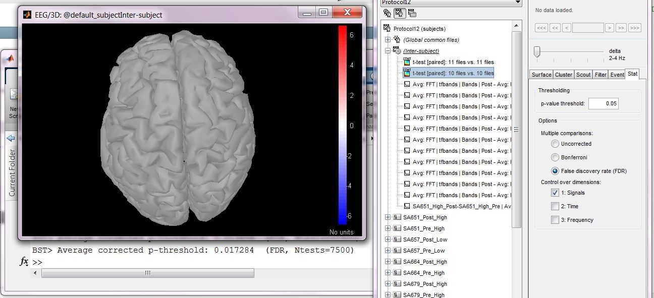
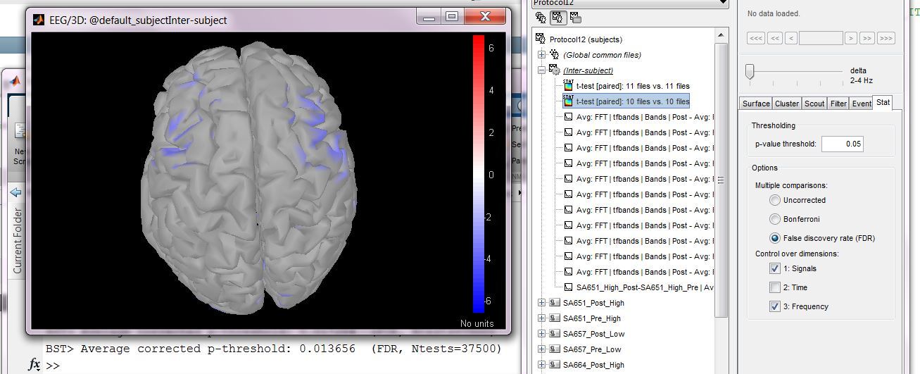
Thank you for your reply. I'm attaching an image. The steps were: 1) Do a frequency analysis (FFT plus frequencies grouped in the usual bands) on the sources of a number of subjects in a repeated measures design (the results of the frequency analysis look just as expected); 2) Use 'Process 2' to perform a paired t-test (no external manipulations were done on the files); 3) I double clicked in the t-test results and a plot with t-scores of each frequency band appeared (left plot in the attached image); 4) I clicked with the right button on the t-test solution and chose the option 'Display on cortex' (this is what I meant with 'projecting back to the cortex', sorry for the confusion); 5) in the 'Stat' tab I chose FDR correction (p=0.05) controlling for 'Signal' and nothing seems significant (no colors on the cortical image), the command window shows:' Average corrected p-threshold: 0.017284 (FDR, Ntests=7500)' (the cortex was previously down sampled to 7500 vertices); 6) I add now a correction for 'Frequency' and the cortex starts to show colors (significant vertices?); as expected (7500 vertices x 5 frequency bands=37500) the command window shows: 'BST> Average corrected p-threshold: 0.013656 (FDR, Ntests=37500)'; 7) if I do the correction starting with frequency and then adding signal, the cortical image shows significant results again; in this case the command window shows the following: 'BST> Average corrected p-threshold: 0.013656 (FDR, Ntests=37500)'
The significance values seem to be correct, maybe there is an issue with the display.
Best
Jose
Hi Francois,
Yes, I waited for the image to be updated before doing something else. I'm attaching two images. In one you can see the case in which I corrected only for signal (no significant results); the Matlab command line can be seen behind the BS windows; in the other you can see that when I added a correction for frequency the significant results appeared. Which is strange since there are more comparisons to correct for.
Best
I can’t reproduce this behavior here. Can you send me this file?
(email or dropbox link sent in a separate email)
Thanks
Francois
Hi Francois,
After redoing all the tests I noticed that it doesn’t seem matter whether you do the signal or the frequency correction first, the issue seems to be that when you add ‘frequency’ correction (which gives significant results in my dataset) to a previously non-significant ‘signal’ correction, the results with the combined correction become significant. There might be a problem since there are more comparisons to correct for in the combined correction (frequency*signal) and also the Matlab command window shows a more stringent p-value in this case (p=0.013656) compared with the signal-alone case (p=0.017284).
Best
Jose
Hi Francois,
What files do you need? Just the t-test results?
Best
Jose
Hi Francois,
I just emailed you a Dropbox link to the files.
Best
Jose
Yes, if it’s calculated on an up-to-date Colin27 template.
Ok, so after double-checking what is happening in the function bst_stat_thresh.m (correction of the p-value maps for multiple comparisons), I don’t think there is any incoherence in the results you are getting.
What is not so intuitive is that you correct for more multiple comparisons but at the same time get more significant values in one frequency band.
- With “signals” you get: “BST> Average corrected p-threshold: 0.028 (FDR, Ntests=7500)”
- With “signals+frequency” you get: “BST> Average corrected p-threshold: 0.024 (FDR, Ntests=37500)”
The important keyword in those messages is “Average”. The way the FDR correction is done is very different in the two cases:
-
Each frequency band is processed independently, and is corrected in a different way. The function bst_stat_thresh calculates one corrected p-value threshold for each frequency band. If you place a breakpoint at line 101, you can observe that:
corr_p = [0.000007 0.0446 0.0487 0.0469 0.000007] % One value per frequency band (average=0.028)
For the Delta frequency band, the significant values are the ones with (p < 0.000007) => Nothing is significant
-
All the frequency bands are processed together. The function bst_stat_thresh calculates one corrected p-value threshold for all the values. If you place a breakpoint at line 101, you can observe that:
corr_p = 0.024 % Same value value for all the frequency bands (average=0.024)
For the Delta frequency band, the significant values are the ones with (p < 0.024) => Many things are significant
Does it make sense?
Francois
Hi Francois,
Thank you very much for your concern and quick response. I think it makes sense now.
Best
Jose
Hi Jose,
FDR (Signals+Frequency): You control the error rate for both dimensions simultaneously. You obtain only one threshold.
FDR (Signals): You control the error rate only for space. In this case, you have different thresholds for each frequency band. FDR is applied independently for each spatial map, so each frequency band will have its own threshold. If you move the slider from delta to another band, you should see different thresholds, some higher and some lower.
For Bonferroni, which controls the familywise error rate, the Signals+Frequency threshold should be higher than Signals threshold only. In this case, you are willing to accept only 5% chance of having a false positive anywhere in space and frequency, this is very strict.
But for FDR, which controls the false discovery rate, the error rate is defined differently. It is ok to have many false positives, as long as they are only 5% of the total significant voxels (on average). So, when you look at an FDR result, you can think that 95% of the voxels you see are indeed significant, but the remaining 5% is false positives (on average). When FDR is applied in Signals, then you know that every spatial map has roughly 5% false positives. When FDR is applied in Signals+Frequency, then there can be spatial maps with more than 5% false positives, and spatial maps with less than 5% false positives (as long as the total sum is 5% in space and frequency).
If I were to do some advertising, these ideas are described well in the chapter ‘Statistical Inference in MEG Distributed Source Imaging’ in the book: MEG Introduction to Methods. A copy here:
https://dl.dropboxusercontent.com/u/4202951/10-Hansen-Ch10.pdf
Best,
Dimitrios
Dear Dimitrios,
Thank you for your reply, it’s been very useful.
Best
Jose