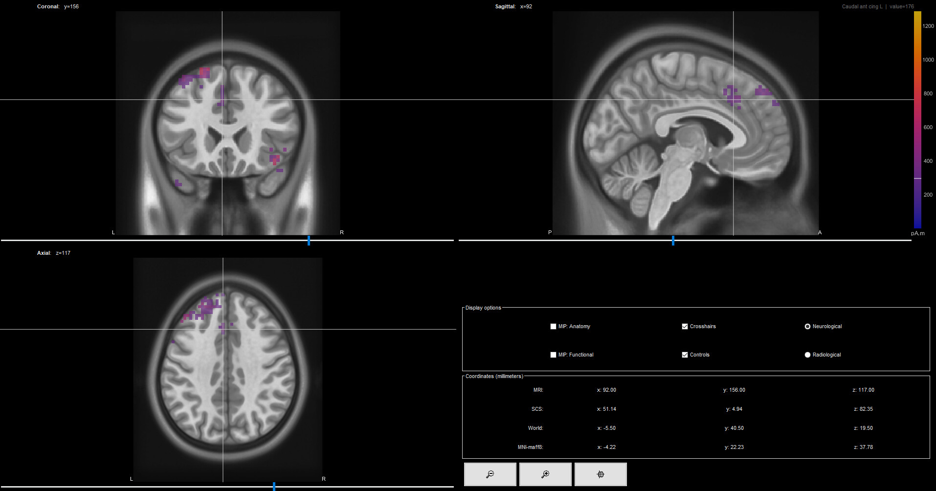
Currently I am looking at the current density maps of intracranial ERP data. On a certain timepoint there are a couple of clusters of activity present. I would like to look at the activity of each ROI (e.g. caudal ACC, SMA, temporal lobe...) and compare the CDM activity relative to ROI size/volume. I have looked at the output files of the CDM, but I don't really understand how they are created and how they translate into the "activity" panel that is shown in Brainstorm.
Then, you can use the resulting Volume atlas to explore the data summarized in Scouts.
Visualize volume Scouts (in MRI slices) *
Check their volume (bottom right)
Plot their aggregated activity (e.g. mean activity)
* Volume scouts are not shown in the MRI viewer display of the sources. It is necessary to plot the source using the option: right-click > Cortical activations > Display on MRI (3D)
thank you very much for your extensive and clear explanation. It is correct that I am using a volume source space, since I work with intracranial data. I have been able to create scouts and to look at their activity. I do have some follow-up questions:
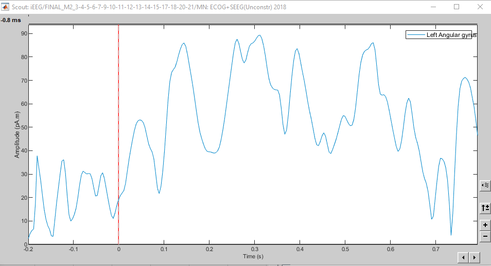
When I look at the mean activity of a certain scout, the amplitude on the y-axis is displayed in pA.m, same as the CDM:
Is it possible to just extract the data as shown in the first plot, so in pA.m? If not, how are they converted from the first plot (pA.m) to the second plot (10^-11)? I ask this because I would like to weigh the activity per scout according to electrode density, so I need to correct these plots.
The discrepancy might be due to your selecting 'absolute values' when visualizing the scout time series. Uncheck that box in the main Brainstorm panel under the scout list box and press the visualization button again to refresh the display.
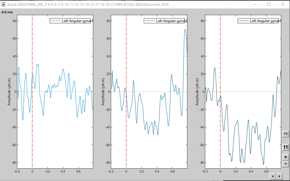
Hello @Sylvain. Thank you for your quick response. I don't really understand how this would make a difference with regards to my question. If I uncheck 'absolute' values the time series is shown separately for the 3 orientations:
with e.g. the time series to generate the first plot in pA.m?
It could be that I am not understanding something very basic, for which I apologize. It is really important for my further analyses that I understand how plot 1 and plot 2 are related/generated.
Since you are using unconstrained sources (this os a must with the volume source space), activity in vertex consist of 3 time series one for X, Y and Z orientations. The difference in the plot is here:
When plotting the Scout activity with the panel with the Absolute option, the time series correspond to the norm of the means in each direction. Aggregation happens before flattening.
When extracting the Scouts, the process first flattens source map (with PCA) and the obtains the mean of those flat time series. Alternatively, it is possible to flat the source with map with norm, but in these two cases (PCA and Norm), Aggregation happens after flattening.
Since flattening is not a linear operation, norm(means) is not the same as mean(norms)
Okay, that really clarifies things for me! I have 3 more small questions:
Practically it is not possible to export the plots as shown using the scout panel (cfr. plot 1)?
If I understand correctly, both plot 1 and 2 show the same, i.e. the mean activity of the current density of all of the verteces per timepoint per ROI?
For publishing purposes, how should I explain what exactly is shown on plot 3?
Many thanks for helping me understand this process!
Extract the mean of the vertices for that Scout (without flattening)
Process Extract > Scout time series
Uncheck the Flatten... option
Scout function: Mean
Uncheck the Flip the sign... option
The result file will contain the mean in X, Y and Z directions
Compute the norm for that result
For this step, you could export the time series to Matlab and compute the norm there. Right-click > File > Export to Matlab
They show two different ways of summarizing the activity. Each of them has their advantages and disadvantages. In our experiments we have resolved to use PCA for flattening and then extract the mean of the flattened signals.
In fact pca_vertices(pca_directions) aprox to pca_directions(pca_vertices)
Blue plot: Obtained within the Scout tab (note that Scout function is PCA)
Green plot: Obtained with the process Extract > Scout time series (used options in image)