Connectivity Graphs
Authors: Yaqi Li, Helen Lin
Prerequisite: This tool is only available for MATLAB versions >= R2014b.
This tutorial will guide the user through the usage of all the features available in the connectivity visualization tool. This tool displays functional connectivity data in the form of a 'graph' suited for human understanding. For a theoretical background on functional connectivity and different connectivity measures, please refer to the tutorial Functional connectivity.
Contents
Loading connectivity graphs
We will begin this tutorial by loading a connectivity graph. Please go through the following steps:
1. Go the protocol TutorialIntroduction, created while following the introduction tutorials. Right-click on the Link to raw file for the first run > Import in database > Select the first 10s.
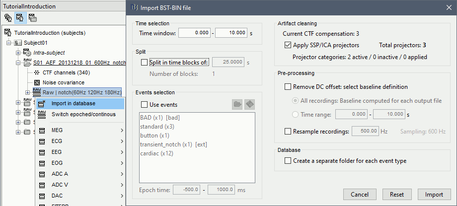
2. Right-click on the imported file > Accept trial. This block of data was marked as bad because it overlapped bad segments.
3. In Process1, select the minimum norm sources associated with this block of 10s, then click "Run".
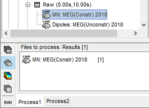
4. In the pipeline editor select "Connectivity", and choose the type of connectivity you would like to load. In this tutorial, we will begin with a Bivariate Granger (spectral) N x N graph.
5. Next, ensure that the scout function is applied "Before". You may also choose a desired atlas. To do so, ensure that the "Use scouts" option at the top left is selected. The atlases can be found in the drop down menu shown on the top right. For this tutorial, choose "DKT" (previously named "Mindboggle"). Click "Run" to start the process.
6. Once computed, you should see the connectivity graph being listed under the raw file. Right-click on the graph and select "Display as graph". The graph should appear on your screen shortly. An example is shown below.
7. You may also view the connectivity matrix for the data generated. To do so, right-click on the graph and select "Display as image". An example is shown in the figure below.
The steps in the following sections will guide you through the options available in this tool.
Connectivity graph structure
In this visualization tool, the connectivity scores from the connectivity matrix are shown as links drawn between regions of interest. As shown in the previous figure, these regions of interests are displayed as nodes labeled along the circumference of the graph. They are grouped in their respective lobes (such as "Frontal", "Central", etc. shown in the figure above) and hemispheres (i.e., left and right hemisphere). Connections are represented by coloured lines. Connectivity scores are represent through a colormap, which you can see in the colorbar on the bottom right of the figure.
The graph used throughout this tutorial is built with the Mindboggle brain atlas, which generates the labeled nodes shown in the previous figure above. Note that the lobe and node structure will vary according to the atlas selected by the user.
Camera view
The mouse wheel (or the up and down arrow keys on your keyboard) can be used to zoom-in and zoom-out on the figure. Click-and-dragging the mouse while holding SHIFT also allows you to move the figure on your screen to focus on one region or area of interest in the figure. Below is an example of zooming in and focusing on the right central lobe.
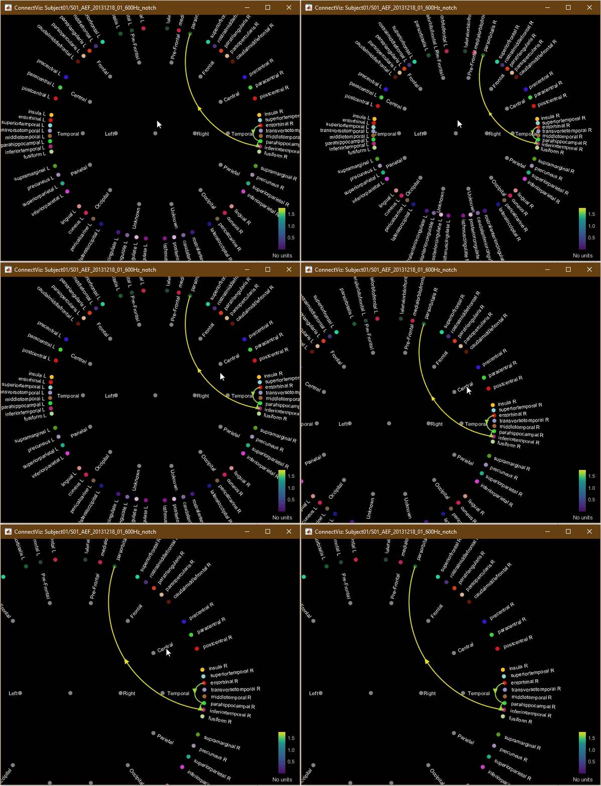
Double-click anywhere on the figure (other than on the colormap) to restore the camera view to the default view.
Filtering options
The following filtering options for the displayed links on the graph are available in the Display panel:
- Intensity threshold (by amplitude or percentile)
- Distance filtering
- Direction (for directional graphs only)
- Anatomy
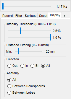
1. You have the option to adjust the intensity threshold, which is the minimum connectivity score that will be displayed on your graph. The first slider represents the value of the threshold, the second represents the percentile of this value in the distribution of all the connecitivity scores. The two sliders are linked and get updated dynamically. Move the first slider to the left. You should see more connectivity links appear, as shown in the figure below.
2. Similarly, you may also adjust the distance filtering slider. This is related to the minimum physical distance between each link's two nodes of interest.
3. For directional graphs, users have the option to display only Inward ("In"), Outward ("Out") or Bidirectional ("Bi") links by selecting the desired option. One can also choose to display all types of links with the "All" option. When the "In" or the "Out" option is selected, you will only see one arrowhead for each link, indicating the directionality of the associated connectivity score.
Now, select "Bi". You should see two arrowheads appear on each link. Links are considered to be "bidirectional" when both links between a pair of nodes are displayed (i.e., when the link from A to B and the link from B to A are both visible).
NOTE: Note that this option is not available for non-directional graphs. Arrowheads also do not appear in non-directional graphs. Below is an example of a non-directional correlation graph.
4. The Anatomy option allows you to display only links between distinct hemispheres or distinct lobes. For example, if you select the "Between Lobes" option, only links that connect nodes of two distinct lobes will be displayed.
5. Spectral graphs, such as this one, have a frequency slider located above the display panel. In such gaphs, connectivity scores are computed at each frequency bin. Move this slider, and notice the graph being reloaded with new connections.
Colormap
Connectivity scores are represent through a colormap, as you can see in the colorbar on the bottom right of the figure.
1. Right-click on the graph. A popup-menu with options will appear. Click on the "Colormap" option. This allows you to select a desired colormap, and to adjust other features, such as contrast and brightness from the options shown in the figure below.
2. In the figure, left-click on the colorbar and drag your mouse up and down while holding the mouse click. This is identical to adjusting the "Brightness" of the colormap directly through the popup menu.
3. Now, click-and-drag your mouse horizontally on the colorbar. This allows you to adjust the "Contrast", which can also be adjusted through the colormap submenu of the popup menu.
4. Double-clicking on the colormap restores the default colormap and colormap settings.
Display options
The appearance settings of the graph can be adjusted according to the user's preferences.
1. In the popup menu, select "Display options".
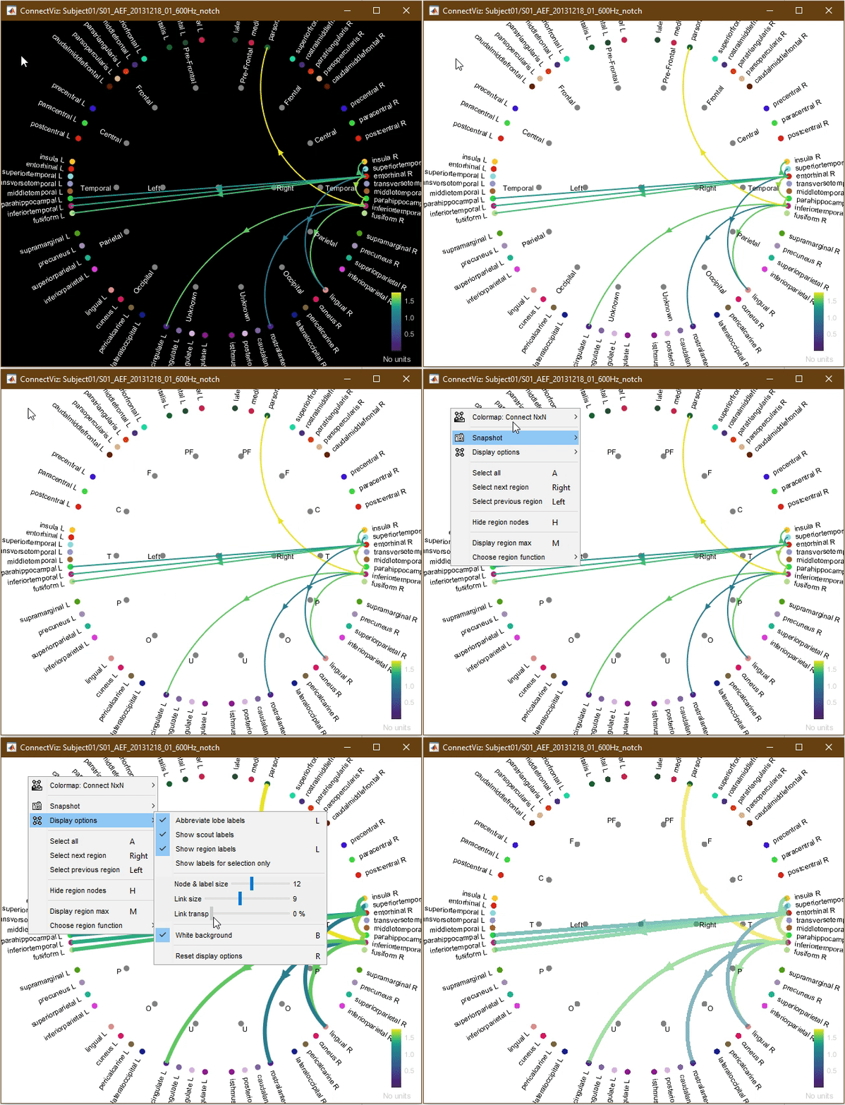
2. Lobe labels are displayed with their full name by default. However, you have the option to display them in their abbreviated forms. Try toggling the "Abbreviate lobe labels" option.
3. Scout labels and region labels can be hidden if the corresponding option is toggled. These label options can also be toggled by using the "L" key on your keyboard.
4. Finally, the "Show labels for selection only" allows you to display labels only for the nodes that have been selected. Node selection is explained in sections Node and region selection through the popup menu and Node and region selection through mouse clicks found below.
5. The size of the nodes and labels can be adjusted with the "Node & label size" slider. This can be particularly useful when labels may be overlapping with some atlases.
6. Similarly, the size of the links displayed can be adjusted via the "Link size" slider.
7. The "Links transp" slider allows you to adjust the transparency of the links displayed. Links are opaque when it is set to 0% and fully transparent when it is set to 100%.
8. The "White background" option allows you to toggle the background theme between black (with white text) and white (with black text). This can be particularly useful when saving a copy of the figure for publication or presentation use. You can also toggle the background by using the "B" keyboard shortcut.
9. All display and camera options can be reset to their default values by selecting "Reset display options" on the popup menu (or by using the "R" keyboard shortcut).
The animation below shows an example where the background color is changed to white, the lobe labels are toggled to being abbreviated, the link size is increased, and link transparency is increased.
Region links
In Brainstorm, connectivity links between lobes (i.e., region links) can also be displayed. Region Max links represent the largest connectivity scores computed to or from nodes belonging to a particular lobe, while Region Mean links represent the average connectivity score of all nodes belonging to a particular lobe of interest.
1. In the popup menu, select the "Display region max" option (or use the "M" keyboard shortcut). You should see connectivity links drawn between lobe nodes. The animation below shows the outcome when using the "M" keyboard shortcut. The tool switches from displaying measure links to displaying region max links.
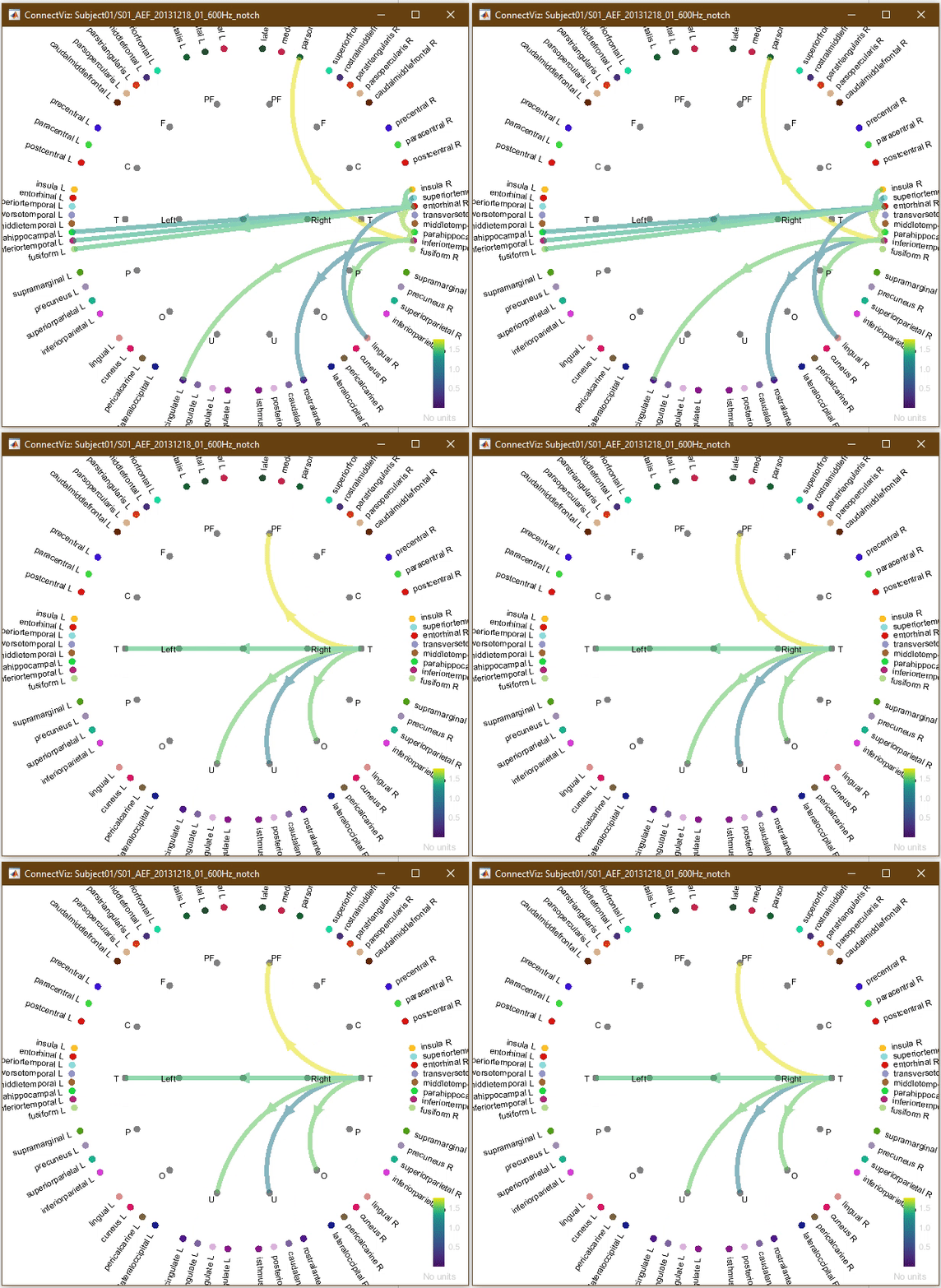
The same display and graph options apply to region links.
2. Next, select "Choose region function" in the popup menu and select "Mean" to display the region mean links, as shown in the figure below. If no links appear on the graph, reduce the intensity threshold since the mean values may be smaller than your threshold. Finally, use the "M" shortcut to return to default scout links.
Node and region selection through the popup menu
This tool provides users with the option to display only links belonging to a particular set of nodes of interest.
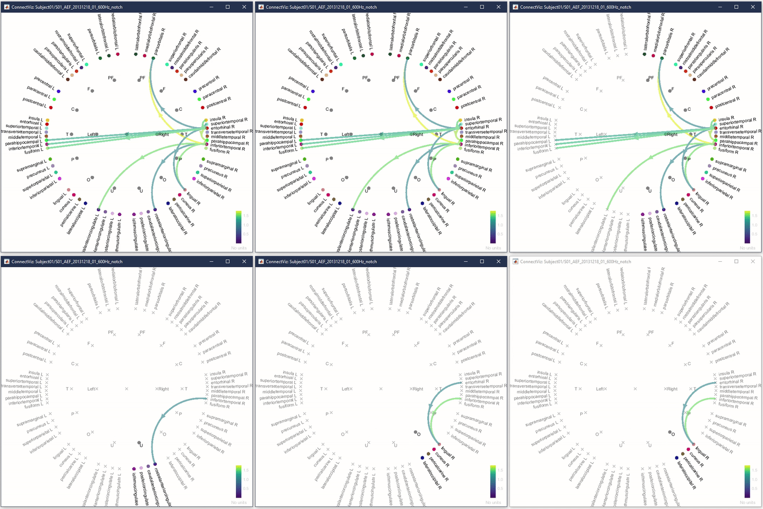
1. In the popup menu, click on "Select next region" (or use the right-arrow key on your keyboard). You should see all nodes belonging to one particular hemisphere or lobe being selected, while all other nodes become unselected. When a region of interest is selected, only nodes belonging to it appear as filled markers, while other nodes will be displayed with a 'x' marker and have their labels greyed out. The region being selected depends on the atlas selected. You may continue to click on "Select next region" (or using the right-arrow key on your keyboard) to iterate through all the different hemipsheres, lobes and measure nodes. The animation below shows the regions being toggled via the right-arrow key on the keyboard.
2. Click on "Select next region" (or click the right-arrow key) a few more times - the program will keep iterating through the different hemispheres, lobes and then the measure nodes.
3. Click on "Select previous region" (or use the left-arrow key). The program will iterate through the regions in the opposite order.
4. Now, click on "Select all" (or hit "A" on your keyboard). You should see all nodes being selected once again.
Node and region selection with mouse clicks
Users also have the possibility to custom select specific nodes, lobes or hemispheres of interest by clicking on them to display links related to these nodes. Again, when a region of interest is selected, only nodes belonging to it appear as filled markers and its links are displayed, while all other nodes will be displayed with a 'x' marker and have their labels greyed out.
1. Click on a lobe of interest or click on its associated label. You should see that only the links associated with this lobe are displayed.
2. Now, click on a hemisphere of your choice to display only links associated with this hemisphere. Again, you may click on either the node marker or on its associated label.
4. Lastly, click on a node along the circumference of the graph which represents a single region of interest/ scout. You should now only see links associated with this node. Do not unselect that node.
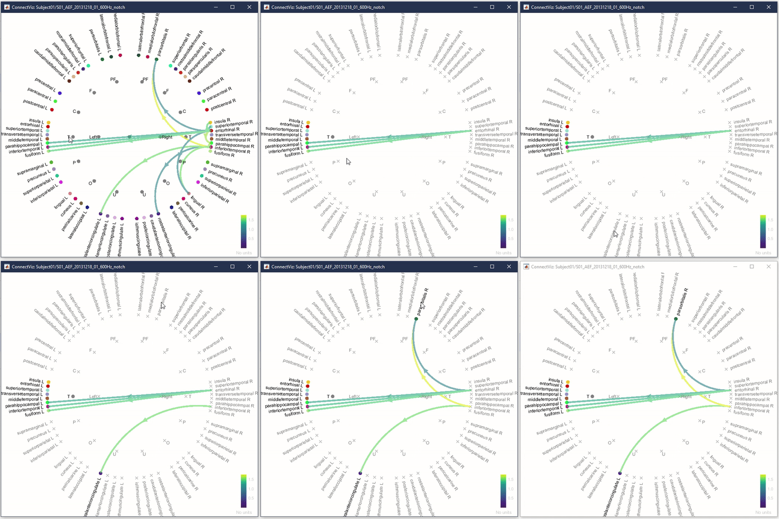
5. Now, click on another node or multiple nodes of your choice while holding SHIFT on your keyboard. Holding SHIFT allows you to select multiple regions of interest at once. Otherwise, the previously selected node will automatically become unselected when another one is selected as shown in the previous steps.
The animation below shows an example of selecting multiple nodes while holding SHIFT as described above.
Link selection
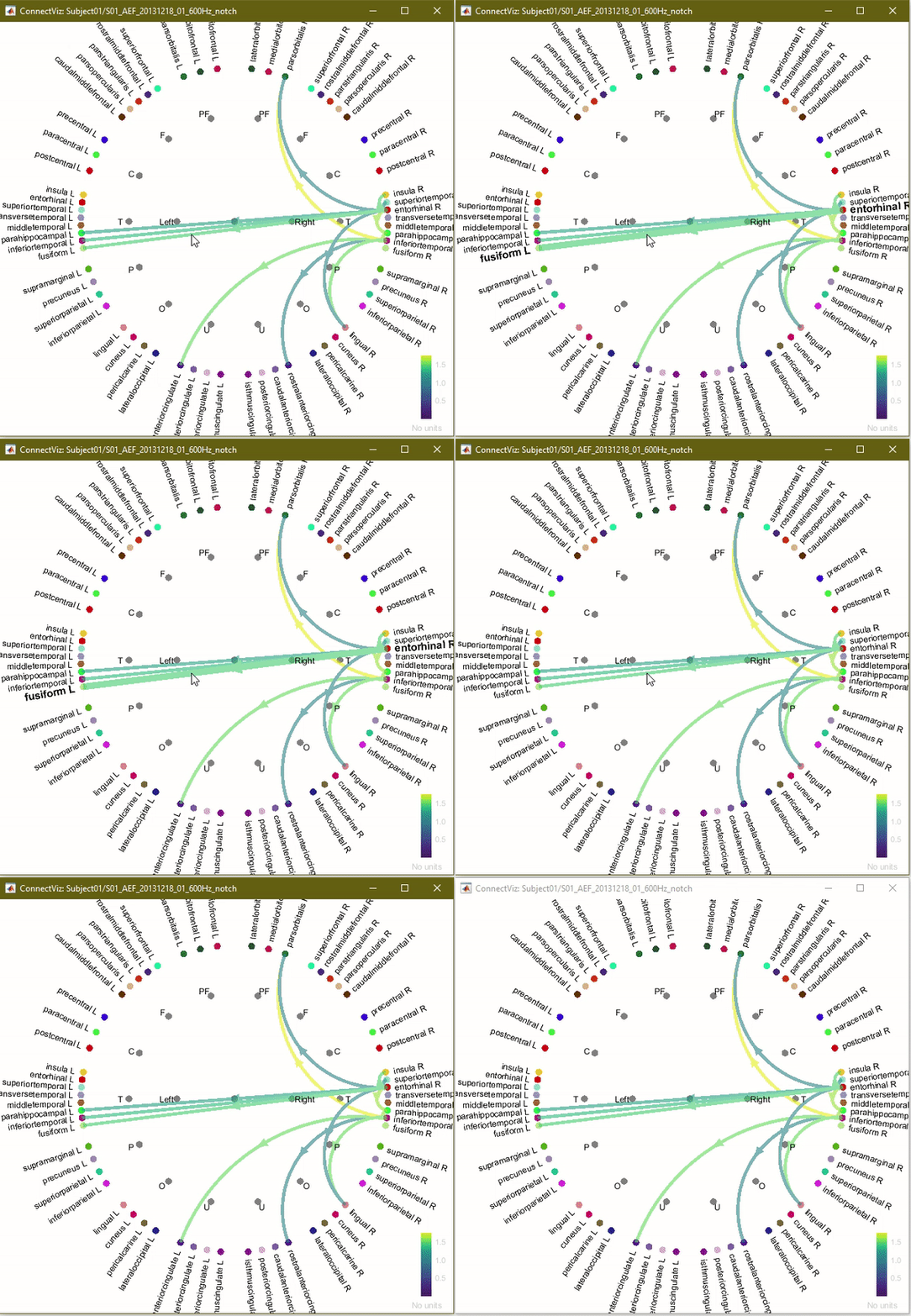
Connectivity links of interest can also be selected temporarily to emphasize a specific link. When selected, the link size is increased and the labels associated with the two nodes being connected become bold and enlarged. This occurs while the user clicks anywhere along the link. Elements return to their original sizes when the mouse click is released. This feature allows you to easily visualize and gain key information regarding connections of interest. An example is shown in the animation below.
Saving the figure as image
In the popup menu, click on the "Snapshot" option. This feature allows you to save the figure as an image locally, and to reuse it later. When using the "Save as image" (or CTRL+I) option, you may select a specific location on your local device.
Summary of features
You have now reviewed all feature of this visualization tool.
The following table summarizes all the user-interactive features available in this tool.
* Features highlighted in blue are also accessible in the popup menu.
Table 1. Summary of features.
Feature* |
Keyboard/Mouse Interaction |
Select all nodes |
A |
Select next region |
→ (right-arrow key) |
Select previous region |
← (left-arrow key) |
Select custom node |
Click node marker(s) and/or label(s) |
Multi-select custom nodes |
SHIFT+Click on multiple nodes |
Toggle/hide visibility of region nodes |
H |
Available on the Display Panel: Intensity Threshold, Distance Filtering, Direction, Anatomy |
|
Temporary emphasis on selected link |
Click any link |
Toggle region/measure links |
M |
Choose region function (mean or max) |
|
Toggle abbreviated/full lobe labels |
L |
Show scout (measure node) labels |
|
Show region labels |
L |
Show labels for selected nodes only |
|
Node & label size slider |
|
Link size slider |
|
Link transparency slider |
|
Toggle background theme |
B |
Reset display options to default |
R |
Save as image |
CTRL+I |
Open as image |
CTRL+J |
Popup menu as imported from Brainstorm Colormap menu: - Double-click (on the colorbar) to reset. - Up/down drag to adjust contrast, left/Right drag to adjust brightness |
|
Zoom in |
Up arrow key; Scroll up mouse wheel |
Zoom out |
Down arrow key; Scroll down mouse wheel |
Pan (horizontal/ vertical translation) |
SHIFT+drag |
Reset camera |
Double-click |
