|
Size: 4046
Comment:
|
Size: 4081
Comment:
|
| Deletions are marked like this. | Additions are marked like this. |
| Line 54: | Line 54: |
| {{attachment:frequency_slider.PNG}} |
last edit: Apr. 3, 2021 by Yaqi
Loading Connectivity Graphs
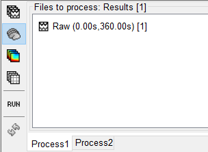
1. Drag the selected raw file into the process block. Ensure the "Process Sources" is selected on the left-hand side.
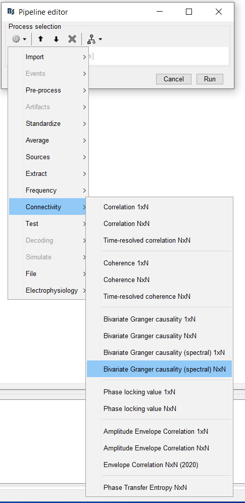
2. In the pipeline editor select "Connectivity", and choose the type of connectivity you would like to load. In this tutorial, we will begin with a Correlation N x N graph.
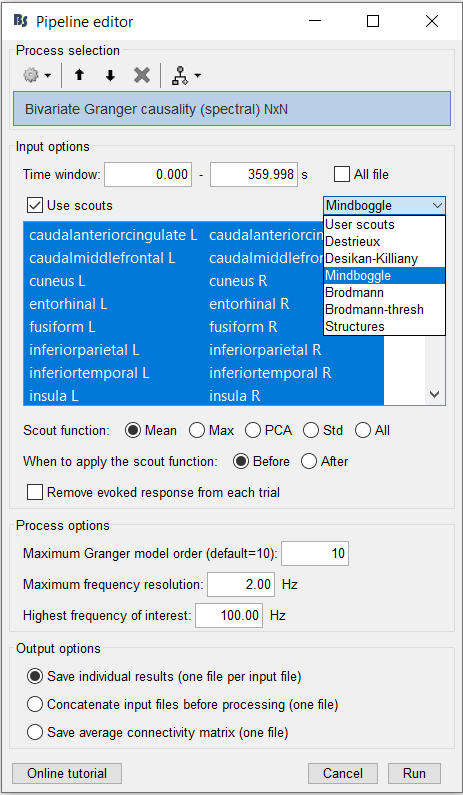
3. Next, ensure that the scout function is applied Before. You may also choose a desired atlas. For this tutorial, choose Mindboogle.
4. Once loaded, you should see the graph being listed under the raw file. Right-click on the graph and select "". The graph should appear on your screen shortly.
Nodes are labeled along the circumference of the graph. Connections are represented by coloured lines. Connectivity scores are represent through a colormap, which you can see in the colorbar on the bottom right of the figure.
5. The steps in the following sections will guide you through the display options available in this tool.
Filtering Options
The following options are available in the display panel:
- Intensity Threshold
- Distance Filtering
- Direction (for directional graphs only)
- Anatomy
1. You have the option to adjust the minimum intensity threshold, which is the minimum connectivity score that will be displayed on your graph. Move this slider to the left. You should see more connectivity links appear.
2. Similarly, you may also adjust the distance filtering slider. This related to the minimum physical distance between two nodes of interest.
3. For directional graphs, users have the option to display only Inward ("In"), Outward ("Out") or bidirectional ("Bi") links by clicking on the desired option. When the "In" or the "Out" option is selected, you will only see one arrowhead for each link, indicating the directionality of the associated connectivity score.
Now, select "Bi". You should see two arrowheads appear on each link. Links are labeled as "bidirectional" when both links between a pair of nodes are displayed.
4. The Anatomy option allows you to display only links between 2 different hemispheres or between 2 different lobes. Select the "Between Lobes" option.
5. Spectral graphs, such as this one, have a frequency slider above the display panel. In such gaphs, connectivity scores are computed at each frequency point. Move this slider, and notice the graph being reloaded with new connections.
Colormap
Connectivity scores are represent through a colormap, as you can see in the colorbar on the bottom right of the figure.
1. Right-click on the graph. A popup-menu with options will appear.
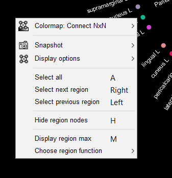
2. Click on the "Colormap" option. This allows you to select a desired colormap, and to adjust other features, such as contrast and brightness from the options shown in the figure below.
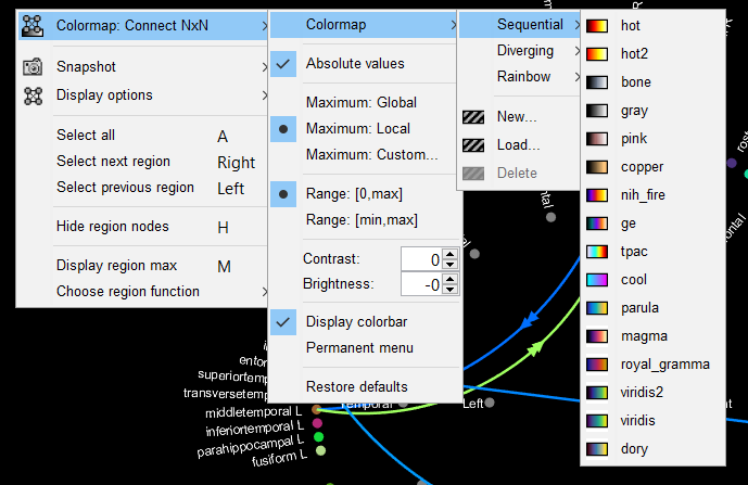
3. The "Restore defaults" option allows you to revert to the default options.
4. In the figure, left-click on the colorbar and move your mouse up and down while keeping the mouse click. This is identical to adjusting the "brightness" directly through the popup menu.
5. Now, drag your mouse horizontally while keeping the mouse click on the colorbar. This allows you to adjust the contrast, which can also be adjusted through the popup menu.
Saving figure as image
In the popup menu, click on the "Snapshot" option. This feature allows you to save the figure as an image locally, and to reuse it later. When clicking on the "Save as image" option, you may select a specific location on your local device.
