|
Size: 27725
Comment:
|
Size: 27112
Comment:
|
| Deletions are marked like this. | Additions are marked like this. |
| Line 1: | Line 1: |
| = Resting state MEG recordings = ==== [TUTORIAL UNDER DEVELOPMENT: NOT READY FOR PUBLIC USE] ==== |
= MEG resting state and phase-amplitude coupling = |
| Line 5: | Line 4: |
| This tutorial explains how to process continuous resting state MEG recordings. It is based on a eyes open resting recordings of one subject recorded at the Montreal Neurological Institute in 2012 with a CTF MEG 275 system. The segmentation of the T1 MRI of the subject was performed using !FreeSurfer. This tutorial features a few pre-processing steps and the calculation of phase-amplitude coupling meaures. | This tutorial features a few pre-processing steps and the calculation of phase-amplitude coupling measures on resting state MEG recordings. It is based on a eyes open resting recordings of one subject recorded at the Montreal Neurological Institute in 2012 with a CTF MEG 275 system. |
| Line 9: | Line 8: |
| <<Include(DatasetResting, , from="\<\<HTML\(\<!-- START-PAGE --\>\)\>\>", to="\<\<HTML\(\<!-- STOP-SHORT --\>\)\>\>")>> |
|
| Line 10: | Line 11: |
| This tutorial dataset (MEG and MRI data) remains a property of the MEG Lab, !McConnell Brain Imaging Center, Montreal Neurological Institute, !McGill University, Canada. Its use and transfer outside the Brainstorm tutorial, e.g. for research purposes, is prohibited without written consent from the MEG Lab. If you reference this dataset in your publications, please aknowledge its authors (Elizabeth Bock, Esther Florin, Francois Tadel and Sylvain Baillet) and cite Brainstorm as indicated on the [[CiteBrainstorm|website]]. For questions, please contact us through the forum. |
This tutorial dataset (MEG and MRI data) remains a property of the MEG Lab, McConnell Brain Imaging Center, Montreal Neurological Institute, McGill University, Canada. Its use and transfer outside the Brainstorm tutorial, e.g. for research purposes, is prohibited without written consent from the MEG Lab. If you reference this dataset in your publications, please acknowledge its authors (Elizabeth Bock, Esther Florin, Francois Tadel and Sylvain Baillet) and cite Brainstorm as indicated on the [[CiteBrainstorm|website]]. For questions, please contact us through the forum. |
| Line 16: | Line 17: |
| * Go to the [[http://neuroimage.usc.edu/brainstorm3_register/download.php|Download]] page of this website, and download the file: '''sample_resting.zip ''' | * Go to the [[http://neuroimage.usc.edu/bst/download.php|Download]] page of this website, and download the file: '''sample_resting.zip ''' |
| Line 18: | Line 19: |
| * Start Brainstorm (Matlab scripts or stand-alone version) * Select the menu File > Create new protocol. Name it "'''!TutorialResting'''" and select the options: |
* Start Brainstorm (Matlab scripts or stand-alone version). * Select the menu File > Create new protocol. Name it "'''TutorialResting'''" and select the options: |
| Line 25: | Line 26: |
| * Right-click on the !TutorialResting folder > New subject > '''Subject02''' * Leave the default options you set for the protocol |
* Right-click on the TutorialResting folder > New subject > '''Subject02''' * Leave the default options you set for the protocol. |
| Line 28: | Line 29: |
| * Set the file format: "!FreeSurfer folder" | * Set the file format: "FreeSurfer folder" |
| Line 41: | Line 42: |
| * The sample_resting download contains two 10 minute resting state runs. We are going to use the first one which is the one labelled 'subj002_spontaneous_20111102_01_AUX.ds'. | ==== Resting state recordings: 10min ==== * The sample_resting download contains two 10 minute resting state runs. We are going to use the first one (run 01). |
| Line 43: | Line 45: |
| * Right click on the Subject02 > Review raw file | * Right click on the Subject02 > Review raw file > Pick the file: <<BR>>'''sample_resting/Data/subj002_spontaneous_20111102_01_AUX.ds''' |
| Line 45: | Line 47: |
==== Empty room recordings: 90s ==== * We are also going to link to the database 20 seconds of empty room measurements that were acquired before the subject entered the MEG room. During the source estimation process, we will use this file to estimate the noise related with the MEG sensors. * Right click on the Subject02 > Review raw file > Pick the file: <<BR>>'''sample_resting/Data/subj002_noise_20111104_02.ds''' * Ignore the misplaced MEG helmet you see after the file is link to the database. These are noise measurements, with no subject in the MEG, so there is no head position in this file. We are not going to use the sensor positions from this file.<<BR>><<BR>> {{attachment:import_noise.gif||height="165",width="211"}} * __Important note__: From now on, all the pre-processing steps that re-write new continuous files (bandpass filter, notch filter) applied to the resting state MEG recordings should be applied as well to the noise recordings. We will calculate the noise covariance from the noise recordings and then use them to whiten the resting state recordings to estimate the sources. For this operation to be valid, the two datasets must be processed exactly in the same way. The SSP are not a problem as they are applied dynamically to the noise covariance when estimating the sources. |
|
| Line 49: | Line 57: |
| ==== Bad segments ==== Some noisy segments have been marked manually. We are going to import these segments now: * Double-click on the "Link to raw file" to display the resting state MEG recordings. * In the Record tab, select the menu '''File > Add events from file''' * Select the file format: '''Brainstorm (events*.mat)''' * Pick the file: '''Data/subj002_spontaneous_20111102_01_AUX.ds/events_BAD.mat''' * This will load 26 bad segments, which will be ignored from most of the upcoming computations. |
|
| Line 50: | Line 68: |
| Signal Space Projection (SSP) is a method in for projecting away stereotyped artifacts (such as eye blinks and heartbeats) out of the recordings. * Double-click on the "Link to raw file" to display the MEG recordings |
Signal Space Projection (SSP) is a method for projecting the recordings away from stereotyped artifacts, such as eye blinks and heartbeats. * Double-click on the "Link to raw file" to display the resting state MEG recordings. |
| Line 54: | Line 72: |
| * '''Detect eye blinks:''' select channel '''EEG058''' (EOG channel), event name "blink" * '''Detect heartbeats:''' select channel '''EEG057''' (ECG channel), event name "cardiac"<<BR>><<BR>> {{attachment:blink.gif||height="181",width="560"}} * Review the MISC channels and make sure the events detected make sense.<<BR>><<BR>> {{attachment:ssp_detect_after.gif||height="223",width="424"}} * From the same menu, run the following processes: * '''Compute SSP: Eyeblinks''': Enter event name "blink", sensor types="MEG" * '''Compute SSP: Heartbeats''': Enter event name "cardiac", sensor types="MEG" * The first component of each category should be selected automatically. Leave the default selection as it is but make sure that the corresponding topographies are really representative of blinks and heartbeats.<<BR>><<BR>> {{attachment:ssp_compute.gif||height="146",width="555"}} * For more information regarding this SSP method, refer to this tutorial: [[Tutorials/TutRawSsp|Detect and remove artifacts]] |
* '''Detect heartbeats:''' select channel '''EEG057''' (ECG channel), event name "cardiac". * '''Detect eye blinks:''' select channel '''EEG058''' (EOG channel), event name "blink".<<BR>><<BR>> {{attachment:blink.gif||height="209",width="547"}} * Review the MISC channels and make sure the events detected make sense.<<BR>><<BR>> {{attachment:ssp_detect_after.gif||height="257",width="557"}} * From the same SSP menu, run the following processes: * '''Remove simultaneous''': Remove events "'''cardiac'''" that are less than '''250ms''' from a "'''blink'''" * '''Compute SSP: Heartbeats''': Enter event name "cardiac", sensor types="MEG". * '''Compute SSP: Eyeblinks''': Enter event name "blink", sensor types="MEG".<<BR>>Here you can '''UNCHECK''' the option "Computing using existing SSP", it gives better results. * The first component of each category should be automatically selected. Leave the default selection as it is but make sure that the corresponding topographies are really representative of blinks and heartbeats.<<BR>><<BR>> {{attachment:ssp_compute.gif||height="146",width="555"}} * For more information regarding this SSP method, refer to this tutorial: [[Tutorials/TutRawSsp|Detect and remove artifacts]]. |
| Line 66: | Line 84: |
| PAC analysis involves examining a wide band of frequencies, often the entire range of 2-150Hz or more. This band contains the frequencies contaminated by line noise, of either 50 or 60Hz and their harmonics. Brainstorm offers tools to remove line noise from functional data and it is most of the time a recommended pre-processing step. However, here we will not run the "Sinusoid removal" process for time efficiency and because it is not required for accurate PAC analysis. The PAC function looks for high frequencies occuring specifically at certain phases of low signals such that the ubiquitous nature of line contamination effectively cancels it out for being identified as PAC. Similarly, running the sinusoid removal results in no 60Hz anywhere, such that the function also identifies no PAC. To demonstrate that we can safely proceed without cleaning for the power line contamination, consider the following PAC maps performed on the same time series with the only difference being line noise removal on one data set (raw data on the left, cleaned for 60Hz and 120Hz on the right). {{attachment:SinCheck.gif||height="168",width="390"}} == Importing == * Right click on the 'Link to raw file' > 'Import in database'.<<BR>><<BR>> {{attachment:Import.gif||height="255",width="480"}} * eave all these options at default. When we click 'Import' brainstorm will now create a new file with the data imported with our SSPs applied and DC offset removed. Note: importing this long recording will create a new large file (~3 gb) and may take a couple minutes. * Due to the way Brainstorm reads raw files vs. imported files it is more computationally demanding to open the imported files (try opening the 'Link to raw file' vs. opening the imported file) which is why we did all the steps in which we need to scroll through the data with the link to the raw file.This is the most efficient way to proceed, as trying to open and scroll through imported files is very computationally inefficient. |
* PAC analysis involves examining a wide band of frequencies, often the entire range of 2-150Hz or more. This band contains the frequencies contaminated by line noise, of either 50 or 60Hz and their harmonics. Brainstorm offers tools to remove line noise from functional data and it is most of the time a recommended pre-processing step. However, here we will not run the notch filter for time efficiency and because it is not required for accurate PAC analysis. * The PAC function looks for high frequencies occurring specifically at certain phases of low signals such that the ubiquitous nature of line contamination effectively cancels it out for being identified as PAC. Similarly, running the notch filter results in no 60Hz anywhere, such that the function also identifies no PAC. |
| Line 82: | Line 88: |
| The imported file should have saved as a new condition in our tree in the brainstorm database. At this point we still have the sensor data and now want to project the data into source space. We will need a head model and noise covariance matrix (as well as the imported anatomy) in order to do this. ==== Head Model ==== * To compute the head model, right click on the newly imported file (which should be labelled 'Raw(0.00s,600.00s') and click on the compute head model. Use the overlapping spheres model and keep all of the options at their default values. |
We need now to calculate a source model for the resting state recordings, using a noise covariance matrix calculated from the noise recordings. ==== Head model ==== * Right-click on the recordings node ("spontaneous") > Compute head model.<<BR>><<BR>> {{attachment:headmodel_popup.gif||height="176",width="228"}} * Use the overlapping spheres model and keep all of the options at their default values.<<BR>><<BR>> {{attachment:headmodel_after.gif||height="224",width="421"}} * For more information: [[Tutorials/TutHeadModel|Head model tutorial]]. |
| Line 88: | Line 96: |
| In the original zip download folder there is an empty room recording from when this data was collected. It is labelled XXXX(TO BE ADDED TO DOWNLOAD) * Right click on 'PACTutorialSubj1', click 'review raw file' and select this file. * Right click on the 'Link to raw file' of the noise recording, go to the 'noise covariance' submenu and click on 'compute from recordings'. * An option box will pop up, within which you should keep all the default values. Click okay to create the noise covariance matrix. This new file should now be available in the tree. Right click on the Noise covariance file and click 'copy to other conditions' to copy this file to all the other conditions where we need it. <<BR>> * Further information as well as the importance and relevance of noise covariance is described here: [[http://neuroimage.usc.edu/brainstorm/Tutorials/TutNoiseCov|Noise Covariance Tutorial]] * You should now have a condition with imported data, a head model and noise covariance that looks like this: {{attachment:importedDB.gif}} * Right click on the raw file again and click 'compute sources'. Use the Minimum norm estimate (wMNE) and keep all the default settings. We are now ready to run the PAC analysis. == Phase amplitude coupling == === Step 2: Using the PAC Function - the Basics === Once you have the sources projected onto the anatomy proceed with the following instructions to use the PAC function on the source data. This PAC function in Brainstorm is not time resolved, but will analyze any given time series for any stable occurence of PAC over any time segment you give it. This can be done at the sensor or source level for and EEG or MEG data. Here we will analyze the source data, by giving the function the time series of the vertices of our projected data. ==== The Function ==== * The function for Phase Amplitude Coupling analysis is found in the frequency menu in the process selection menu. {{attachment:PACMenu.gif}} * Drag and drop the sources file (it should be labelled 'MN: MEG(Constr)') into the dropbox in the process 1 tab. Click on run, go to frequency and click on Phase Amplitude Coupling. ==== Process Options ==== Once you click on 'Phase-amplitude coupling' you should get an options box with the following options. {{attachment:PACOptions.gif}} See PAC tutorial for details on those options. We will first demonstrate the process by computed the PAC for a single vertice (a single time series in source space). This will allow us to examine what the PAC process does and visualize the result. * In the PAC option box, if the options are not already filled out, fill in time window as the full length of the file (0 - 599.9996) and the frequency options as the wide bands of low: 2 - 30 and high: 40 - 150. * We are going to arbitrarily compute PAC on source #224. (Vertices in the source data are labelled with numbers). Write '224' in the source indices option. * Click on run. * PAC files that are computed will be saved under the file containing the time series from which they were computed under the name 'MaxPAC'.It should look like this in brainstorm. {{attachment:224DB.gif}} * Double click on the 'MaxPAC file to open the PAC map - the comodulogram. You should open an interactive graphical representation of the data which looks like this. {{attachment:comodulogram224.gif}} * We have this map available because we selected the 'Save Full PAC maps' and can therefore now visualize all the frequencies pairings and their PAC strenghs for each time series. * The small white circle indicates the PAC pairing with the strongest coupling (the maxPAC pairing) and the results relevant to this pairing that are displayed on the top of the comodulogram. * MaxPAC: the strength of the coupling * flow: the low frequency (nesting) * fhigh: the high frequency (nested) * coupling phase: the phase of the flow at which the fhigh occurs * You can click to any frequency pairing and the relevant results will be displayed at the bottom of the comodulogram.This allows you to explore the values represented in the comodulogram. Here I clicked on PAC at around at 9 Hz nesting. We can see that the coupling strength is similar to the coupling at the maxPAC flow of 11.47. This suggests there are two clusters of PAC in this time series, of almost equal occurence. {{attachment:comodulogram224sel.gif}} <<BR>> The full PAC comodulograms contain a lot of information, especially considering that we have this amount of information for every time series (each vertex) if we do this across all sources. You need not save the full PAC maps when doing this analysis - the MaxPAC function offers the option to save only the values at the maxPAC - at the frequency pairing with the highest coupling strength. This examines the time series for the maximally coupled pairing and then saves only the results related to that value. It is no quicker to compute, but saves much smaller files. To demonstrate this, we can re-run the same PAC analysis on the same time series, but unselect the 'Save full PAC maps' options. (You can do this if you wish, but if it is a long computation on your system you can look at the result below - it is simply another representation of the same data in the 'Full' file). Using the maxPAC in this manner saves nothing that can be visualized, and double clicking on the resultant file simply opens the file contents, which contains the 4 values of interest computed by the maxPAC function. <<BR>> {{attachment:PACnonfull.gif}} <<BR>> If you are unfamiliar with these tables, it is the 'File Contents' table available for every file in the Brainstorm database by right clicking - file - view file contents. It contains the datapath and name of the actual file on the computer as well as some summary information of everything in the file. __Relevant MaxPAC information in File Contents<<BR>>__ * TF: the top line in the table contains the coupling strength(s) of the maximally coupled frequency pairing (maxPAC pair) * Options: the options struct contains all the parameters that were given to the process * sPAC: this struct contains all the information related to the PAC function (other than coupling strength saved in TF) * Nesting Freq: the low frequency at the maxPAC * Nested Freq: the high frequency at the maxPAC * PhasePAC: the phase at the maxPAC * DirectPAC: this holds all the values for all the other pairings to represent the PAC comodulograms * Empty when full maps are not saved * Contains a very large matrix when maps are saved * [Low Freqs]: contains the lowFreqs used * [High Freqs]: containts the highFreqs used This is a much more efficient way of saving and representing a small part of the data and pulling out the main mode of PAC in any time series. The caveat is (as we can see in the example map of vertex # 224) that pulling out only the strongest pair may not be particularly representative of the overall PAC in the time series. In this special case, where the difference in coupling strength between f-low of 11.47 and 8.30 is likely to be statistically insignificant it may be somewhat arbitrary which pair is picked. The vertex used here is something of an anomaly in that most of the time there is a much more obvious single pairing apparent in the PAC maps. When doing PAC analysis you should consider the relevance and importance of finding only the maxPAC pair for your hypothesis and guide your analysis accordingly. === Step 3: Verifying with Canolty Maps === Canolty maps are a type of Time Frequency decomposition that offer another way to visualize the data and serve as a complimentary tool to visualize and assess Phase-Amplitude Coupling. Currently there are no significance tests within Brainstorm that can give a measure if PAC is significant in a given time series, but the Canolty maps provide an important way to verify and corroborate the results of the PAC process. Canolty maps are a kind of time frequency decomposition in which the zero point of the map is aligned up to the trough of a low frequency of interest. The process lines up the data to a specific low frequency so as to visualize what happens in the power spectrum related to the phase of the low frequency. Specifically, it filters the data to extract the low frequency of interest, marks each trough as an 'event', extracts a time window around each 'event' and averages over all of them. The colormap of the Canolty map represents power in relation to the mean power. By representing a time frequency map in relation to a low frequency, we can visualize whether the power of any high frequencies fluctuates systematically with the phase of the low frequency (basically - we can visualize PAC). If there is PAC present, we should see quite stereotyped stripes of the power of certain high frequencies changing consistently with the phase of the low frequency. If there is no PAC there will be no discernable pattern (the map will just look like a 'mess'). Canolty maps are named after the author of the paper in which they were published, entitled 'High gamma power is phase-locked to theta oscillations in human neocortex' by Canolty & Knight which appeared in Science in 2006. ==== The Function ==== The Canolty Map's function is also found in the Frequency tab from the process functions. {{attachment:CanoltyMenu.gif}} There are two ways to use Canolty maps - you can manually input a low frequency of interest or you can give it the maxPAC file and it will take the low frequency at the maxPAC value. * Process 1 tab - Drop a file of time series into the process one tab and manually select the low-frequency of interest. * Process 2 tab - Drop a file of time series into File A and the corresponding maxPAC file into File B. This process will make the Canolty maps by finding (for each time series) the low frequency defined in the maxPAC file and use that to create the Canolty map. We will continue by doing the Process2 version to compliment our maxPAC results. * Click on the Process2 tab. In the FileA box drop the original time series (the source data file). In the FileB box drop the maxPAC file that we just created for source 224. {{attachment:224canoltyBox.gif}} * When in the Process2 format, clicking on run will only show the processes available. Canolty maps is still under the frequency tab, but the drop down menu will look a bit different. {{attachment:canolty2menu.gif}} <<BR>>When you click on the Canolty Maps (process2) function you should get a an options box like this.<<BR>> {{attachment:Canolty2Options.gif}} ==== Process Options ==== . '''Time Window: ''' the time segment from the input file to be used to compute the Canolty map. . '''Epoch Time: '''''' '''The length of the epochs used. . '''Source Indices:''' which time series from the given file to compute the Canolty maps for. . ''' ''' '''Number of signals to process at once: ''' This process is also done in blocks and this option allows for setting the block size (can be left at the default value). . '''Save averaged low frequency signals:''' In order to create the Canolty maps, Brainstorm filters the input time series at the low frequency of interest. This option saves that filtered signal, which can be useful for visualization. The only difference in the Process1 version of Canolty Maps is the additional required field of Nesting Frequency. In this case you can enter in any low frequency of interest with which to compute the Canolty Map(s).<<BR>> {{attachment:Canolty1Options.gif}} * Click run and the option box for the Canolty process will pop up. In the case where the given maxPAC file does not include PAC values for all the time series in FileA (such as now, since the maxPAC only contains the PAC values for vertex #224 in FileA) Brainstorm does not automatically determine which time series it has PAC information for and this information has to be given. * In the 'Source Indices' option write '224' so that it will use the maxPAC for this vertice and compute the Canolty map. {{attachment:canolty224Options.gif}} * Canolty maps are saved under the time series file from which they come - similar to the maxPAC. However, if the lowFreq signal is saved the link to this file is saved below. In Brainstorm your database should look something like this. {{attachment:canotlyTree224.gif}} * Double click on the 'Canolty map' file to open it. You should see the following image. At the top the image the vertice number and low freq are written. {{attachment:Canolty2-224.gif}} * Here we can see that the Canolty map corroborates what was represented in the maxPAC file. With the data plotted controlling the phase of the low freq (here - 11.47Hz) we can see that the amplitude of the gamma (indicated by the colour) is patterned such that it appears to related to the phase of the low frequency, and as such is phase-amplitude coupling. * We can also see if the frequencies of the high (nested) frequencies are similar between functions. Similar to our PAC comodulogram, we can see in the Canolty map that the nested frequency is predominantly around 80 Hz, but that we see (less) PAC occuring at other frequencies, such as around 120Hz. * In the Canolty map itself there is no representation of the low frequency used. It can be useful to visualize the low frequency. The low frequency is accessble through the other link in the brainstorm database. Double click on the file named 'Canolty ERP'. This will open the time series filtered at the low frequency of interest that was used to compute the canolty map. {{attachment:CanoltyERPLabel.gif}} * It is common for the low frequency to look like this where it appears to fade away further from the 0 point. This is because of some jitter in the signal, and that the low frequency may not be exactly 11.47 Hz, so a filter centered at zero extracts less of signal further away. {{attachment:C-ERP-224.gif}} * By arranging the Canolty map and Low Frequency file you can get a sense of how the low frequency oscillation and high frequency amplitude relate to each. The time selection on the two is synchronized, so try clicking at particular parts of the low frequency file and examining the power in the Canolty map. You should notice gamma amplitude is low at the peak and trough of the low frequency oscillation and high between them. * There are other more quantitative ways of verifying the phase of the coupling (such as by using the phase value extracted by the maxPAC function). Canolty maps can be used for visualization purposes, and as converging evidence of the coupling. {{attachment:Canolty+ERP224.gif|Canolty+ERP224.gif}} You may remember that in the PAC comodulogram for vertice 224 the maxPAC value was at 11.47 Hz but that there was also other areas of high PAC, including an almost equal coupling intensity at 8.3 Hz. Canolty maps only portray information relevant to the low frequency used to create the map - therefore we cannot make any conclusions about PAC at low Freq = 8.3 with the Canolty map we have made with low Freq = 11.47 Hz. We will now examinethe PAC at lowFreq = 8.3 with a new Canolty map using the Process1 version. Since 8.3 Hz is not the low frequency at the maxPAC pairing in the maxPAC pair we cannot examine this by giving the maxPAC file, we must manually specify it as a low frequency of interest. * Click on the Process1 tab and drop the source time series. {{attachment:Process1canolty.gif}} * Press run, go to frequency and click on the Canolty maps process * We need to specify the vertice of interest (224) and the low frequency of interest (8.3 Hz). Fill out the option box as follows: {{attachment:Canolty1-8.3Options.gif}} * Press run * Open the resultant file and you should see the following Canolty map * Again, we can see that when filtered based on the low frequency of 8.3 Hz the high frequency amplitude changes in a consistent manner in relation to the phase of the low frequency, supporting that there is indeed PAC at a low-freq of 8.3 Hz. {{attachment:canolty-224-8.3.gif}} <<BR>> * We can also visualize the relation by using the low frequency filtered signal that we saved again.<<BR>> {{attachment:Canotly224-8.3+ERP.gif|Canotly224-8.3+ERP.gif}} <<BR>> An alternative use of Canolty maps is to verify that in the case where the PAC function indicates very low levels of Phase-amplitude coupling, that the Canolty map function also corroborates this. * Open the PAC map for vertice #224. Now we want to find a lowFreq where the PAC function did not indicate much coupling.<<BR>> {{attachment:224-3.57.gif}} * Take the lowFreq of 3.57. * Now use the lowFreq value of 3.57 to create a Canolty map, in the exact same way we did with the low Freq of 8.30, changing only this value in the parameters. * You should get a Canolty map that looks like this {{attachment:224C-3.57.gif}} * Here we can see that the Canolty map displays nothing that looks like consistent coupling between the low frequency of 3.57 Hz and any high frequencies. This is what we expected based on the PAC comodulogram. You should notice that the Process1 version of canolty maps can be done on any time series without ever doing the exhaustive PAC process. However, since Canolty maps only use one low frequency of interest, this is not a very efficient approach (unless you have a specific frequency of interest, such as in a frequency tagging paradigm). === Step 4: 'Advanced' PAC analysis === By now you should have a pretty good idea of how to use the PAC process, what it gives out and how to check these results with the complementary Canolty maps process. The 'advanced' aspect is not a question of increased difficulty but simply of increased scale. We have been working with a single time series here. It is likely that PAC analysis you perform will want to look at much larger sets of data. This basically comes down to filling in the 'Source indices' option for the PAC process. Option for this: * Empty: will perform PAC analysis on all the time series in the file (all sensors or all sources) * Specify a subset - you can specific single time series or subsets * Recall that Brainstorm will evaluate what you write in 'Source indices'. This means you can write a single vertex (ex - '224') or a list (ex - '224, 225') and/or something to be evaluated by matlab before being handed to the PAC function (ex. '224:230') PAC analysis is a very computationally demanding process. Options for reducing computation time include: * Downsample data * You can downsample temporally (downsample to a lower sampling rate) or spatially (downsample anatomy to a smaller number of vertices) * Use shorter time segments * Use ROIs or scouts to use a smaller number of time series When you run a file with multiple time series and open it (with full PAC maps) it will open the map of the first time series, in the same way as if you only had one. In the Brainstorm window there is a 'Selected data' option to go to any time series of interest. You can also scroll through the maps using the up and down arrows on the keyboard. {{attachment:PACSelectData.gif}} The same things all apply for using the Canolty process. Experiment as you want using the PAC function with inputs of multiple time series. == Feedback == <<EmbedContent(http://neuroimage.usc.edu/brainstorm3_register/get_feedback.php?Tutorials/Resting)>> |
* Right-click on the noise recordings > Noise covariance > Compute from recordings.<<BR>><<BR>> {{attachment:noisecov_popup.gif||height="242",width="346"}} * Leave all the default options and click [OK]. * Right-click on the noise covariance file > Copy to other conditions.<<BR>><<BR>> {{attachment:noisecov_copy.gif||height="147",width="409"}} * For more information: [[Tutorials/TutNoiseCov|Noise covariance tutorial]]. ==== Inverse model ==== * Right-click on the "Link to raw file" > Compute sources.<<BR>><<BR>> {{attachment:inverse_popup.gif||height="292",width="378"}} * The inverse kernel is saved in a new file in the database.<<BR>><<BR>> {{attachment:inverse_after.gif||height="154",width="259"}} * For more information: [[Tutorials/TutSourceEstimation|Source estimation tutorial]]. ==== Scouts ==== * Double-click on the source file and review it briefly with the keyboard shortcut indicated for the [>>] button in the time panel, just to get a sense of what these continuous resting state recordings look like. * Create a scout "RO1" with 20 vertices at the pole of the right occipital lobe.<<BR>><<BR>> {{attachment:scout_ro1.gif||height="207",width="456"}} == Phase-amplitude coupling == We are now ready to run the PAC analysis on the source signals. This PAC function in Brainstorm is not time resolved, but will analyze the given time series for any stable occurrence of PAC over a time segment you give it. For more information about the PAC measure used here, please refer to the online tutorial<<BR>>[[Tutorials/TutPac|Phase-amplitude coupling]]. ==== PAC estimation ==== * Drag and drop the sources for the spontaneous recordings to the Process1 tab. * Select the process '''"Frequency > Phase-amplitude coupling'''" * Set the options as follows (400s-600s, all the sources of scout RO1):<<BR>><<BR>> {{attachment:pac_ro1_all.gif||height="524",width="288"}} * All the options are described in the [[Tutorials/TutPac|PAC tutorial]], except for the scout options: * The input options allow you to select whether to process the full brain (15000 sources) or just a few scouts. Processing the full source maps might require a tremendous amount of memory and days of computation, so we recommend you run your analysis on a few small regions of interest. Select the "Use scouts" option, and select the scouts to process. * '''Scout function''': Operation to apply to group the multiple vertices into one, or "All" to keep all the sources. * '''Before''': Applies the scout function before the process, so that only the resulting scout time series is evaluated for PAC coupling. This is usually not a recommended option for more than a few sources, as the fine temporal dynamics are sometimes observable only on raw source signals and become less clear in averaged signals. * '''After''': Applies the scout function after the process. First the full PAC comodulograms are calculated for all the individual sources within the scout, then these comodulograms are grouped together using the scout function. Only one resulting averaged PAC map is evaluated for maxPAC and/or saved in the database. * In the case of the scout function "All", the before/after option is not relevant. * Note that you need at least '''5Gb''' of memory to run this process. If the process is taking more than two minutes or if your computer becomes very slow or unresponsive, you might be going over your memory limits. At this point, you should monitor the memory usage on your computer using the task manager or the "ps" command from a terminal (google for help). If you notice that the total memory usage is reaching 99%, you should stop the computation and start over with a smaller time window (400s-500s) or a scout with fewer vertices (10).<<BR>><<BR>> {{attachment:memory_monitor.gif||height="316",width="420"}} * To stop a running Brainstorm process from Matlab: click on the Matlab command window and press '''CTRL+C'''. This will terminate the current script execution once the current process is over. If it doesn't stop after a short while, you may have to kill the Matlab process itself (using your task manager or the "kill" command from a terminal). ==== Visual exploration of the comodulogram ==== * Double-click on the PAC file to display the comodulograms (X=freq for phase, Y=freq for amplitude).<<BR>><<BR>> {{attachment:pac_ro1.gif||height="196",width="509"}} * By default it shows the PAC map for the first signal only. This file contains one map for each of the 20 sources, because we selected the scout function "All" in the process options. To switch to a different source, use the drop-down menu in the Display tab, or the '''up and down arrows''' of your keyboard. The name of each map is "ScoutName.VertexIndex".<<BR>><<BR>> {{attachment:pac_change_vertex.gif||height="172",width="508"}} * The spots with the yellow and red colors indicate the frequency pairs that show a higher coupling. Some sources seem to show some strong coupling patterns, some other don't. Isolated values are not necessarily meaningful, we are more looking for extended colored blobs that are observable across multiple frequency bins. Manipulating the colormap can help you identifying the coupling values of interest. Click on the colorbar and move the mouse left/right to adjust the contrast and up/down to adjust the brightness. Alternatively, right-click on the figure > Colormap: PAC > Contrast/Brightness. Double-click on the colorbar to reset its default configuration.<<BR>><<BR>> {{attachment:pac_colormap.gif||height="306",width="346"}} * A small white circle indicates the PAC pairing with the strongest coupling that was identified for the file (maxPAC). The values for this pairing are displayed on the top of the comodulogram: * '''MaxPAC''': the strength of the coupling * '''flow''': the low frequency (nesting) * '''fhigh''': the high frequency (nested) * The maximum is not a very stable estimator and the identified maximal coupling does not necessarily represent the effect we are interested in. In some cases, we would not want to use the default maxPAC but some other low-frequency value that we identify visually. You can click on the figure to see the coupling frequencies and measure at other points: it shows a red circle and the PAC information at the bottom of the figure. This allows you to explore the values represented in the comodulogram.<<BR>><<BR>> {{attachment:pac_editmax.gif||height="184",width="356"}} * As a general observation we notice that many sources seem to show a strong coupling around 10Hz/90Hz, others seem to show coupling around 12Hz/110Hz. Both could be relative to relation between the alpha rhythms and the high-frequency activity in the primary visual areas of the cortex (V1). However, it is difficult from this first computation to estimate whether these two observations are relative to the same brain process, or due to two different mechanisms. ==== Scout functions ==== * You can run again the same process but selecting a different way to process the region of interest. In the previous example, we have saved all the sources independently. Now, run again the same process but using the following scouts configurations: * '''Mean / Before''': Calculate the PAC map for the average scout time series * '''Mean / After''': Calculate the average of the PAC maps obtained for each source * '''Max / After''': Extract the maximum value across the PAC maps calculated for each source * Note that to open again the pipeline editor with the same options on the same input files, you can use the menu '''File > Reload last pipeline'''. This is a faster way to run again the same process twice but changing just one parameter, this way you don't have to enter the time window again. * Open all these files, and observe that there is now only one comodulogram saved per file, for the RO1 scout. The first one (before) shows only the most robust effects that are still present in the signal after the averaging of all the sources. The two others (after) show a combination of all the coupling effects that were identified individually for each source, the resulting maps are a lot noisier, with more intermediate values. * Comodulograms for RO1 scouts with the default colormap configuration:<<BR>>1) mean/before, 2) mean/after, 3) max/after<<BR>><<BR>> {{attachment:pac_scout_orig.gif||height="172",width="550"}} * After changing the brightness/contrast of the colormap:<<BR>><<BR>> {{attachment:pac_scout_contrast.gif||height="172",width="550"}} * After setting the same maximum for all the three views:<<BR>><<BR>> {{attachment:pac_scout_maxval.gif||height="172",width="550"}} * All three maps seem to show stronger coupling between the range [9-13]Hz and [90-110]Hz. Averaging the values for the region of interest groups into one mode the two separate coupling ranges we were observing with the maps of the individual sources in the previous section (10/90Hz and 12/110Hz). We lose some resolution but probably extract more reproducible results. The purpose of this tutorial is not to discuss whether one result is more correct than the other, but rather to illustrate the tools available in Brainstorm to estimate the phase-amplitude coupling within brain signals. * Double-click on the colorbar to reset it to its defaults. == Canolty maps == ==== Introduction to the method ==== Canolty maps are a type of time-frequency decomposition that offer another way to visualize the data and serve as a complimentary tool to visualize and assess phase-amplitude coupling. The process lines up the data to a specific low frequency so as to visualize what happens in the power spectrum related to the phase of the low frequency. Currently there are no significance tests within Brainstorm that can give a measure if PAC is significant in a given time series, but the Canolty maps provide an important way to verify and corroborate the results of the PAC process. We name these maps after the author of the paper in which they were first introduced: '''Canolty RT''', Edwards E, Dalal SS, Soltani M, Nagarajan SS, Kirsch HE, Berger MS, Barbaro NM, Knight RT<<BR>>[[http://www.ncbi.nlm.nih.gov/pubmed/16973878|High gamma power is phase-locked to theta oscillations in human neocortex]]<<BR>>'''Science''', '''2006 '''Sep 15;313(5793):1626-8. The procedure to obtain a Canolty map for a signal is the following: * The signal of interest is filtered at the low frequency of interest using a narrow band-pass filter. * The amplitude troughs of the low frequency are detected from the filtered signal. * A small time window is extracted around each of these marked troughs. * A time-frequency decomposition of these short epochs is performed using a collection of narrow band-pass filters. * The power of all the TF maps is averaged to constitute the final Canolty map. ==== Computation ==== * Select the sources for the spontaneous recordings in the Process1 tab (same as previously). * Select the process '''"Frequency > Canolty maps'''", set the options following:<<BR>><<BR>> {{attachment:canolty_process_all.gif||height="444",width="295"}} * Explanation of the options: * '''Time window''': Create these maps for the segment [400s-600s] (same as before). * '''Scouts''': Keep '''all '''the sources separately (before/after option is not relevant). * '''Epoch time''': How much time we take around each trough of the low frequency amplitude. * '''Nesting frequency''': Let's use 11Hz, which is in the middle of the band we identified in the previous section (9-13Hz). * '''Save average low frequency signal''': Saves the average of the extracted epochs, obtained before the time-frequency decomposition. It will show the event-related signals, locked on the troughs of the low frequency. * If you get out of memory errors, or if it takes too long to calculate, you can decrease the number of vertices in the scout. * Double-click on the file "'''Canolty maps'''": standard TF plot, for help read the [[Tutorials/TutTimefreq|time-frequency tutorial]].<<BR>><<BR>> {{attachment:canolty_file.gif||height="212",width="641"}} * This representation shows whether the power of any high frequencies fluctuates systematically with the phase of the low frequency: basically, we can visualize PAC. If there is PAC present, we see quite stereotyped stripes of the power of certain high frequencies changing consistently with the phase of the low frequency. If there is no PAC there is no discernible pattern. The image above shows some strong '''coupling between the alpha''' oscillations (11Hz nesting frequency that we selected in the process options) '''and the gamma band''' (60-150Hz, with a peak around 95Hz). * Double-click on the file "'''Link to raw file | Canolty ERP'''": it contains the average of the source signals epoched at the trough of the nesting frequency. In the Canolty map itself there is no representation of the low frequency used, it can be useful to visualize the low frequency simultaneously. In this figure, one black line represents one source, you can click on one line to select it then right-click on it to see its name or index.<<BR>><<BR>> {{attachment:canolty_erp.gif||height="340",width="390"}} * By arranging the Canolty map and low frequency time series you can get a sense of how the low frequency oscillation and high frequency amplitude relate to each. The time selection on the two is synchronized, so try clicking at particular parts of the low frequency file and examining the power in the Canolty map. You should notice gamma amplitude is low at the peak and trough of the low frequency oscillation and high between them. * If you cycle through a few sources, you can see that some show a strong coupling and some others don't. If you open at the same time the PAC comodulogram, you can observe that the sources for which we had higher PAC values are also the ones for which with see a better evidence of the alpha-gamma coupling here. Here are a few examples, two good ones and a bad one:<<BR>><<BR>> {{attachment:canolty_comparison.gif||height="333",width="683"}} ==== Scout functions ==== * Similarly to what we've done with the PAC estimation, we can run again the same process but selecting a function to unify the region of interest: * '''Mean / Before''': Calculate the Canolty map for the average scout time series * '''Mean / After''': Calculate the average of the Canolty maps obtained for each source * '''Max / After''': Extract the maximum value across the Canolty maps obtained for each source * Open the three files side by side:<<BR>><<BR>> {{attachment:canolty_scoutfunc.gif||height="248",width="680"}} * Same conclusion as with the PAC maps: we get weaker effects if we group multiple sources together, but on the other hand we can extract one meaningful statistic that gets rid of some possibly meaningless variability. With these views, we can restrict our band of interest for the high frequencies to 90-105Hz (instead of 60-150Hz). ==== Other frequencies ==== * We have calculated Canolty maps for 20 occipital sources, based on a low frequency that was showing strong phase-amplitude coupling with higher frequencies. To illustrate the link between the PAC values and the Canolty maps, let's now take a low-frequency that shows only low values of PAC. We can try '''7.5Hz''' because this frequency bin is showing very little coupling in all the PAC maps we calculated previously. * Run again the same process "Frequency > Canolty maps" for this different low frequency: * '''Time window''': 400s-600s * '''Scout function''': All * '''Nesting frequency''': 7.5Hz * None of the sources in the scout RO1 show any of the clear patterns we observed previously:<<BR>><<BR>> {{attachment:canolty_bad.gif||height="170",width="685"}} ==== Two inputs ==== * In the previous example, we have identified visually the optimal low frequency on the PAC comodulograms, and we have entered this value manually in the options of the "Canolty map" process. This methodology is probably the best way to proceed when exploring manually some specific brain regions, but it will not be adapted to process a large number of signals. In the case of a full brain analysis, we cannot reproduce the same steps individually for the 15000 sources. * To automate this, a version of the "Canolty maps" process exists in another flavor, with two inputs. The second input must contains the result of a maxPAC analysis for the file to process. Drop a file of time series into File A and the corresponding maxPAC file into File B. <<BR>><<BR>> {{attachment:canolty_process2.gif||height="135",width="456"}} <<BR>> {{attachment:canolty_options2.gif||height="404",width="281"}} * The only difference in the process options is that there is no edit box for the low frequency. The low-frequency is directly read for each signal from the PAC file (values in the TF field). * At the current moment, the problem with this approach is that the metric used for estimating the maxPAC is not very stable. It just takes the frequency pair that gives the maximum PAC value, and as we saw earlier in this tutorial, it is most of the time not matching the frequency we are really interested in. This automated version of the low-frequency detection is not recommended for now, but we are currently working on implementing more stable metrics. We will post the updates on these developments on this tutorial page. == Scripting == The following script from the Brainstorm distribution reproduces the analysis presented in this tutorial page: '''brainstorm3/toolbox/script/tutorial_''''''resting''''''.m''' <<HTML(<div style="border:1px solid black; background-color:#EEEEFF; width:720px; height:500px; overflow:scroll; padding:10px; font-family: Consolas,Menlo,Monaco,Lucida Console,Liberation Mono,DejaVu Sans Mono,Bitstream Vera Sans Mono,Courier New,monospace,sans-serif; font-size: 13px; white-space: pre;">)>><<EmbedContent("http://neuroimage.usc.edu/bst/viewcode.php?f=tutorial_resting.m")>><<HTML(</div >)>> <<EmbedContent(http://neuroimage.usc.edu/bst/get_feedback.php?Tutorials/Resting)>> |
MEG resting state and phase-amplitude coupling
Authors: Thomas Donoghue, Soheila Samiee, Elizabeth Bock, Esther Florin, Francois Tadel, Sylvain Baillet
This tutorial features a few pre-processing steps and the calculation of phase-amplitude coupling measures on resting state MEG recordings. It is based on a eyes open resting recordings of one subject recorded at the Montreal Neurological Institute in 2012 with a CTF MEG 275 system.
Contents
License
This tutorial dataset (MEG and MRI data) remains a property of the MEG Lab, McConnell Brain Imaging Center, Montreal Neurological Institute, McGill University, Canada. Its use and transfer outside the Brainstorm tutorial, e.g. for research purposes, is prohibited without written consent from the MEG Lab.
If you reference this dataset in your publications, please acknowledge its authors (Elizabeth Bock, Esther Florin, Francois Tadel and Sylvain Baillet) and cite Brainstorm as indicated on the website. For questions, please contact us through the forum.
Presentation of the experiment
Experiment
- One subject
- Two runs of 10 min of resting state recordings
- Eyes open
MEG acquisition
Acquisition at 2400Hz, with a CTF 275 system, subject in seating position
- Recorded at the Montreal Neurological Institute in 2012
- Anti-aliasing low-pass filter at 600Hz, files saved with the 3rd order gradient
- Recorded channels (301):
- 26 MEG reference sensors (#2-#27)
- 272 MEG axial gradiometers (#28-#299)
- 1 ECG bipolar (#300)
- 2 vertical EOG bipolar (#301)
- 1 Unused channels (#1)
- 3 datasets:
subj002_spontaneous_20111102_01_AUX.ds: Run #1, 10min resting state
subj002_spontaneous_20111102_02_AUX.ds: Run #2, 10min resting state
subj002_noise_20111104_02.ds: Empty room recordings, 100s
Head shape and fiducial points
3D digitization using a Polhemus Fastrak device (subj002_11022011.pos)
Position of the anatomical references used for these recordings:
The position of the CTF head localization coils, pictures available in file fiducials.jpg- Around 100 head points distributed on the hard parts of the head (no soft tissues)
Subject anatomy
- Subject with 1.5T MRI
Processed with FreeSurfer 5.2
License
This tutorial dataset (MEG and MRI data) remains a property of the MEG Lab, McConnell Brain Imaging Center, Montreal Neurological Institute, McGill University, Canada. Its use and transfer outside the Brainstorm tutorial, e.g. for research purposes, is prohibited without written consent from the MEG Lab.
If you reference this dataset in your publications, please acknowledge its authors (Elizabeth Bock, Esther Florin, Francois Tadel and Sylvain Baillet) and cite Brainstorm as indicated on the website. For questions, please contact us through the forum.
Download and installation
Requirements: You have already followed all the basic tutorials and you have a working copy of Brainstorm installed on your computer.
Go to the Download page of this website, and download the file: sample_resting.zip
Unzip it in a folder that is not in any of the Brainstorm folders (program or database folder).
- Start Brainstorm (Matlab scripts or stand-alone version).
Select the menu File > Create new protocol. Name it "TutorialResting" and select the options:
"No, use individual anatomy",
"No, use one channel file per condition".
Import the anatomy
- Switch to the "anatomy" view.
Right-click on the TutorialResting folder > New subject > Subject02
- Leave the default options you set for the protocol.
Right-click on the subject node > Import anatomy folder:
Set the file format: "FreeSurfer folder"
Select the folder: sample_resting/anatomy
- Number of vertices of the cortex surface: 15000 (default value)
- Set the 6 required fiducial points (indicated in MRI coordinates):
- NAS: x=128, y=225, z=135
- LPA: x=54, y=115, z=107
- RPA: x=204, y=115, z=99
- AC: x=133, y=137, z=152
- PC: x=132, y=108, z=150
- IH: x=133, y=163, z=196 (anywhere on the midsagittal plane)
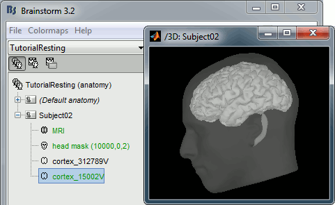
At the end of the process, make sure that the file "cortex_15000V" is selected (downsampled pial surface, that will be used for the source estimation). If it is not, double-click on it to select it as the default cortex surface.
Access the recordings
Resting state recordings: 10min
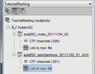
- The sample_resting download contains two 10 minute resting state runs. We are going to use the first one (run 01).
- Switch to the "functional data" view, the middle button in the toolbar above the database explorer.
Right click on the Subject02 > Review raw file > Pick the file:
sample_resting/Data/subj002_spontaneous_20111102_01_AUX.dsRefine registration now? YES
Empty room recordings: 90s
- We are also going to link to the database 20 seconds of empty room measurements that were acquired before the subject entered the MEG room. During the source estimation process, we will use this file to estimate the noise related with the MEG sensors.
Right click on the Subject02 > Review raw file > Pick the file:
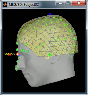
sample_resting/Data/subj002_noise_20111104_02.dsIgnore the misplaced MEG helmet you see after the file is link to the database. These are noise measurements, with no subject in the MEG, so there is no head position in this file. We are not going to use the sensor positions from this file.
Important note: From now on, all the pre-processing steps that re-write new continuous files (bandpass filter, notch filter) applied to the resting state MEG recordings should be applied as well to the noise recordings. We will calculate the noise covariance from the noise recordings and then use them to whiten the resting state recordings to estimate the sources. For this operation to be valid, the two datasets must be processed exactly in the same way. The SSP are not a problem as they are applied dynamically to the noise covariance when estimating the sources.
Pre-processing
All data should be pre-processed and checked for artifacts prior to doing analyses such as PAC (including marking bad segments and correcting for artifacts). For the purposes of this tutorial, we will correct for blinks and heartbeats with SSPs but will not go through marking out bad sections. When using your own data reviewing the raw data for bad segments and using clean data is of the utmost importance.
Bad segments
Some noisy segments have been marked manually. We are going to import these segments now:
- Double-click on the "Link to raw file" to display the resting state MEG recordings.
In the Record tab, select the menu File > Add events from file
Select the file format: Brainstorm (events*.mat)
Pick the file: Data/subj002_spontaneous_20111102_01_AUX.ds/events_BAD.mat
- This will load 26 bad segments, which will be ignored from most of the upcoming computations.
Heartbeats and eye blinks
Signal Space Projection (SSP) is a method for projecting the recordings away from stereotyped artifacts, such as eye blinks and heartbeats.
- Double-click on the "Link to raw file" to display the resting state MEG recordings.
- From the SSP menu in the Record tab, run the automatic detection of the blinks and the heartbeats:
Detect heartbeats: select channel EEG057 (ECG channel), event name "cardiac".
Detect eye blinks: select channel EEG058 (EOG channel), event name "blink".
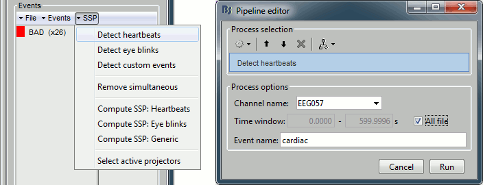
Review the MISC channels and make sure the events detected make sense.
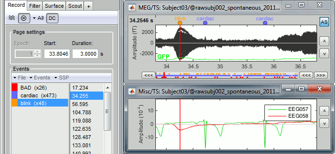
- From the same SSP menu, run the following processes:
Remove simultaneous: Remove events "cardiac" that are less than 250ms from a "blink"
Compute SSP: Heartbeats: Enter event name "cardiac", sensor types="MEG".
Compute SSP: Eyeblinks: Enter event name "blink", sensor types="MEG".
Here you can UNCHECK the option "Computing using existing SSP", it gives better results.
The first component of each category should be automatically selected. Leave the default selection as it is but make sure that the corresponding topographies are really representative of blinks and heartbeats.

For more information regarding this SSP method, refer to this tutorial: ?Detect and remove artifacts.
Power line contamination
- PAC analysis involves examining a wide band of frequencies, often the entire range of 2-150Hz or more. This band contains the frequencies contaminated by line noise, of either 50 or 60Hz and their harmonics. Brainstorm offers tools to remove line noise from functional data and it is most of the time a recommended pre-processing step. However, here we will not run the notch filter for time efficiency and because it is not required for accurate PAC analysis.
- The PAC function looks for high frequencies occurring specifically at certain phases of low signals such that the ubiquitous nature of line contamination effectively cancels it out for being identified as PAC. Similarly, running the notch filter results in no 60Hz anywhere, such that the function also identifies no PAC.
Source estimation
We need now to calculate a source model for the resting state recordings, using a noise covariance matrix calculated from the noise recordings.
Head model
Right-click on the recordings node ("spontaneous") > Compute head model.
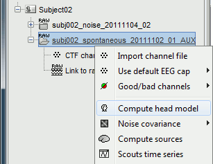
Use the overlapping spheres model and keep all of the options at their default values.
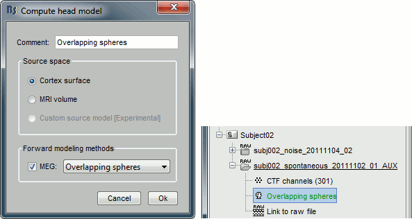
For more information: ?Head model tutorial.
Noise covariance
Right-click on the noise recordings > Noise covariance > Compute from recordings.
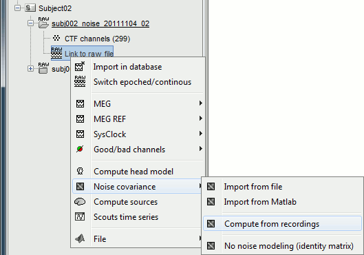
- Leave all the default options and click [OK].
Right-click on the noise covariance file > Copy to other conditions.
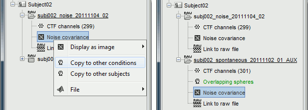
For more information: ?Noise covariance tutorial.
Inverse model
Right-click on the "Link to raw file" > Compute sources.
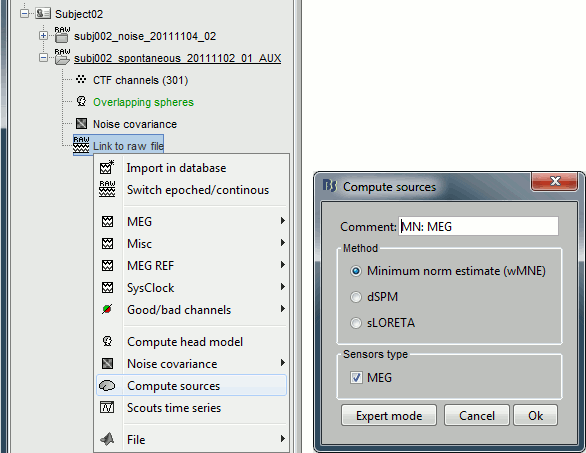
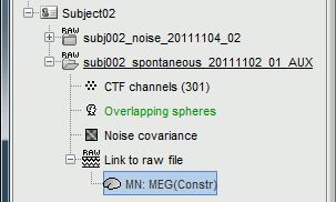
The inverse kernel is saved in a new file in the database.
For more information: ?Source estimation tutorial.
Scouts
Double-click on the source file and review it briefly with the keyboard shortcut indicated for the [>>] button in the time panel, just to get a sense of what these continuous resting state recordings look like.
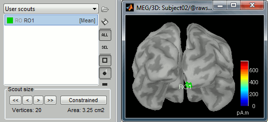
Create a scout "RO1" with 20 vertices at the pole of the right occipital lobe.
Phase-amplitude coupling
We are now ready to run the PAC analysis on the source signals. This PAC function in Brainstorm is not time resolved, but will analyze the given time series for any stable occurrence of PAC over a time segment you give it. For more information about the PAC measure used here, please refer to the online tutorial
Phase-amplitude coupling.
PAC estimation
- Drag and drop the sources for the spontaneous recordings to the Process1 tab.
Select the process "Frequency > Phase-amplitude coupling"
Set the options as follows (400s-600s, all the sources of scout RO1):
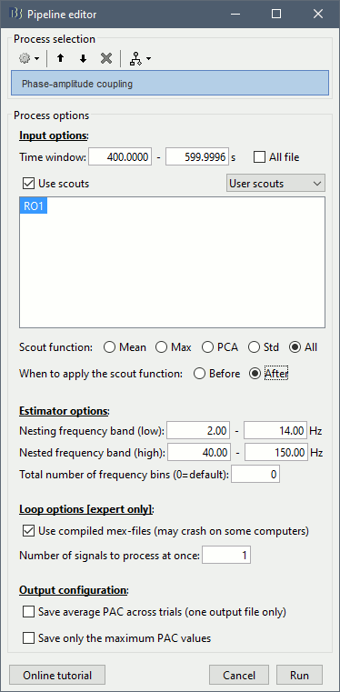
All the options are described in the PAC tutorial, except for the scout options:
- The input options allow you to select whether to process the full brain (15000 sources) or just a few scouts. Processing the full source maps might require a tremendous amount of memory and days of computation, so we recommend you run your analysis on a few small regions of interest. Select the "Use scouts" option, and select the scouts to process.
Scout function: Operation to apply to group the multiple vertices into one, or "All" to keep all the sources.
Before: Applies the scout function before the process, so that only the resulting scout time series is evaluated for PAC coupling. This is usually not a recommended option for more than a few sources, as the fine temporal dynamics are sometimes observable only on raw source signals and become less clear in averaged signals.
After: Applies the scout function after the process. First the full PAC comodulograms are calculated for all the individual sources within the scout, then these comodulograms are grouped together using the scout function. Only one resulting averaged PAC map is evaluated for maxPAC and/or saved in the database.
- In the case of the scout function "All", the before/after option is not relevant.
Note that you need at least 5Gb of memory to run this process. If the process is taking more than two minutes or if your computer becomes very slow or unresponsive, you might be going over your memory limits. At this point, you should monitor the memory usage on your computer using the task manager or the "ps" command from a terminal (google for help). If you notice that the total memory usage is reaching 99%, you should stop the computation and start over with a smaller time window (400s-500s) or a scout with fewer vertices (10).
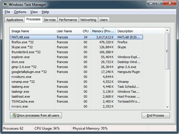
To stop a running Brainstorm process from Matlab: click on the Matlab command window and press CTRL+C. This will terminate the current script execution once the current process is over. If it doesn't stop after a short while, you may have to kill the Matlab process itself (using your task manager or the "kill" command from a terminal).
Visual exploration of the comodulogram
Double-click on the PAC file to display the comodulograms (X=freq for phase, Y=freq for amplitude).
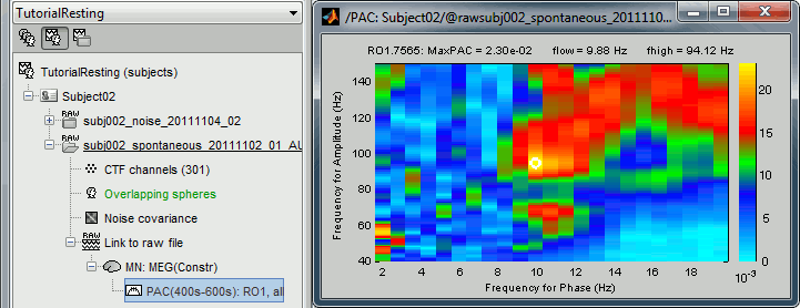
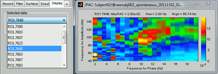
By default it shows the PAC map for the first signal only. This file contains one map for each of the 20 sources, because we selected the scout function "All" in the process options. To switch to a different source, use the drop-down menu in the Display tab, or the up and down arrows of your keyboard. The name of each map is "ScoutName.VertexIndex".
The spots with the yellow and red colors indicate the frequency pairs that show a higher coupling. Some sources seem to show some strong coupling patterns, some other don't. Isolated values are not necessarily meaningful, we are more looking for extended colored blobs that are observable across multiple frequency bins. Manipulating the colormap can help you identifying the coupling values of interest. Click on the colorbar and move the mouse left/right to adjust the contrast and up/down to adjust the brightness. Alternatively, right-click on the figure > Colormap: PAC > Contrast/Brightness. Double-click on the colorbar to reset its default configuration.
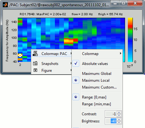
- A small white circle indicates the PAC pairing with the strongest coupling that was identified for the file (maxPAC). The values for this pairing are displayed on the top of the comodulogram:
MaxPAC: the strength of the coupling
flow: the low frequency (nesting)
fhigh: the high frequency (nested)
The maximum is not a very stable estimator and the identified maximal coupling does not necessarily represent the effect we are interested in. In some cases, we would not want to use the default maxPAC but some other low-frequency value that we identify visually. You can click on the figure to see the coupling frequencies and measure at other points: it shows a red circle and the PAC information at the bottom of the figure. This allows you to explore the values represented in the comodulogram.
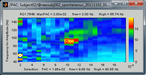
- As a general observation we notice that many sources seem to show a strong coupling around 10Hz/90Hz, others seem to show coupling around 12Hz/110Hz. Both could be relative to relation between the alpha rhythms and the high-frequency activity in the primary visual areas of the cortex (V1). However, it is difficult from this first computation to estimate whether these two observations are relative to the same brain process, or due to two different mechanisms.
Scout functions
- You can run again the same process but selecting a different way to process the region of interest. In the previous example, we have saved all the sources independently. Now, run again the same process but using the following scouts configurations:
Mean / Before: Calculate the PAC map for the average scout time series
Mean / After: Calculate the average of the PAC maps obtained for each source
Max / After: Extract the maximum value across the PAC maps calculated for each source
Note that to open again the pipeline editor with the same options on the same input files, you can use the menu File > Reload last pipeline. This is a faster way to run again the same process twice but changing just one parameter, this way you don't have to enter the time window again.
- Open all these files, and observe that there is now only one comodulogram saved per file, for the RO1 scout. The first one (before) shows only the most robust effects that are still present in the signal after the averaging of all the sources. The two others (after) show a combination of all the coupling effects that were identified individually for each source, the resulting maps are a lot noisier, with more intermediate values.
Comodulograms for RO1 scouts with the default colormap configuration:
1) mean/before, 2) mean/after, 3) max/after

After changing the brightness/contrast of the colormap:

After setting the same maximum for all the three views:

- All three maps seem to show stronger coupling between the range [9-13]Hz and [90-110]Hz. Averaging the values for the region of interest groups into one mode the two separate coupling ranges we were observing with the maps of the individual sources in the previous section (10/90Hz and 12/110Hz). We lose some resolution but probably extract more reproducible results. The purpose of this tutorial is not to discuss whether one result is more correct than the other, but rather to illustrate the tools available in Brainstorm to estimate the phase-amplitude coupling within brain signals.
- Double-click on the colorbar to reset it to its defaults.
Canolty maps
Introduction to the method
Canolty maps are a type of time-frequency decomposition that offer another way to visualize the data and serve as a complimentary tool to visualize and assess phase-amplitude coupling. The process lines up the data to a specific low frequency so as to visualize what happens in the power spectrum related to the phase of the low frequency. Currently there are no significance tests within Brainstorm that can give a measure if PAC is significant in a given time series, but the Canolty maps provide an important way to verify and corroborate the results of the PAC process. We name these maps after the author of the paper in which they were first introduced:
Canolty RT, Edwards E, Dalal SS, Soltani M, Nagarajan SS, Kirsch HE, Berger MS, Barbaro NM, Knight RT
High gamma power is phase-locked to theta oscillations in human neocortex
Science, 2006 Sep 15;313(5793):1626-8.
The procedure to obtain a Canolty map for a signal is the following:
- The signal of interest is filtered at the low frequency of interest using a narrow band-pass filter.
- The amplitude troughs of the low frequency are detected from the filtered signal.
- A small time window is extracted around each of these marked troughs.
- A time-frequency decomposition of these short epochs is performed using a collection of narrow band-pass filters.
- The power of all the TF maps is averaged to constitute the final Canolty map.
Computation
- Select the sources for the spontaneous recordings in the Process1 tab (same as previously).
Select the process "Frequency > Canolty maps", set the options following:
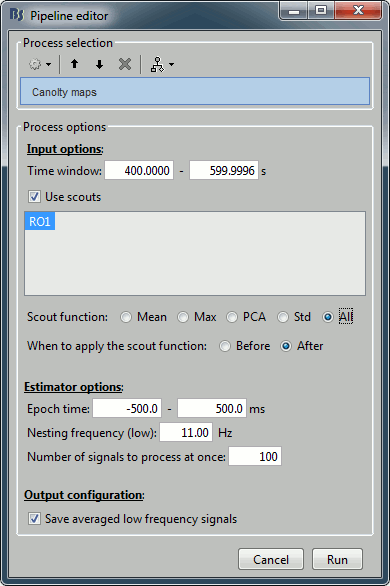
- Explanation of the options:
Time window: Create these maps for the segment [400s-600s] (same as before).
Scouts: Keep all the sources separately (before/after option is not relevant).
Epoch time: How much time we take around each trough of the low frequency amplitude.
Nesting frequency: Let's use 11Hz, which is in the middle of the band we identified in the previous section (9-13Hz).
Save average low frequency signal: Saves the average of the extracted epochs, obtained before the time-frequency decomposition. It will show the event-related signals, locked on the troughs of the low frequency.
- If you get out of memory errors, or if it takes too long to calculate, you can decrease the number of vertices in the scout.
Double-click on the file "Canolty maps": standard TF plot, for help read the ?time-frequency tutorial.

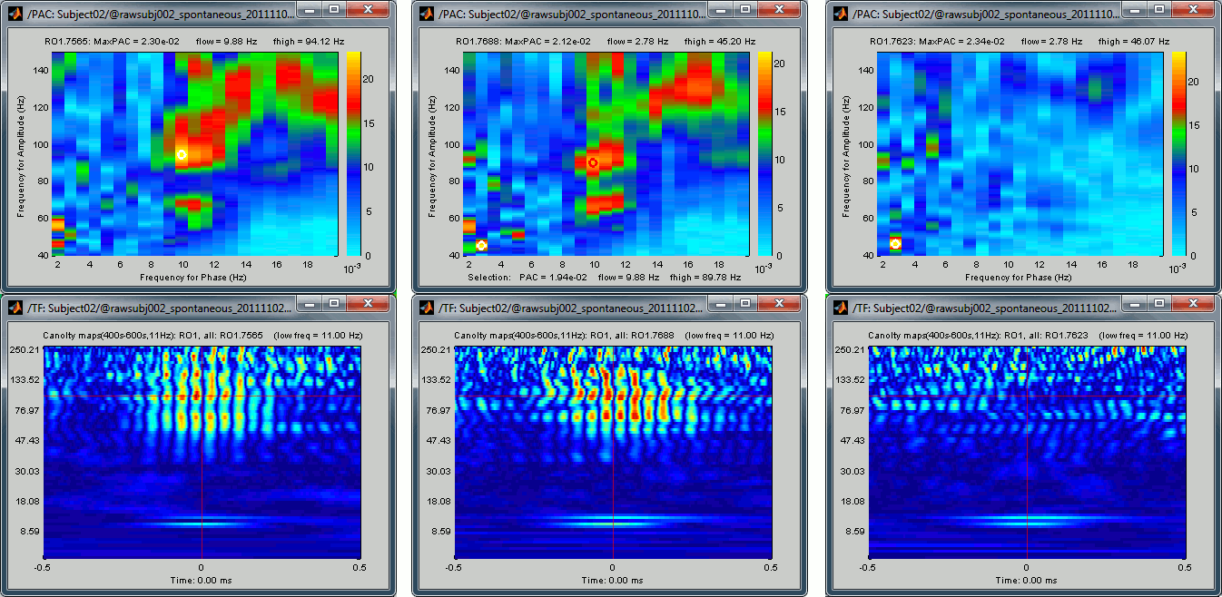
This representation shows whether the power of any high frequencies fluctuates systematically with the phase of the low frequency: basically, we can visualize PAC. If there is PAC present, we see quite stereotyped stripes of the power of certain high frequencies changing consistently with the phase of the low frequency. If there is no PAC there is no discernible pattern. The image above shows some strong coupling between the alpha oscillations (11Hz nesting frequency that we selected in the process options) and the gamma band (60-150Hz, with a peak around 95Hz).
Double-click on the file "Link to raw file | Canolty ERP": it contains the average of the source signals epoched at the trough of the nesting frequency. In the Canolty map itself there is no representation of the low frequency used, it can be useful to visualize the low frequency simultaneously. In this figure, one black line represents one source, you can click on one line to select it then right-click on it to see its name or index.
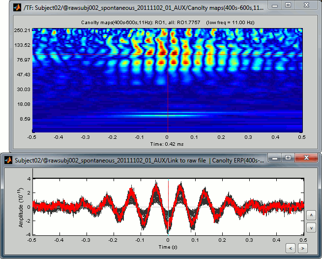
- By arranging the Canolty map and low frequency time series you can get a sense of how the low frequency oscillation and high frequency amplitude relate to each. The time selection on the two is synchronized, so try clicking at particular parts of the low frequency file and examining the power in the Canolty map. You should notice gamma amplitude is low at the peak and trough of the low frequency oscillation and high between them.
If you cycle through a few sources, you can see that some show a strong coupling and some others don't. If you open at the same time the PAC comodulogram, you can observe that the sources for which we had higher PAC values are also the ones for which with see a better evidence of the alpha-gamma coupling here. Here are a few examples, two good ones and a bad one:
Scout functions
- Similarly to what we've done with the PAC estimation, we can run again the same process but selecting a function to unify the region of interest:
Mean / Before: Calculate the Canolty map for the average scout time series
Mean / After: Calculate the average of the Canolty maps obtained for each source
Max / After: Extract the maximum value across the Canolty maps obtained for each source
Open the three files side by side:
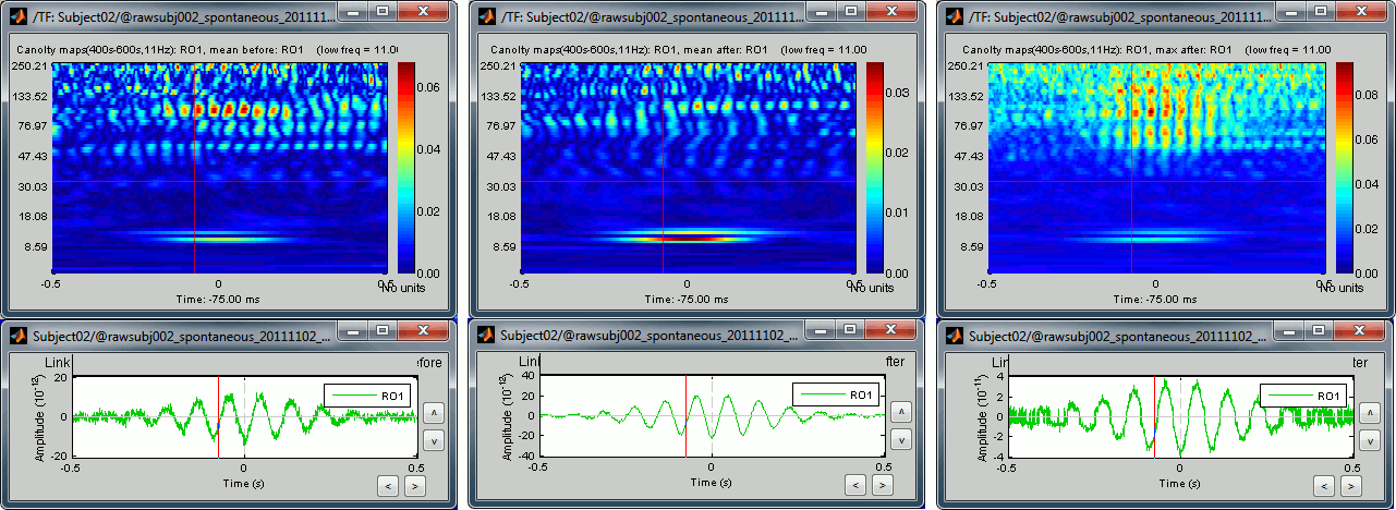
- Same conclusion as with the PAC maps: we get weaker effects if we group multiple sources together, but on the other hand we can extract one meaningful statistic that gets rid of some possibly meaningless variability. With these views, we can restrict our band of interest for the high frequencies to 90-105Hz (instead of 60-150Hz).
Other frequencies
We have calculated Canolty maps for 20 occipital sources, based on a low frequency that was showing strong phase-amplitude coupling with higher frequencies. To illustrate the link between the PAC values and the Canolty maps, let's now take a low-frequency that shows only low values of PAC. We can try 7.5Hz because this frequency bin is showing very little coupling in all the PAC maps we calculated previously.
Run again the same process "Frequency > Canolty maps" for this different low frequency:
Time window: 400s-600s
Scout function: All
Nesting frequency: 7.5Hz
None of the sources in the scout RO1 show any of the clear patterns we observed previously:

Two inputs
- In the previous example, we have identified visually the optimal low frequency on the PAC comodulograms, and we have entered this value manually in the options of the "Canolty map" process. This methodology is probably the best way to proceed when exploring manually some specific brain regions, but it will not be adapted to process a large number of signals. In the case of a full brain analysis, we cannot reproduce the same steps individually for the 15000 sources.
To automate this, a version of the "Canolty maps" process exists in another flavor, with two inputs. The second input must contains the result of a maxPAC analysis for the file to process. Drop a file of time series into File A and the corresponding maxPAC file into File B.

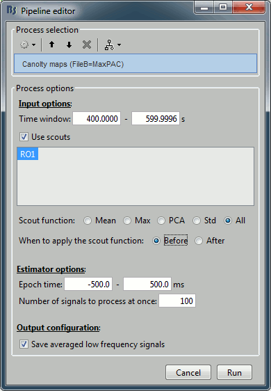
- The only difference in the process options is that there is no edit box for the low frequency. The low-frequency is directly read for each signal from the PAC file (values in the TF field).
- At the current moment, the problem with this approach is that the metric used for estimating the maxPAC is not very stable. It just takes the frequency pair that gives the maximum PAC value, and as we saw earlier in this tutorial, it is most of the time not matching the frequency we are really interested in. This automated version of the low-frequency detection is not recommended for now, but we are currently working on implementing more stable metrics. We will post the updates on these developments on this tutorial page.
Scripting
The following script from the Brainstorm distribution reproduces the analysis presented in this tutorial page: brainstorm3/toolbox/script/tutorial_resting.m
