|
Size: 19235
Comment:
|
Size: 31778
Comment:
|
| Deletions are marked like this. | Additions are marked like this. |
| Line 1: | Line 1: |
| = Tutorial: Explore the recordings = This tutorial is based on the ''TutorialCTF'' protocol, and will show you how to explore efficiently the sensory response to an electric stimulation of the fingers. The two previous tutorials explain how to create this tutorial and describe the data that are used in it. <<TableOfContents(2)>> == Display modes == Several display modes are available for recordings. They are all accessible with a right-click.The first three menus (MEG, Stimulation input, Video Time), represent all the different types of channels that were found in the channel file. You can check that with Channel Edit (right-click on channel file > Edit). {{attachment:treePopupRecordings.gif||height="291",width="401"}} <<BR>>Now repeat this operation several times to display all the available modes: ''Display time series, 3D sensor cap, 2D sensor cap, 2D disc'' and ''2D Layout''. You should now see all the following figures. Keep them opened for the next few paragraphs, we will learn how to manipulate multiple views of the same data. * '''Display time series''': values over the time for all the sensors<<BR>>Zoom with mouse wheel, move with left+right or middle mouse click+move<<BR>><<BR>> {{attachment:dataTimeSeries.gif}} * '''3D sensor cap, ''''''2D sensor cap, 2D disc''': The recordings at a given time instant and interpolated over a 2D or 3D surface <<BR>>2D figures: Zoom with mouse wheel, move with left+right or middle mouse click+move<<BR>>3D figures: regular mouse operations as introduced in previous tutorials. <<BR>><<BR>> {{attachment:data3Dcap.gif}} {{attachment:data2Dcap.gif}} {{attachment:data2Ddisc.gif}} * '''2D layout''': The time course of each channel is drown at the actual position of the electrode, projected in 2D the same way as ''2D sensor ''<<BR>>Zoom with mouse wheel, move with left-click+move. ''cap'' <<BR>><<BR>> {{attachment:data2Dlayout.gif}} |
= Tutorial 5: Exploring the recordings = This tutorial is based on the ''TutorialCTF'' protocol, and will show you how to explore efficiently the sensory response to an electric stimulation of the fingers. <<TableOfContents(2,2)>> == Display recordings == Several display modes are available for recordings. They are all accessible with a right-click.The first four menus (MEG, MEG REF, Stim, Video), represent all the different types of channels that were found in the channel file. You can check that with Channel Edit (right-click on channel file > Edit). We are only interested in the "MEG" in this tutorial. Select Left / ERF > MEG > Display time series. {{attachment:treePopupRecordings.gif}} <<BR>>Now repeat this operation several times to display all the available modes: ''Display time series, 3D sensor cap, 2D sensor cap, 2D disc'' and ''2D Layout''. You should now see all the figures displayed below. Keep them opened for the next few paragraphs, you will learn how to manipulate multiple views of the same data. === Display time series === Amplitude fluctuations over time for all the sensors.<<BR>>List of mouse and keyboard operations for this type of figure (most of the operations are detailed later): * '''Mouse wheel''': Zoom horizontal * '''CTRL+mouse wheel''': Zoom vertical * '''Right click + move''': Move in zoomed figure * '''Left click + move''': Time selection * '''Left-click / Shift+Click''': Set current time * '''Left-click on a line''': Select the corresponding sensor * '''Right-click''': Popup menu * '''Double-click''': Restore initial view (ie. unzoom) * '''Keyboard arrows''': Change current time * '''!PageUp / !PageDown''': Change current time (10 samples at a time) * __Notes for Mac users__: * All the actions involving the mouse wheel can be performed on !MacBook laptops by moving up and down two fingers on the pad. * "!PageUp" or "!PageDown" keys are obtained by pressing the "Fn" key together with the arrows UP or DOWN {{attachment:dataTimeSeries.gif}} === 3D Sensor cap / 2D Sensor cap / 2D Disc === The recordings at a given time instant and interpolated over a 2D or 3D surface. * '''Mouse wheel''': Zoom / unzoom * '''Left click + move''': Rotate (3D only) * '''Middle click + move''': Or left+right click + move: Move in zoomed figure * '''Right click + move''': Select sensors (2D only, when sensors are visible, see below) * '''Right click''': Popup menu * '''Left click on the colorbar + move''': Change contrast (up/down) and brightness (left/right) * '''Control + E''': Display the channels markers and/or names * '''Keyboard arrows''': Change current time * '''!PageUp / !PageDown''': Change current time (10 samples at a time) / Mac: Fn+UP/Fn+Down {{attachment:data3Dcap.gif||height="175px",width="204px"}} {{attachment:data2Dcap.gif||height="174px",width="203px"}} {{attachment:data2Ddisc.gif||height="173px",width="201px"}} === 2D layout === The time course of each channel is drawn at the actual position of the electrode, projected in 2D the same way as ''2D Sensor cap''. The light gray lines represent the zero amplitude (horizontal) and the current time (vertical lines). Only a part of the full time window is displayed for each channel, before and after the current time. The length of this time window can be modified either with the mouse shortcut Control+wheel, or with the 2D Layout options, in the figure popup menu. Other options are also available in the popup menu. * '''Mouse wheel''': Zoom / unzoom * '''Middle click + move''': (or left+right click + move) Move into the zoomed figure * '''Shift + mouse wheel''': Increase/decrease the amplitude gain of the channels * '''Control + mouse wheel''': Increase/decrease the length of the time window around the current time * '''Click on a line''': Select a sensor * '''Right click + move''': Select a group of sensors * '''Shift + click on a line''': Select one sensor and unselect all the others<<BR>>Display the time-frequency decomposition for the selected sensor, when available * '''Right-click''': Display popup menu. <<BR>>Sub-menu "2DLayout options" offer some configuration options for this type of figure. * '''Control + E''': Display/hide the channels names * '''Keyboard arrows''': Change current time * '''!PageUp / !PageDown''': Change current time (10 samples at a time) / Mac: Fn+UP/Fn+Down {{attachment:data2Dlayout.gif}} {{attachment:data2DlayoutWhite.gif}} {{attachment:data2DlayoutMenu.gif}} === Magnetic interpolation === Some of the views (3D Sensor cap / 2D Sensor cap / 2D Disc), are by default re-interpolating the field that is recorded by the sensors to get much smoother displays. A simple inverse problem + forward problem are solved to reconstruct the magnetic fields on a high-resolution surface. The menu '''"No magnetic interpolation"''' offer the same views, but without using this recontruction of the magnetic field, and performing instead a spatial interpolation of the values between the sensors. {{attachment:data3DcapRaw.gif|data3Dcap.gif|height="175px",width="204px"}} {{attachment:data2DcapRaw.gif|data2Dcap.gif|height="174px",width="203px"}} {{attachment:data2DdiscRaw.gif|data2Ddisc.gif|height="173px",width="201px"}} === Important note === If you are experiencing any kind of graphic bug, you should try to disable the OpenGL renderer. In Brainstorm main window, select menu File > Set preferences, and check the option "OpenGL: Disabled (no transparency)". All the 3D views would be very slow and with no transparency, but it may solve all the problems. This is more likely to happen on 64bit machines or when working on a remote system (X-server, !VirtualBox, Windows remote desktop connection...). You may also try keeping the OpenGL renderer but typing "opengl software" before you run Brainstorm. It would force Matlab to do a software OpenGL rendering instead of using the 3D hardware accelerations. The display would be similar to hardware OpenGL but much slower. |
| Line 19: | Line 108: |
| The time window and the current time instant are centralized and managed by the ''Time window'' panel in Brainstorm window. You can use the text boxes and the slider to set the time bounds or to change the current time value. All the figures always stay synchronized, you cannot display the 2D disc topography at t=10ms and the 3D sensor cap topography at t=50ms at once. It might look too strict at the beginning, but the contrary would have made the interface much too complex; we wanted to keep it as simple as possible. | The time window and the current time instant are centralized and managed from the top of the Brainstorm window. You can use the text box or the buttons to change the current time value. All the figures always stay synchronized, you cannot display the 2D disc topography at t=10ms and the 3D sensor cap topography at t=50ms at the same time. It might look too restrictive at the beginning, but the contrary would have made the interface much too complex; we wanted to keep it as simple and intuitive as possible. |
| Line 23: | Line 112: |
| The time is not the best way to browse your data. There are many other shortcuts that are much more intuitive to navigate through the time. * '''Click on ''''''time series'''''' figure''':<<BR>>Left-click in any white area of the figure and it will move the time cursor at this point, and update all the other figure to match this new value. Don't click on a black line, it would select the corresponding channel instead of moving the time cursor. * '''Press the keyboard arrows''': <<BR>>Click on any data figure and try to press several time the left and right arrows, and also the ''!PageUp ''and ''!PageDown ''keys. This feature is really useful when you want to quickly see how the recordings are changing in the time. It might be a bit slow because you have many figures to refresh at each time change. It should be much faster if you have only one topography window. To remember: An efficient and quick way to review your recordings just after importation is to: |
The time window panel is not the best way to expore your recordings. There are many other shortcuts that are much faster to navigate through the time. * '''Click on ''''''time series'''''' figure''':<<BR>>Left-click in any white area of the figure: it will move the time cursor at this point and update all the other figures to match this new value. Don't click on a black line, it would select the corresponding channel instead of moving the time cursor. * '''Press the keyboard arrows''': <<BR>>Click on any data figure and try to press several time the left and right arrows, and also the ''!PageUp ''and ''!PageDown ''keys. This feature is really useful when you want to quickly see how the recordings are changing in time. Try holding the arrow keys for a while. It might be a bit slow because you have many figures to refresh at each time change. It is much faster if you have only one 2D figure to refresh. '''To remember''': An efficient and quick way to review your recordings just after importation is to: |
| Line 33: | Line 123: |
| 1. Use the left/right arrows, and !PageUp/PageDown keys | 1. Use the left/right arrows, and !PageUp/PageDown keys (or Fn+Up / Fn+Down on a Mac) |
| Line 38: | Line 129: |
| 1. Now close all the figures except the ''Time series'' and the ''2D Sensor cap'' topography (if you don't remember which one it was, close everything and open again these two figures following the 4 steps in previous section). 1. On 2D Disc figure: right-click anywhere on the window ''> Channels > Display sensors''. You'll see white dots representing the center of each MEG coil. Note that there is keyboard shortcut indicated for this menu: ''Ctrl + E''. |
1. Now close all the figures except the ''Time series'' and the ''2D Sensor cap'' topography (if you don't remember which one it was, close everything and open again these two figures). 1. On ''2D Sensor cap'' figure: right-click anywhere on the window ''> Channels > Display sensors''. You'll see white dots representing the center of each MEG coil. Note that there is keyboard shortcut indicated for this menu: ''Ctrl + E''. |
| Line 41: | Line 134: |
| Line 42: | Line 136: |
| * They turn red and the corresponding lines in the time series window also turn red. * Left-click on the lines in the time series window: it also selects the sensors. * Right-click on a red line in time series figure: you'll have the name and indice of the selected channel. |
* They turn red and the corresponding lines in the time series window also turn red * Left-click on the lines in the time series window: it also selects the sensors * Right-click on a red line in time series figure: shows the name and index of the selected channel |
| Line 46: | Line 140: |
| * To deselect all the sensors at once, press ''Escape ''key, or ''right-click > Channels > Reset selection'' 1. Now select three sensors.<<BR>><<BR>> {{attachment:channelSelection.gif}} 1. Right-click > Channels > View selected (Shortcut = enter). A new window is created, with only those three sensors, whose names are indicated in a legend box (you can move this legend if needed).<<BR>><<BR>> {{attachment:channelPopupMenu.gif}} {{attachment:channelViewSelected.gif}} |
* To deselect all the sensors, press ''Escape'' or ''right-click > Channels > Reset selection'' 1. Now select randomly three sensors.<<BR>><<BR>> {{attachment:channelSelection.gif||height="174px",width="545px"}} 1. Right-click > Channels > View selected (Shortcut = Enter key). A new window is created, with only those three sensors, whose names are indicated in a legend box (you can move this legend if needed).<<BR>><<BR>> {{attachment:channelPopupMenu.gif||height="143px",width="327px"}} {{attachment:channelViewSelected.gif||height="121px",width="295px"}} 1. Close that last figure. In the 2D topography figure, right-click and move the mouse to select a group of sensors, just to remember that this feature exists.<<BR>><<BR>> {{attachment:channelGroupSelection.gif}} == Time series in columns == There are two display modes for the time series. Open a time series figure. To switch from the current mode to the "column" mode, click on {{attachment:buttonTsCol.gif}} in the toolbar. * You will first see a completely useless figure like the following one: <<BR>><<BR>> {{attachment:tsColumn.gif}} * This requires a little configuration: you need to select a subset of the channels and/or to increase the gain of the channels. * Start by maximizing the size of the figure * '''Channel gain''': You can increase/decrease the amplitude of the traces in different ways: * Click on the up/down buttons on the right of the window * Click on the "..." button on the right of the window to set manually the gain value for each vertical unit in the graph (distance between two horizontal lines). * Press the "+" or "-" keys on your keyboard * Hold the SHIFT key down, and use the mouse wheel to zoom/unzoom * '''Vertical zoom''': Hold the CTRL key down, and use the mouse wheel to zoom in or out. * '''Horizontal zoom''': * Click on the "<" and ">" buttons at the bottom of the window * Use the mouse wheel to zoom in or out. * '''Move in the zoomed figure''': Hold down left and right buttons of the mouse, and move the mouse. * You can reach some display results that are already a little more interesting:<<BR>><<BR>> {{attachment:tsColumnZoom.gif}} * '''Reset initial view''': Double-click * '''Channels selections''': you can create and save subsets of channels, or used pre-defined sets. Right-click on the figure > Display setup > ... Try several predefined sets (ex. CTF LF = Group of left frontal sensors). You may need to decrease again the gain of the channels (use SHIFT+Mouse wheel)<<BR>><<BR>> {{attachment:selectionsMenu.gif}} * Note the keyboard shortcuts: '''SHIFT+letter'''. It makes it really easy to switch from a group of sensors to another (ex: Shift+A = all sensors, Shift+B = Left-frontal, Shift+C=Right-frontal...) * To edit/create your own selections, Right-click on the figure > Display setup > Edit selections... Click on the first button to create a new selection Test1, select a few channels in the list.<<BR>> {{attachment:selections.gif}} * Click on Save. Back to the time series figure. Look in the popup menu again, you can see your new selection in the menu: Test1. You can now use the time series view with those pre-defined selections of sensors. == Time selection == Go back to the previous view mode ("butterfly view"). Left-click somewhere on the white part of the time series figure, hold the mouse button, and drag your mouse left or right: A transparent blue rectangle appears to represent the time selection. * Now right-click on the figure to see the functions you can apply on this time window. The selected time window and its duration are shown at the bottom of the figure.<<BR>><<BR>> {{attachment:timeSelection.gif}} * '''Set current time''': Just sets the time cursor when the right-click ocured. The shortcut Shift+Click can be useful when trying to move in time on dense displays in columns view. * '''Set selection manually''': Select a time window by giving the bounds in ms. * '''Average over time''': Average over the selected time window, saved as a new file in the database. * '''Export to database''': Extract the recordings and save them in a new file in database. * If some sensors are selected, only their values are extracted, all the others are set to zero. * '''Export to file''': Same, but in a user-defined file (not in the database) * '''Export to Matlab''': Same, but export as a Matlab variable in the current workspace. |
| Line 53: | Line 201: |
| If you find out that a sensor has unexpected values, that are not coherent with the other surrounding sensors, you can choose to ignore it in the displays and in the source estimation process. In the channel file, each channel has a flag which indicates if is good or bad. You may also import recordings files that already have some bad channels defined. * '''Mark channels as bad''':<<BR>>You should still have three sensors selected in both figures. Right-click > ''Channels > Set selected as bad'', or press ''Delete ''key. The sensors should disappear in all figures, and the topography view (2D sensors cap) is updated so that the interpolation now ignores the bad channels.<<BR>><<BR>> {{attachment:channelSetBad.gif}} |
If you find out that a sensor has unexpected values, that are not coherent with the other surrounding sensors, you can choose to ignore it in the displays and in the source estimation process. In the channel file, each channel has a flag which indicates if it is good or bad. You may also import recordings files that already have some bad channels defined. * Select a few channels with one of the method described above: click on the time series, click on the sensors dots, right-click and move to select a group of sensors. Then right-click in one of the figures and check out the '''Channels''' sub-menu:<<BR>><<BR>> {{attachment:channelMenu.gif}} * '''View selected''': Show the time series of the selected sensors * '''Mark selected as bad''': Remove sensors from the display and all the further computations * '''Mark non-selected as bad''': Keep only the selected channels * '''Reset selection''': Un-select all the selected sensors * '''Mark all channels as good''': Brings back all the channels to display * '''Edit good/bad channels''': Opens an interface that looks like the channel editor, but with one extra column to edit the status (good or bad) of each channel. * '''Mark channels as bad''':<<BR>>Right-click > ''Channels > Mark selected as bad'', or press ''Delete ''key. The sensors should disappear in all figures, and the topography view (2D sensors cap) is updated so that the interpolation on the 2D surface now ignores the bad channels.<<BR>><<BR>> {{attachment:channelSetBad.gif}} |
| Line 58: | Line 220: |
| Line 59: | Line 222: |
| Line 61: | Line 225: |
| Line 62: | Line 227: |
| * You will find a "Channels" menu you right-click on any node in the tree that contains recordings. * If you select on the of the item in this menu, the operation will be applied recursively to all the recordings contained in the node. This way, you can quickly set that the channel 63 is always bad, or that electrode 43 is not working for subject #12, without having to visualize all the recordings one after the other. * The'' View all bad channels'' command displays the list of all the bad channels in all the files in the ''Messages ''tab, in main Brainstorm window. <<BR>><<BR>> {{attachment:channelTreePopup.gif||height="309",width="376"}} |
* You will find a "Channels" menu for any node in the tree that contains recordings. * If you do this on the level of a node, the operation will be applied recursively to all the recordings contained in the node. This way, you can quickly set that the channel 63 is always bad, or that electrode 43 is not working for subject #12, without having to visualize all the recordings one after the other. * The'' View all bad channels'' command displays the list of all the bad channels in all the files in the ''Messages ''tab, in main Brainstorm window. <<BR>><<BR>> {{attachment:channelTreePopup.gif}} |
| Line 67: | Line 232: |
| * The good/bad channel flags are stored in the recordings files, not in the channel files. So if you marked some channels as ''bad ''in the ''ERP ''data file, there are still considered as ''good ''in the ''Std ''data file. | * The good/bad channel flags are stored in the recordings files, not in the channel files. So if you marked some channels as ''bad ''in the ''ERF ''data file, there are still considered as ''good ''in the ''Std ''data file. |
| Line 70: | Line 235: |
| We will now describe how to manipulated the colormap in the topography windows. Open a ''2D sensor cap'' view, and play with colors. * Brainstorm keeps track of four user-defined colormaps: Anatomy, Recordings, Sources and Stat. You can go to the Colormaps menu in the Brainstorm main window to see this list. Usually, you will use only popup menus on figures to edit the colormaps. * If you modify a colormap, the changes will be saved in your user preferences and available the next time you start Brainstorm. * For the moment, you are going to play only with Recordings colormap, but the other work exactly the same way. |
We will now describe how to manipulate the colormap in the topography windows. Open a ''2D sensor cap'' view, and play with colors. * Brainstorm keeps track of many user-defined colormaps: anatomy, EEG, MEG, sources, stat, time, time-frequency, etc. You can go to the Colormaps menu in the main window to see this list. Usually, you will use only popup menus from specific figures to edit the colormaps. * If you modify a colormap, the changes will be applied to all the figures and saved in your user preferences and available the next time you start Brainstorm. * You are going to play only with the MEG colormap, but the others work exactly the same way. |
| Line 76: | Line 241: |
| Line 77: | Line 243: |
| * '''Absolute values''': Displays the absolute values of the recordings, instead of the original values. * This is the default for ''Anatomy, Sources'' and ''Stat ''colormaps, but it is not very useful for recordings: for for EEG and MEG, the sign of the values is very important. <<BR>><<BR>> {{attachment:colormapDefault.gif}} {{attachment:colormapAbsolute.gif}} <<BR>>''__Fig.1__: Relative values; __Fig.2__: Absolute values '' * '''Normalized for each time frame''': * If not selected: The bounds of the colormap are set to the maximum value across the whole time window. Eg. if you use the ''rbw'' colormap and the min and max values are [-80ft, +130ft], the colors will be mapped in the following way: -130ft is blue, +130ft is red, 0ft is white. And it will be like this wherever, for each time sample. * If selected: It uses the local min and max values at the current time frame, instead of the global min and max. Eg. at t=0ms, the extrema values are roughly [-17ft, +17ft]. So the colors will be mapped in order to have: -17ft = blue, and +17 = red.<<BR>>If you uncheck this option and go to t=0ms, the 2D topography figure will turn almost white.<<BR>><<BR>> {{attachment:colormapDefault.gif}} {{attachment:colormapNotNormalized.gif}} <<BR>>''__Fig.1__: Local maximum (normalized); __Fig.2__: Global maximum (not normalized) '' * You can usually keep this ''Normalized ''option when looking at recordings, it makes things nicer. But keep in mind that it is not because you see flashy colors that you have a strong effects. It's always a matter of colormap configuration. * '''Set colorbar max value''': disable when ''Normalized ''option is selected, because it wouldn't have any effect. This menu allows you to fix the maximum bounds of the colormap, instead of using the automatic ones. |
* '''Absolute values''': Display the absolute values of the recordings, instead of the original values. * This is the default for ''Anatomy, Sources'' and ''Stat ''colormaps, but it is not very useful for recordings: for EEG and MEG, the sign of the values is very important. <<BR>><<BR>> {{attachment:colormapDefault.gif}} {{attachment:colormapAbsolute.gif}} <<BR>>''__Fig.1__: Relative values; __Fig.2__: Absolute values '' * '''Normalize for each display''': * If not selected: The bounds of the colormap are set to the maximum value across the whole time window. Eg. if you use the ''rbw'' colormap and the min and max values are [-80ft, +130ft], the colors will be mapped in the following way: -130ft is blue, +130ft is red, 0ft is white. And it will be like this for each time sample. * If selected: It uses the local min and max values at the current time frame AND for each figure, instead of the global min and max. Eg. at t=0ms, the extrema values are roughly [-17ft, +17ft]. So the colors will be mapped in order to have: -17ft = blue, and +17 = red.<<BR>>If you uncheck this option and go to t=0ms, the 2D topography figure will turn almost white.<<BR>><<BR>> {{attachment:colormapDefault.gif}} {{attachment:colormapNotNormalized.gif}} <<BR>>''__Fig.1__: Local maximum (normalized); __Fig.2__: Global maximum (not normalized) '' * You can usually keep this ''Normalized ''option when looking at recordings, it makes things nicer. But keep in mind that it is not because you see flashy colors that you have strong effects. It's always a matter of colormap configuration. * '''Set colorbar max value''': disabled when the ''Normalize ''option is selected, because it wouldn't have any effect. This menu allows you to fix the maximum bounds of the colormap, instead of using the automatic ones. |
| Line 86: | Line 257: |
| Line 88: | Line 260: |
| Line 91: | Line 264: |
| * The words brightness/contrast may not be adapted for colormaps such as ''rbw, jet'' or ''hsv;'' but try selecting the ''grey ''colormap, it suddenly makes more sense. * On some combinations of Matlab version / operating systems, those sliders may not work (it depends on the embedded Java virtual machine version). * You can also modify those values by clicking directly on the color bar in the figures. Hold the mouse button, and move up/down to change the brightness and left/right to change the contrast. Even if the sliders do not work, you can modify the colormaps. |
* The words brightness/contrast may not be adapted for colormaps such as ''rbw, jet'' or ''hsv. ''It makes more sense for colormaps with only one tint that varies in intensity, such as the ''grey'' colormap. * On some combinations of Matlab version / operating systems, those sliders may not work (it depends on the version of the embedded Java Virtual Machine). * You can also modify those values by '''clicking directly on the color bar''' in the figures. Hold the mouse button, and move up/down to change the brightness and left/right to change the contrast. Even if the sliders do not work, you can modify the colormaps. |
| Line 95: | Line 271: |
* '''Permanent menu''': Open a window that displays this colormap sub-menu. Might be useful when you do a lot of colormap adjustments. |
|
| Line 96: | Line 275: |
== Manipulating multiple windows == One the interesting points in Brainstorm interface is that you can display easily different conditions or different subjects at the same time. If you want to open at the same time many subjects in many different experimental conditions, you will quickly have a lot of small windows everywhere. The buttons on the right part of the toolbar in the main Brainstorm window may help to organize them. From left to right:<<BR>><<BR>> {{attachment:toolbarWindows.gif}} * '''Tiled layout''': If checked, the figures are reorganized automatically each time their number change. 1. Uncheck this button. 1. Double-click succively on ''!StimRightThumb / ERP'' and ''!StimLeftThumb / ERP'' to open them. The two figures appear at the same place exactly, in the middle of the screen. This is the default Matlab positionning. 1. Now selected again this toggle button, the two figures will be re-arranged.<<BR>><<BR>> {{attachment:figuresNotTiled.gif}} --- {{attachment:figuresTiled.gif}} 1. Unchecking this option can be useful if the auto-arrangement does work well on your Linux system for some reason, or if you want to organize your windows by yourself. * '''Uniformize time series scales''': If checked, all the time series figures with similar units have the same y-axis scale, so that you can compare visually the amplitudes between two datasets. 1. Keep the two figures you've just opened, and click on this button several times. 1. You'll see that the scale of the amplitude axis will change in the ''!StimRightThumb ''window, and fit alternatively its own maximum or the ''!StimLeftThumb ''one.<<BR>><<BR>>Uniformize on:<<BR>> {{attachment:figuresUniform.gif}} <<BR>><<BR>>Uniformize off:<<BR>> {{attachment:figuresNotUniform.gif}} * '''Show all figures''': If you many figures and they are all hidden because of some othe fullscreen window (Matlab to run Brainstorm, Firefox to read this tutorial, etc.), you don't have click on all of them in the taskbar to get them back. Just make the Brainstorm window visible and click on this button, and it will show all the data figures. |
* You can also reset the colormap by '''double-clicking on the color bar'''. == Toolbar / Manipulating multiple windows == One of the interesting points in Brainstorm interface is that you can display easily different conditions or different subjects at the same time. If you want to open at the same time many subjects in many different experimental conditions, you will quickly have a lot of small windows everywhere. The buttons on the right part of the toolbar in the main Brainstorm window may help organize them. From left to right: {{attachment:toolbarWindows.gif}} * '''Display mode for time series''': Already introduced in this tutorial. * '''Average reference''': If checked, displays the average reference of EEG time series instead of the real values: at each time instant, substract the average of all the channels. For EEG only... * '''Uniform amplitude scales''': If checked, all the time series figures with similar units have the same y-axis scale, so that you can compare visually the amplitudes between two datasets. 1. Double-click on ''Left / ERF'' and ''Right / ERF'', and click on this button several times. 1. You'll see that the scale of the amplitude axis will change in the ''Right ''window, and fit alternatively its own maximum or the ''Left ''one.<<BR>><<BR>>Uniform amplitude on:<<BR>> {{attachment:figuresUniform.gif}} <<BR>><<BR>>Uniform amplitude off:<<BR>> {{attachment:figuresNotUniform.gif}} * '''Layout options''': Defines how the figures are positioned on the screen * '''Tiled''': All the figures have similar sizes * '''Weighted''': Some figures containing more information are given more space on the screen. This mode is mostly useful when reviewing continuous recordings * '''Full area''': Each figure takes all the space next to the Brainstorm window * '''Full screen''': Each figure is displayed full screen * '''None''': The new figures are displayed at the default Matlab position, always at the same place, and never re-organized after. Selecting this option can be useful if the auto-arrangement does not work well on your system or if you want to organize your windows by yourself. * Change this option, close everything and double-click successively on ''Right / ERF'' and ''Left / ERF''. Observe the behavior of the the different layout options.<<BR>><<BR>> {{attachment:figuresNotTiled.gif}} --- {{attachment:figuresTiled.gif}} * '''One screen / two screens''': If you have multiple monitors, Brainstorm can try to place the database window on one screen and all the other figures on the screen. If you force Brainstorm to use only one screen, all the figures should stay on the same screen. * '''Show all figures''': If you have many figures and they are all hidden because of some other fullscreen window (Matlab to run Brainstorm, Firefox to read this tutorial, etc.), you don't have click on all of them in the taskbar to get them back. Just make the Brainstorm window visible and click on this button, it will bring all the figures back. |
| Line 114: | Line 307: |
| * You can access it from anywhere: Brainstorm main window, and all the figures that display functional data.<<BR>><<BR>> {{attachment:navigator.gif}} * As you can see in the menu, you can also use the keyboard shortcuts:'' F1, F2, F3'', together with ''Shift ''key to go backwards. |
{{attachment:navigator.gif}} * You can access it from the popup menus of all the figures showing functional data. * You can also use the keyboard shortcuts:'' F1, F2, F3'', together with ''Shift ''key to go backwards. |
| Line 117: | Line 314: |
| * For ''!StimRightThumb / ERP'', display three views : | * For ''Right / ERF'', display three views : |
| Line 120: | Line 318: |
| * 2D Layout (right click on ERP file > Display > 2D Layout) * Press ''F3 ''once: It updates all the figures to display now ''!StimRightThumb / Std'', and it also selects the ''Std'' file in the Database explorer. * Press ''F3 ''again: Nothing happens, but a message is displayed in Messages tab: ''Navigator: already at last data file''. You are already at the last dataset for this subject / condition. * Press ''Shift + F3'': And you'll be back to ''ERP ''file. * Press ''F2'': It does exactly the same thing as F3, but jumps from a condition to another, within the same subject. |
* 2D Layout (right click on ERF file > Display > 2D Layout) * Press ''F3 ''once: Updates all the figures to display ''Right/Std'' and selects it in the database explorer * Press ''F3 ''again: Nothing happens, you are already at the last dataset for this subject / condition. * Press ''Shift + F3'': And you'll be back to ''ERF ''file. * Press ''F2'': Similar to F3, but jumps from a condition to another, within the same subject. |
| Line 127: | Line 331: |
| * __!MacBook users__: The keys "Fx" are obtained by holding the "Fn" key simultaneously. |
|
| Line 128: | Line 334: |
| Using Brainstorm, you will quickly feel the necessity to save the beautiful images you produce. For that you can: * Press the ''!PrintScreen'' key and paste the copied screen in your favorite text editor. * Even more subtile: ''Alt+!PrintScreen'' will only copy the figure that is currently selected. * But there is also a ''Snapshots ''menu present in the popup of all the figures, to help you do this in a more efficient way. Here are two examples of Snapshots menus, respectively on ''Time series'' figures and 2D/3D figures:<<BR>><<BR>> {{attachment:snapshotsTS.gif}} --- {{attachment:snapshotsTopo.gif}} |
Using Brainstorm, you will quickly feel like saving the beautiful images you produce. For that you can: * Press the ''!PrintScreen'' key on your keyboard and paste the copied screen in your favorite image or text editor (note on MacOS - Google for the replacement key combination). * More subtle: ''Alt+!PrintScreen'' would only copy the figure that is currently selected (note on MacOS). * The ''Snapshots ''menu present in the popup of all the figures can be useful too. Here are two examples of Snapshots menus, respectively on time series and 3D figures:<<BR>><<BR>> {{attachment:snapshotsTS.gif}} --- {{attachment:snapshotsTopo.gif}} |
| Line 134: | Line 343: |
| * '''Save as Matlab figure''': save the figure as a Matlab .fig file. Honestly, I didn't find any use for this yet... * '''Save time series''': extract the time series displayed in this figure, and save them in a file. Available formats: |
* '''Open as image''': capture the figure and open it in as an image. This can be useful if you want to compare visually the selected figure with another one that you cannot display at the same time (because they have different time or frequency definitions) * '''Export to database''': get the time series in the figure, and create a new entry in database with these values. * If there are some selected channels, only their values will be saved, all the others being set to zero. * '''Save time series''': extract the time series displayed in this figure (or only the selected sensors), and save them in a file. Available formats: |
| Line 140: | Line 354: |
| * '''Export to Matlab''': do the same as ''Save time series'' in Matlab .mat format, but exports the structure in a variable in Matlab workspace instead of creating a new file. * '''Movie (...)''': Create .avi movies, to show time evolution, or to rotate spatially the 3D scene. * Only available on MS Windows, because Matlab or Java do not provide access to any video codecs on Linux or MacOS... * Even on MS Windows, you only have access to the worst codec still distributed nowadays (Indeo5). * So you can set the compression to 99% and get an ugly video of less than 1Mb * Or if you need quality, you can leave the movie uncompressed (quality=100%), get an outrageously big file, and then compress it with a XviD codec using a nice and free software, such as !VirtualDub. * The size of the movie depends on the actual size of the figure on the screen. |
* '''Export to Matlab''': Same thing, but exports the structure in a variable in Matlab workspace instead of creating a new file. * '''Movie (time): Selected figure''': Create .avi movies to show time evolution of the selected figure. * The dimensions of the movie image depend on the actual size of the figure on the screen. |
| Line 148: | Line 360: |
| * '''Movie (time): All figures''': Instead of capturing one figure only, it captures them all and creates a movie showing what you see on the screen. Arrange your figures the way you want and create a movie of all your workspace at once.<<BR>><<BR>> * '''Movie (horizontal/vertical)''': Rotate spatially the 3D scene. |
|
| Line 149: | Line 364: |
| * Same recommandations than for movies: if you don't want the final image to be too huge, reduce the size of your figure, zoom a bit, and maybe eventually the colorbar; and don't hide the figure during the capture. * {{file:///C:/DOCUME~1/tadel/LOCALS~1/Temp/moz-screenshot-13.jpg}} {{file:///C:/DOCUME~1/tadel/LOCALS~1/Temp/moz-screenshot-14.jpg}} At the end, the image is displayed in a viewer with which you can zoom (menu or wheel), move (left-click+move), and save the image (File > Save as). * Just for the example, this is what you get with three images:<<BR>><<BR>> {{attachment:contactSheet.gif}} |
* Same recommendations than for movies: if you don't want the final image to be too big, reduce the size of your figure, zoom a bit, and maybe hide the colorbar. Don't hide the figure during the capture. * At the end, the image is displayed in a viewer with which you can zoom (menu or wheel), move (left-click+move), and save the image (File > Save as). * The contact sheet menu also appears for the time series figure, which is not that interesting because nothing changes except for the position of the time cursor. However, it can make sense to use in combination with the same contact sheet for a 2D/3D figure. Displaying the two images side by side you would have a clear view of the exact timing of each topography. <<BR>><<BR>> {{attachment:contactSheet.gif||height="299px",width="487px"}} * '''Figure menu''': Before you save a figure, you can also use the ''Figure ''menu in popup, with which you can edit the figures with the Matlab tools. |
| Line 154: | Line 371: |
| Here is a memo with all the keyboard shortcuts of time series and topography figures. If you don't remember them, you can find many of them in the figure popup menus. | Here is a memo of all the keyboard shortcuts for time series and topography figures. If you don't remember them, you can find most of them in the figure popup menus. * '''Arrows: '''left, right, !PageUp, !PageDown: Move in time * '''Delete''': Mark selected sensors as ''bad'' * '''Shift + ''''''Delete''': Mark non-selected sensors as ''bad'' (=keeps ony the selected sensors) * '''Enter''': View time series for selected sensors * '''Shift + Enter''': Set all the bad sensors as good (=brings back all the channels in the display) * '''Escape''': Unselect all the selected sensors * '''Ctrl + A''': Show axis on 3D figures (X,Y,Z) * '''Ctrl + A''': Add event in raw file viewer (see raw file viewer tutorial) * '''Ctrl + B''': Set trial as bad * '''Ctrl + D''': Dock/undock figure in Matlab's figures list * '''Ctrl + E''': Show sensors and labels (E stands initially for ''Electrode'') * '''Ctrl + I''': Save figure as image * '''Ctrl + R''': Open ''Time series'' view (R stands for ''Recordings'') * '''Ctrl + S''': Open ''Sources'' view (see next tutorial) * '''Ctrl + T''': Open ''2D sensor cap'' view (T stands for ''Topography'') * '''Shift + letter''': Change sensors display when in "column" display mode for the time series. * '''F1, F2, F3''': with or without '''Shift''', calls the database navigator (F1=subject, F2=condition, F3=file) * __Notes for Mac users__: * !PageUp = Fn + UP * !PageDown = Fn + DOWN * F1 = Fn + F1 * Mouse wheel = Two finger up/down on the !MacBook pad == Feedback == <<EmbedContent(http://neuroimage.usc.edu/brainstorm3_register/get_feedback.php?Tutorials/TutExploreRecodings)>> == Next == Now you are able to use all the tools that are available for importing and displaying your MEG or EEG recordings, and should start to feel comfortable with the database explorer.The next two steps are the resolution of the forward problem and the inverse problem. [[Tutorials/TutHeadModel|Next]]. |
Tutorial 5: Exploring the recordings
This tutorial is based on the TutorialCTF protocol, and will show you how to explore efficiently the sensory response to an electric stimulation of the fingers.
Contents
Display recordings
Several display modes are available for recordings. They are all accessible with a right-click.The first four menus (MEG, MEG REF, Stim, Video), represent all the different types of channels that were found in the channel file. You can check that with Channel Edit (right-click on channel file > Edit). We are only interested in the "MEG" in this tutorial. Select Left / ERF > MEG > Display time series.
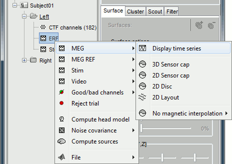
Now repeat this operation several times to display all the available modes: Display time series, 3D sensor cap, 2D sensor cap, 2D disc and 2D Layout. You should now see all the figures displayed below. Keep them opened for the next few paragraphs, you will learn how to manipulate multiple views of the same data.
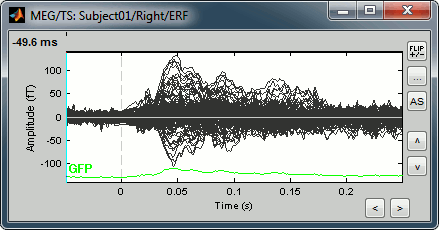
Display time series
Amplitude fluctuations over time for all the sensors.
List of mouse and keyboard operations for this type of figure (most of the operations are detailed later):
Mouse wheel: Zoom horizontal
CTRL+mouse wheel: Zoom vertical
Right click + move: Move in zoomed figure
Left click + move: Time selection
Left-click / Shift+Click: Set current time
Left-click on a line: Select the corresponding sensor
Right-click: Popup menu
Double-click: Restore initial view (ie. unzoom)
Keyboard arrows: Change current time
PageUp / PageDown: Change current time (10 samples at a time)
Notes for Mac users:
All the actions involving the mouse wheel can be performed on MacBook laptops by moving up and down two fingers on the pad.
"PageUp" or "PageDown" keys are obtained by pressing the "Fn" key together with the arrows UP or DOWN
3D Sensor cap / 2D Sensor cap / 2D Disc
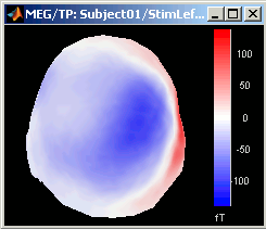
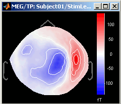
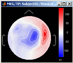
The recordings at a given time instant and interpolated over a 2D or 3D surface.
Mouse wheel: Zoom / unzoom
Left click + move: Rotate (3D only)
Middle click + move: Or left+right click + move: Move in zoomed figure
Right click + move: Select sensors (2D only, when sensors are visible, see below)
Right click: Popup menu
Left click on the colorbar + move: Change contrast (up/down) and brightness (left/right)
Control + E: Display the channels markers and/or names
Keyboard arrows: Change current time
PageUp / PageDown: Change current time (10 samples at a time) / Mac: Fn+UP/Fn+Down
2D layout
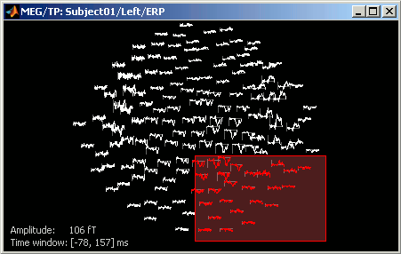
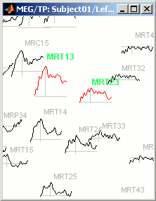
The time course of each channel is drawn at the actual position of the electrode, projected in 2D the same way as 2D Sensor cap. The light gray lines represent the zero amplitude (horizontal) and the current time (vertical lines).
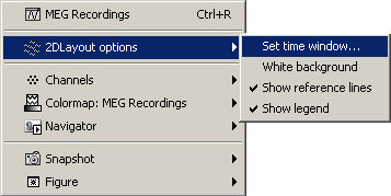
Only a part of the full time window is displayed for each channel, before and after the current time. The length of this time window can be modified either with the mouse shortcut Control+wheel, or with the 2D Layout options, in the figure popup menu. Other options are also available in the popup menu.
Mouse wheel: Zoom / unzoom
Middle click + move: (or left+right click + move) Move into the zoomed figure
Shift + mouse wheel: Increase/decrease the amplitude gain of the channels
Control + mouse wheel: Increase/decrease the length of the time window around the current time
Click on a line: Select a sensor
Right click + move: Select a group of sensors
Shift + click on a line: Select one sensor and unselect all the others
Display the time-frequency decomposition for the selected sensor, when availableRight-click: Display popup menu.
Sub-menu "2DLayout options" offer some configuration options for this type of figure.Control + E: Display/hide the channels names
Keyboard arrows: Change current time
PageUp / PageDown: Change current time (10 samples at a time) / Mac: Fn+UP/Fn+Down
Magnetic interpolation
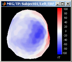
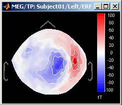
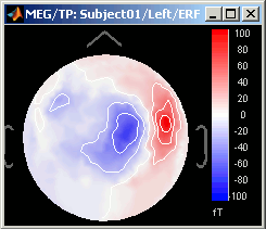
Some of the views (3D Sensor cap / 2D Sensor cap / 2D Disc), are by default re-interpolating the field that is recorded by the sensors to get much smoother displays. A simple inverse problem + forward problem are solved to reconstruct the magnetic fields on a high-resolution surface.
The menu "No magnetic interpolation" offer the same views, but without using this recontruction of the magnetic field, and performing instead a spatial interpolation of the values between the sensors.
Important note
If you are experiencing any kind of graphic bug, you should try to disable the OpenGL renderer. In Brainstorm main window, select menu File > Set preferences, and check the option "OpenGL: Disabled (no transparency)". All the 3D views would be very slow and with no transparency, but it may solve all the problems. This is more likely to happen on 64bit machines or when working on a remote system (X-server, VirtualBox, Windows remote desktop connection...).
You may also try keeping the OpenGL renderer but typing "opengl software" before you run Brainstorm. It would force Matlab to do a software OpenGL rendering instead of using the 3D hardware accelerations. The display would be similar to hardware OpenGL but much slower.
Time exploration
The time window and the current time instant are centralized and managed from the top of the Brainstorm window. You can use the text box or the buttons to change the current time value. All the figures always stay synchronized, you cannot display the 2D disc topography at t=10ms and the 3D sensor cap topography at t=50ms at the same time. It might look too restrictive at the beginning, but the contrary would have made the interface much too complex; we wanted to keep it as simple and intuitive as possible.

The time window panel is not the best way to expore your recordings. There are many other shortcuts that are much faster to navigate through the time.
Click on time series figure:
Left-click in any white area of the figure: it will move the time cursor at this point and update all the other figures to match this new value. Don't click on a black line, it would select the corresponding channel instead of moving the time cursor.Press the keyboard arrows:
Click on any data figure and try to press several time the left and right arrows, and also the PageUp and PageDown keys. This feature is really useful when you want to quickly see how the recordings are changing in time. Try holding the arrow keys for a while. It might be a bit slow because you have many figures to refresh at each time change. It is much faster if you have only one 2D figure to refresh.
To remember: An efficient and quick way to review your recordings just after importation is to:
- Open a Time series window (double click on recordings file)
- Click on the time of interest (eg. first response peak)
Open a topography view of your choice (2D disc, 2D sensor cap, or 3D sensor cap)
You can do this by right-clicking on the time series figure > MEG Topography (or Ctrl+T keyboard shortcut).Use the left/right arrows, and PageUp/PageDown keys (or Fn+Up / Fn+Down on a Mac)
Sensors selection
You can select some channels, and then display them separately or mark them as good or bad.
Now close all the figures except the Time series and the 2D Sensor cap topography (if you don't remember which one it was, close everything and open again these two figures).
On 2D Sensor cap figure: right-click anywhere on the window > Channels > Display sensors. You'll see white dots representing the center of each MEG coil. Note that there is keyboard shortcut indicated for this menu: Ctrl + E.
Press Ctrl + E several times and see what happens. Come back to the display with only the sensors markers (no labels).
- Click on some white dots.
- They turn red and the corresponding lines in the time series window also turn red
- Left-click on the lines in the time series window: it also selects the sensors
- Right-click on a red line in time series figure: shows the name and index of the selected channel
- Click on a selected (red) point or line: the sensor is deselected.
To deselect all the sensors, press Escape or right-click > Channels > Reset selection
Now select randomly three sensors.

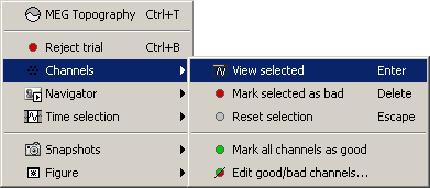
Right-click > Channels > View selected (Shortcut = Enter key). A new window is created, with only those three sensors, whose names are indicated in a legend box (you can move this legend if needed).
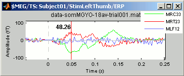
Close that last figure. In the 2D topography figure, right-click and move the mouse to select a group of sensors, just to remember that this feature exists.
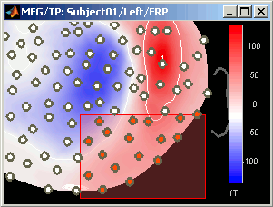
Time series in columns
There are two display modes for the time series. Open a time series figure. To switch from the current mode to the "column" mode, click on  in the toolbar.
You will first see a completely useless figure like the following one:
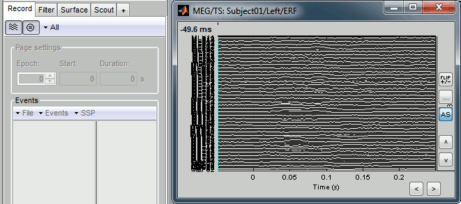
- This requires a little configuration: you need to select a subset of the channels and/or to increase the gain of the channels.
- Start by maximizing the size of the figure
Channel gain: You can increase/decrease the amplitude of the traces in different ways:
- Click on the up/down buttons on the right of the window
- Click on the "..." button on the right of the window to set manually the gain value for each vertical unit in the graph (distance between two horizontal lines).
- Press the "+" or "-" keys on your keyboard
- Hold the SHIFT key down, and use the mouse wheel to zoom/unzoom
Vertical zoom: Hold the CTRL key down, and use the mouse wheel to zoom in or out.
Horizontal zoom:
Click on the "<" and ">" buttons at the bottom of the window
- Use the mouse wheel to zoom in or out.
Move in the zoomed figure: Hold down left and right buttons of the mouse, and move the mouse.
You can reach some display results that are already a little more interesting:
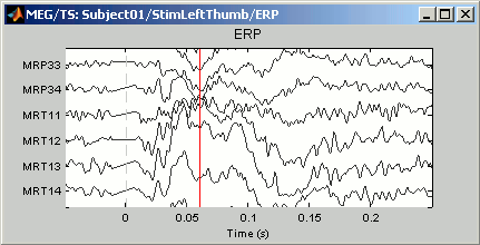
Reset initial view: Double-click
Channels selections: you can create and save subsets of channels, or used pre-defined sets. Right-click on the figure > Display setup > ... Try several predefined sets (ex. CTF LF = Group of left frontal sensors). You may need to decrease again the gain of the channels (use SHIFT+Mouse wheel)
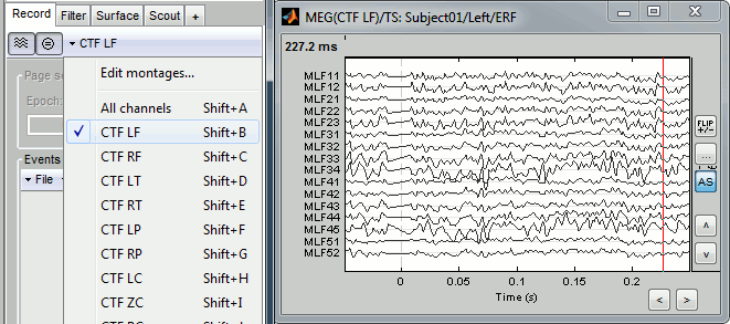
Note the keyboard shortcuts: SHIFT+letter. It makes it really easy to switch from a group of sensors to another (ex: Shift+A = all sensors, Shift+B = Left-frontal, Shift+C=Right-frontal...)
To edit/create your own selections, Right-click on the figure > Display setup > Edit selections... Click on the first button to create a new selection Test1, select a few channels in the list.
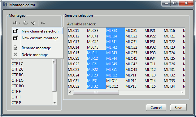
- Click on Save. Back to the time series figure. Look in the popup menu again, you can see your new selection in the menu: Test1. You can now use the time series view with those pre-defined selections of sensors.
Time selection
Go back to the previous view mode ("butterfly view"). Left-click somewhere on the white part of the time series figure, hold the mouse button, and drag your mouse left or right: A transparent blue rectangle appears to represent the time selection.
Now right-click on the figure to see the functions you can apply on this time window. The selected time window and its duration are shown at the bottom of the figure.
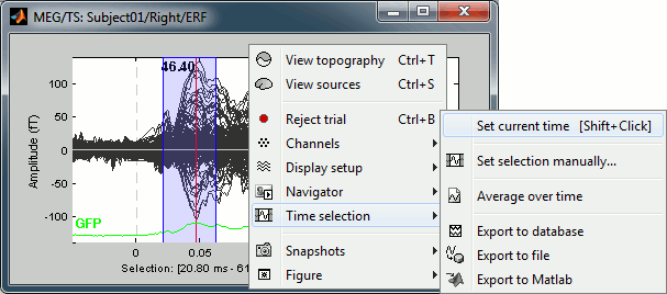
Set current time: Just sets the time cursor when the right-click ocured. The shortcut Shift+Click can be useful when trying to move in time on dense displays in columns view.
Set selection manually: Select a time window by giving the bounds in ms.
Average over time: Average over the selected time window, saved as a new file in the database.
Export to database: Extract the recordings and save them in a new file in database.
- If some sensors are selected, only their values are extracted, all the others are set to zero.
Export to file: Same, but in a user-defined file (not in the database)
Export to Matlab: Same, but export as a Matlab variable in the current workspace.
Good / bad channels
If you find out that a sensor has unexpected values, that are not coherent with the other surrounding sensors, you can choose to ignore it in the displays and in the source estimation process. In the channel file, each channel has a flag which indicates if it is good or bad. You may also import recordings files that already have some bad channels defined.
Select a few channels with one of the method described above: click on the time series, click on the sensors dots, right-click and move to select a group of sensors. Then right-click in one of the figures and check out the Channels sub-menu:
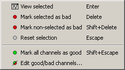
View selected: Show the time series of the selected sensors
Mark selected as bad: Remove sensors from the display and all the further computations
Mark non-selected as bad: Keep only the selected channels
Reset selection: Un-select all the selected sensors
Mark all channels as good: Brings back all the channels to display
Edit good/bad channels: Opens an interface that looks like the channel editor, but with one extra column to edit the status (good or bad) of each channel.
Mark channels as bad:
Right-click > Channels > Mark selected as bad, or press Delete key. The sensors should disappear in all figures, and the topography view (2D sensors cap) is updated so that the interpolation on the 2D surface now ignores the bad channels.

Get the channels back: two options
Right-click on figure > Channels > Mark all channels as good
Right-click on figure > Channels > Edit good/bad channels... : this menu open a window very similar to the Channel Editor window introduced in previous tutorials, but without the annoying location and orientation values, and with green and red dots. Click on the dots to mark a channel as good or bad.

- Note that if you click on a row in this window, it will select the corresponding channel in the time series and topography figures.
- Close this window to save the changes.
Batching this from the database explorer:
- You will find a "Channels" menu for any node in the tree that contains recordings.
- If you do this on the level of a node, the operation will be applied recursively to all the recordings contained in the node. This way, you can quickly set that the channel 63 is always bad, or that electrode 43 is not working for subject #12, without having to visualize all the recordings one after the other.
The View all bad channels command displays the list of all the bad channels in all the files in the Messages tab, in main Brainstorm window.
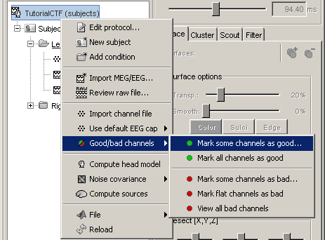
Important notes:
The good/bad channel flags are stored in the recordings files, not in the channel files. So if you marked some channels as bad in the ERF data file, there are still considered as good in the Std data file.
Colormap configuration
We will now describe how to manipulate the colormap in the topography windows. Open a 2D sensor cap view, and play with colors.
- Brainstorm keeps track of many user-defined colormaps: anatomy, EEG, MEG, sources, stat, time, time-frequency, etc. You can go to the Colormaps menu in the main window to see this list. Usually, you will use only popup menus from specific figures to edit the colormaps.
- If you modify a colormap, the changes will be applied to all the figures and saved in your user preferences and available the next time you start Brainstorm.
- You are going to play only with the MEG colormap, but the others work exactly the same way.
Right-click on you 2D sensor cap figure > Colormap.
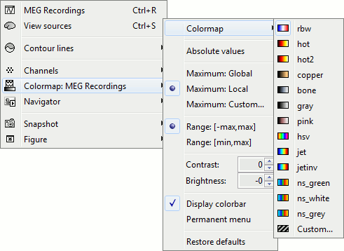
Colormap: You can change the colors that are used to represent the recorded MEG values. You can create your own colormaps with the Matlab colormap editor, clicking on the last option Custom.
Absolute values: Display the absolute values of the recordings, instead of the original values.
This is the default for Anatomy, Sources and Stat colormaps, but it is not very useful for recordings: for EEG and MEG, the sign of the values is very important.
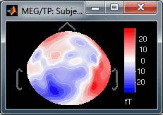
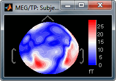
Fig.1: Relative values; Fig.2: Absolute values
Normalize for each display:
If not selected: The bounds of the colormap are set to the maximum value across the whole time window. Eg. if you use the rbw colormap and the min and max values are [-80ft, +130ft], the colors will be mapped in the following way: -130ft is blue, +130ft is red, 0ft is white. And it will be like this for each time sample.
If selected: It uses the local min and max values at the current time frame AND for each figure, instead of the global min and max. Eg. at t=0ms, the extrema values are roughly [-17ft, +17ft]. So the colors will be mapped in order to have: -17ft = blue, and +17 = red.
If you uncheck this option and go to t=0ms, the 2D topography figure will turn almost white.


Fig.1: Local maximum (normalized); Fig.2: Global maximum (not normalized)You can usually keep this Normalized option when looking at recordings, it makes things nicer. But keep in mind that it is not because you see flashy colors that you have strong effects. It's always a matter of colormap configuration.
Set colorbar max value: disabled when the Normalize option is selected, because it wouldn't have any effect. This menu allows you to fix the maximum bounds of the colormap, instead of using the automatic ones.
- Click on it, it will ask you for the maximum value you want.
Set it first to 5, then do it again and then to 500; and observe that it modifies the values displayed on the right side of the color bar, in the 2D sensor cap figure.
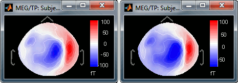
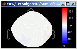
Fig.1: Maximum = 5 fT; Fig.2: Maximum = 500 fT- Select one last time this menu, and follow the instruction to reset it: enter 0. It will go back again to the automatic bounds.
- Remember that when you use this option, it is saved in your user preferences, so it can cause some trouble: You close Brainstorm, you start it again one week later, you totally forget that you had set this value to a very high level, you try to import and review new recordings, all you see is white, you spend two hours to understand why, you install a new version of Brainstorm and it stays desperately white... Just think about checking this option.
Contrast and Brightness:
- Brightness moves the center of the colormap up and down.
Contrast saturate/desaturate the colors.
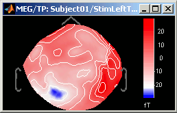
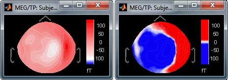
Fig.1: High brighness; Fig.2: High contrastThe words brightness/contrast may not be adapted for colormaps such as rbw, jet or hsv. It makes more sense for colormaps with only one tint that varies in intensity, such as the grey colormap.
- On some combinations of Matlab version / operating systems, those sliders may not work (it depends on the version of the embedded Java Virtual Machine).
You can also modify those values by clicking directly on the color bar in the figures. Hold the mouse button, and move up/down to change the brightness and left/right to change the contrast. Even if the sliders do not work, you can modify the colormaps.
Display colorbar: Just in case you want to hide the color bar...
Permanent menu: Open a window that displays this colormap sub-menu. Might be useful when you do a lot of colormap adjustments.
Restore defaults: Click on it now so all your experimentations will be discarded.
You can also reset the colormap by double-clicking on the color bar.
Toolbar / Manipulating multiple windows
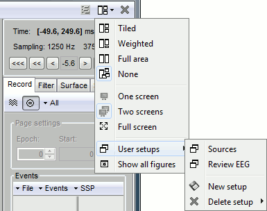
One of the interesting points in Brainstorm interface is that you can display easily different conditions or different subjects at the same time. If you want to open at the same time many subjects in many different experimental conditions, you will quickly have a lot of small windows everywhere. The buttons on the right part of the toolbar in the main Brainstorm window may help organize them. From left to right:
Display mode for time series: Already introduced in this tutorial.
Average reference: If checked, displays the average reference of EEG time series instead of the real values: at each time instant, substract the average of all the channels. For EEG only...
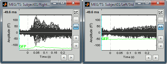
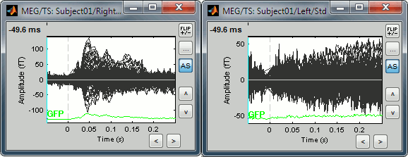
Uniform amplitude scales: If checked, all the time series figures with similar units have the same y-axis scale, so that you can compare visually the amplitudes between two datasets.
Double-click on Left / ERF and Right / ERF, and click on this button several times.
You'll see that the scale of the amplitude axis will change in the Right window, and fit alternatively its own maximum or the Left one.
Uniform amplitude on:
Uniform amplitude off:
Layout options: Defines how the figures are positioned on the screen
Tiled: All the figures have similar sizes
Weighted: Some figures containing more information are given more space on the screen. This mode is mostly useful when reviewing continuous recordings
Full area: Each figure takes all the space next to the Brainstorm window
Full screen: Each figure is displayed full screen
None: The new figures are displayed at the default Matlab position, always at the same place, and never re-organized after. Selecting this option can be useful if the auto-arrangement does not work well on your system or if you want to organize your windows by yourself.
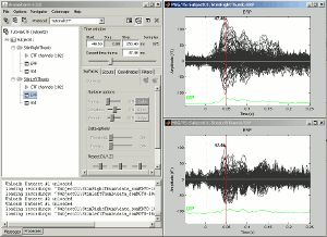
Change this option, close everything and double-click successively on Right / ERF and Left / ERF. Observe the behavior of the the different layout options.
 ---
--- 
One screen / two screens: If you have multiple monitors, Brainstorm can try to place the database window on one screen and all the other figures on the screen. If you force Brainstorm to use only one screen, all the figures should stay on the same screen.
Show all figures: If you have many figures and they are all hidden because of some other fullscreen window (Matlab to run Brainstorm, Firefox to read this tutorial, etc.), you don't have click on all of them in the taskbar to get them back. Just make the Brainstorm window visible and click on this button, it will bring all the figures back.
Close all windows: Close everthing and free most of the allocated memory.
Database navigator
The Navigator menu can help you to go quickly from a dataset to another. It can be almost indispensable when your are reviewing 200 trials of the same MEG response.
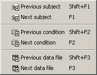
- You can access it from the popup menus of all the figures showing functional data.
You can also use the keyboard shortcuts: F1, F2, F3, together with Shift key to go backwards.
Now, close all the figures (use the Close all figures button)
For Right / ERF, display three views :
- Time series (double click)
2D sensor cap (Ctrl+T)
2D Layout (right click on ERF file > Display > 2D Layout)
Press F3 once: Updates all the figures to display Right/Std and selects it in the database explorer
Press F3 again: Nothing happens, you are already at the last dataset for this subject / condition.
Press Shift + F3: And you'll be back to ERF file.
Press F2: Similar to F3, but jumps from a condition to another, within the same subject.
If you had many subjects you could also use F1 / Shift+F1.
MacBook users: The keys "Fx" are obtained by holding the "Fn" key simultaneously.
Snapshots
Using Brainstorm, you will quickly feel like saving the beautiful images you produce. For that you can:
Press the PrintScreen key on your keyboard and paste the copied screen in your favorite image or text editor (note on MacOS - Google for the replacement key combination).
More subtle: Alt+PrintScreen would only copy the figure that is currently selected (note on MacOS).
The Snapshots menu present in the popup of all the figures can be useful too. Here are two examples of Snapshots menus, respectively on time series and 3D figures:
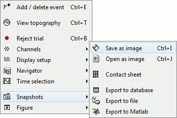 ---
--- 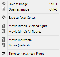
Save as image: save the figure (without the title bar and borders) in a file. Many formats available.
Open as image: capture the figure and open it in as an image. This can be useful if you want to compare visually the selected figure with another one that you cannot display at the same time (because they have different time or frequency definitions)
Export to database: get the time series in the figure, and create a new entry in database with these values.
- If there are some selected channels, only their values will be saved, all the others being set to zero.
Save time series: extract the time series displayed in this figure (or only the selected sensors), and save them in a file. Available formats:
- ASCII (.txt)
- Matlab (.mat): saves much more information (titles, time values, etc.)
- Cartool (.eph)
- EGI (.raw)
Export to Matlab: Same thing, but exports the structure in a variable in Matlab workspace instead of creating a new file.
Movie (time): Selected figure: Create .avi movies to show time evolution of the selected figure.
- The dimensions of the movie image depend on the actual size of the figure on the screen.
- Don't do anything else while creating the movies: the figure which is captured must be visible all the time.
Movie (time): All figures: Instead of capturing one figure only, it captures them all and creates a movie showing what you see on the screen. Arrange your figures the way you want and create a movie of all your workspace at once.
Movie (horizontal/vertical): Rotate spatially the 3D scene.
Contact sheet: Produce a big image with all the time frames in it.
- Same recommendations than for movies: if you don't want the final image to be too big, reduce the size of your figure, zoom a bit, and maybe hide the colorbar. Don't hide the figure during the capture.
At the end, the image is displayed in a viewer with which you can zoom (menu or wheel), move (left-click+move), and save the image (File > Save as).
The contact sheet menu also appears for the time series figure, which is not that interesting because nothing changes except for the position of the time cursor. However, it can make sense to use in combination with the same contact sheet for a 2D/3D figure. Displaying the two images side by side you would have a clear view of the exact timing of each topography.
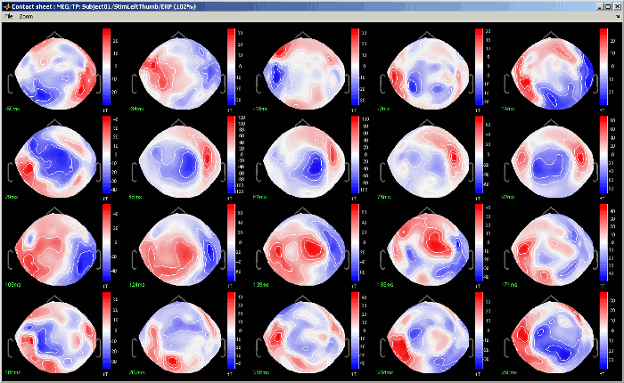
Figure menu: Before you save a figure, you can also use the Figure menu in popup, with which you can edit the figures with the Matlab tools.
Keyboard shortcuts
Here is a memo of all the keyboard shortcuts for time series and topography figures. If you don't remember them, you can find most of them in the figure popup menus.
Arrows: left, right, PageUp, PageDown: Move in time
Delete: Mark selected sensors as bad
Shift + Delete: Mark non-selected sensors as bad (=keeps ony the selected sensors)
Enter: View time series for selected sensors
Shift + Enter: Set all the bad sensors as good (=brings back all the channels in the display)
Escape: Unselect all the selected sensors
Ctrl + A: Show axis on 3D figures (X,Y,Z)
Ctrl + A: Add event in raw file viewer (see raw file viewer tutorial)
Ctrl + B: Set trial as bad
Ctrl + D: Dock/undock figure in Matlab's figures list
Ctrl + E: Show sensors and labels (E stands initially for Electrode)
Ctrl + I: Save figure as image
Ctrl + R: Open Time series view (R stands for Recordings)
Ctrl + S: Open Sources view (see next tutorial)
Ctrl + T: Open 2D sensor cap view (T stands for Topography)
Shift + letter: Change sensors display when in "column" display mode for the time series.
F1, F2, F3: with or without Shift, calls the database navigator (F1=subject, F2=condition, F3=file)
Notes for Mac users:
PageUp = Fn + UP
PageDown = Fn + DOWN
- F1 = Fn + F1
Mouse wheel = Two finger up/down on the MacBook pad
Feedback
Next
Now you are able to use all the tools that are available for importing and displaying your MEG or EEG recordings, and should start to feel comfortable with the database explorer.The next two steps are the resolution of the forward problem and the inverse problem. ?Next.
