
|
Size: 48213
Comment:
|
← Revision 716 as of 2025-08-26 13:47:58 ⇥
Size: 56712
Comment:
|
| Deletions are marked like this. | Additions are marked like this. |
| Line 4: | Line 4: |
| '''[TUTORIAL UNDER DEVELOPMENT: NOT READY FOR PUBLIC USE] ''' ''Authors: Hossein Shahabi, Raymundo Cassani, Takfarinas Medani, François Tadel'' Cognitive and perceptual functions are the result of coordinated activity of functionally specialized regions in the brain. [[http://www.scholarpedia.org/article/Brain_connectivity|Brain connectivity]] investigates how these different regions (or nodes) interact as a network, with the goal of having a better understanding of how the brain processes information. Depending on which connectivity characteristic is studied, a distinction is made between '''structural''' (fiber pathways), '''functional''' (non-directed statistical dependency) and '''effective''' (causal interaction) connectivity between regions. Effective connectivity is often referred as directed functional connectivity. In this tutorial we will see how to compute different connectivity metrics for non-directed and directed functional analyses in Brainstorm, first with simulated data and later with real data. |
''Authors: Hossein Shahabi, Raymundo Cassani, Takfarinas Medani, François Tadel, Marc Lalancette, [[https://www.neurospeed-bailletlab.org/sylvain-baillet|Sylvain Baillet]]'' Brain functions (e.g., in cognition, behavior and perception) stem from the coordinated activity of multiple regions. [[http://www.scholarpedia.org/article/Brain_connectivity|Brain connectivity]] measures are designed to probe how brain regions (or nodes) interact as a network. A distinction is made between '''structural''' (fiber pathways), '''functional''' (non-directed statistical associations) and '''effective''' (causal interactions, or "directed functional connectivity") connectivity between regions. Here we explain how to compute various connectivity metrics for non-directed and directed functional connectivity analyses with Brainstorm, both with simulated (ground-truth) and empirical data. We encourage the interested reader to [[https://pubmed.ncbi.nlm.nih.gov/34906715/|learn more]] about the specific aspects of electrophysiology for studying human ''connectomics''. |
| Line 12: | Line 12: |
| == General considerations in connectivity analysis == Connectivity analyses are commonly performed by computing a bivariate connectivity metric for all the possible pairs of time series or signals. The result of such approach can be presented as a '''connectivity graph''' (left image), where each signal is represented as a node, and the value of the connectivity metric is the value of the edge between the corresponding nodes. This graph representation becomes overwhelming when too many nodes are considered, as such, the connectivity graph can be represented with its '''connectivity matrix''', aka adjacency matrix (right image). |
== Introduction == === Definitions === Connectivity analyses are commonly performed by computing a bivariate measure between pairs of regional time series of interest. The outcome (a.k.a a ''connectome'') can be represented as a '''connectivity graph''' (left panel below), with each brain region as a node (x, y, z,...), and the connectivity measures shown above each edge of the graph. The ''connectome ''can also be represented by a '''connectivity array''', a.k.a. an adjacency matrix (right panel below). |
| Line 17: | Line 18: |
| '''Sensors or sources:''' The signals used for the connectivity analysis can be derived from the '''sensor data''' (EEG/MEG signals) or from the reconstructed '''sources''' (voxels or scouts). '''Directed and non-directed:''' The direction of the interaction between signals (as statistical causation) can be measured with '''directed metrics'''. However, this is not possible with '''non-directed metrics''', as result, the connectivity metric "from Signal <<latex($$x$$)>> to Signal <<latex($$y$$)>> " is equal to the connectivity metric "from Signal <<latex($$y$$)>> to Signal <<latex($$x$$)>>". '''Recording condition:''' Connectivity analyses can be performed on resting-state (spontaneous) and event-related (trials) recordings, the appropriate connectivity method depends on the recording condition. '''Full network vs point-based connectivity:''' In '''full network''', the connectivity metric is computed for all the possible node pairs in the network (N×N approach), and gives as result a detailed connectivity graph. Alternatively, '''point-based''' analysis is performed solely between one node (aka seed) and the rest of the nodes in the network (1×N approach), this approach is faster to compute and is more useful when you are interested in the connectivity of a specific sensor or source. '''Temporal resolution:''' Connectivity analyses can be performed in two ways: static and dynamic. Time-varying networks can present the dynamics of brain networks. In contrast, the static graphs illustrate a general perspective of brain connectivity which is helpful in specific conditions. Users need to decide which type of network is more informative for their study. '''Time-frequency transformation:''' Several connectivity metrics rely on the [[Tutorials/TimeFrequency|time-frequency representation]] of the signals, which is obtained with approaches such as the short-time Fourier transform, Hilbert transform, and Morlet wavelet. == Requirements == Please note that this is an advanced tutorial, it assumes that that you have already followed all the [[http://neuroimage.usc.edu/brainstorm/Tutorials#Get_started|introduction tutorials]]. For readability, most of the interface details are omitted, you must be familiar with the Brainstorm software in order to reproduce the computations illustrated below. This tutorial is mostly based on simulated data, and independent from the other tutorials. Only one part at the end uses the results of the introduction tutorials (auditory oddball dataset), in order to illustrate how to apply the connectivity processes to real MEG recordings. |
'''Sensors or sources:''' The time series used for connectivity analyses can be from '''sensor data''' (EEG/MEG signals) or from '''source time series''' (brain voxels or scouts). '''Directed vs. non-directed:''' The direction of interactions between signals (as a measure of statistical causation) is estimated with '''directed metrics'''. '''Non-directed metrics '''produce symmetrical connectivity graphs/matrices: the connectivity measure "from Signal <<latex($$x$$)>> to Signal <<latex($$y$$)>> " is identical to the connectivity measure "from Signal <<latex($$y$$)>> to Signal <<latex($$x$$)>>". '''Experimental condition:''' Depending on the neuroscience question, connectivity analyses can be performed on resting-state or task (e.g., ongoing or trial-based) data. '''Full (NxN) vs. seeded (1xN) connectivity:''' In a '''full connectivity analysis''', the connectivity metric is computed for all the possible pairs of nodes between N time series (noted N×N here). Alternatively, '''seeded connectivity''' (noted 1×N) is measured between one time series of interest (a ''seed, ''e.g., one brain region or a behavioral marker) and N other regions/time series. '''Time-frequency transformations:''' Some connectivity metrics rely on a [[Tutorials/TimeFrequency|time-frequency representation]] of the signals. These latter are obtained with approaches such as the short-time Fourier transform, Hilbert transform, or Morlet wavelets. Just as in other areas of electrophysiology studies, connectivity analyses need to be'''guided by mechanistic hypotheses concerning the expected neurophysiological effects'''. === Sensor-level analyses === 1. '''Their anatomical interpretation is limited and ambiguous'''. 1. Sensor data is affected by '''field spread''' and '''volume conduction of brain activity '''across the scalp/sensor array. Hence, activity from one single brain area is picked up at multiple, possibly distant sensor locations. Connectivity measures may show strong interactions between sensor time series, which may be wrongly interpreted as inter-regional brain connections. === Source-level analyses === Connectivity measures between source time series are '''neuroanatomically interpretable''' and can be derived across participants. We recommended that the outcomes of sensor and source connectivity analyses are mutually compatible; see ([[https://doi.org/10.1038/s41598-018-30869-w|Lai et al., 2018]]). '''Full-brain connectomes''' Whole-brain connectivity analyses at the typical resolution of cortical surfaces in Brainstorm involve '''thousands''' of source locations, making the N×N derivations impractical. For instance, 15000 cortical vertices would yield a connectivity matrix of 15000x15000x8 bytes = 1.6 GB. If unconstrained cortical sources are used and coherence is computed across 50 frequency bins, the memory allocation increases to 45000x45000x50x8 = 754 GB per participant/condition/trial/etc. Reducing the N (via e.g., cortical parcellations, ROIs) may be required for practical reasons, depending on computing resources. '''Regions of interest''' Grouping individual brain sources into ROIs, defined on the [[http://Tutorials/Scouts|cortical surface]] or in the brain [[https://neuroimage.usc.edu/brainstorm/Tutorials/TutVolSource#Volume_scouts|volume]] helps contain the computational resources required for connectivity analyses (see above). ROIs can be defined based on neuroscience priors and the purpose of the study ([[https://doi.org/10.1002/hbm.20745|Schhoffen and Gross, 2009]]). You may consider: * '''Study priors '''from the literature in your field, specific working hypotheses in terms of neuro-anatomical brain structures expected to be involved. * '''Association with a non-neuronal signal''' (e.g., cortico-muscular coherence). * '''Signal strength''', by defining ROIs from brain regions with strongest activity in current data. * '''Whole-brain '''[[https://neuroimage.usc.edu/brainstorm/Tutorials/LabelFreeSurfer#Cortical_parcellations|cortical parcellation]] to reduce N. The tutorial [[https://neuroimage.usc.edu/brainstorm/Tutorials/CorticomuscularCoherence|Corticomuscular coherence]] explains the computation of connectivity measures '''constrained''' and '''unconstrained''' brain maps for these cases: 1. '''One signal x full-brain source maps''': [[https://neuroimage.usc.edu/brainstorm/Tutorials/CorticomuscularCoherence#Method|link]] 2. '''One signal x scouts''': [[https://neuroimage.usc.edu/brainstorm/Tutorials/CorticomuscularCoherence#Coherence:_EMG_x_Scouts|link]] 3. ROI-based connectomes, i.e., '''scouts x scouts''': [[https://neuroimage.usc.edu/brainstorm/Tutorials/CorticomuscularCoherence#Coherence_Scouts_x_Scouts|link]] {{{#!wiki note Studies have reported similarities and differences between electrophysiological connectomes (from MEG/EEG) and fMRI connectomes. See how the '''electrophysiological connectomes provide unique insights on how functional communication is implemented in the brain''' in [[https://doi.org/10.1016/j.neuroimage.2021.118788|Sadaghiani et al., 2022]]. }}} {{{#!wiki caution On whole-brain connectivity analyses and the issue of circular analysis, please see [[https://doi.org/10.1038/nn.2303|Kriegeskorte et al., 2009]]. }}} == Pre-requisites == Here we focus on the specifics on connectivity analyses with Brainstorm. Please make sure you are familiar with Brainstorm and go through all [[http://neuroimage.usc.edu/brainstorm/Tutorials#Get_started|introduction tutorials]] first, before following the present tutorial. We first use simulated, synthetic data to emphasize the theoretical aspects of each connectivity metric with respect to groundtruth outcomes. Real, empirical MEG data are featured later in the tutorial (same auditory oddball dataset as in the other tutorial sections). |
| Line 36: | Line 79: |
| * Select the menu File > Create new protocol > "'''TutorialConnectivity'''" and select the options: | * Select the menu File > Create new protocol > type in "'''TutorialConnectivity'''" and select the options: |
| Line 42: | Line 85: |
| To compare different connectivity metrics, we use simulated data with known ground truth using a [[https://en.wikipedia.org/wiki/Brain_connectivity_estimators#Multivariate_Autoregressive_Model|multivariate autoregressive (MVAR)]] model. This model consist in three signals in a way that: * '''Signal 1''': Components at 10 and 25 Hz with a dominant peak at 25 Hz (beta band). * '''Signal 2''': Same components, but dominant peak is at 10 Hz (alpha band). * '''Signal 3''': Similar power for both components (10 and 25 Hz). * '''Signal 1>>Signal 3''': Signal 3 is influenced by Signal 1, with a peak at 25 Hz. Simulation process: * In the '''''Process1''''' tab, leave the file list empty and click on the button '''''[Run]''''' * Select process: '''''Simulate > Simulate AR signals (ARfit) with spectra'''''.<<BR>><<BR>> {{attachment:simulate_ar_spectra.png||width="400"}} |
To compare connectivity metrics, let's use synthetic time series simulated with known ground truth interactions. We will use a [[https://en.wikipedia.org/wiki/Brain_connectivity_estimators#Multivariate_Autoregressive_Model|multivariate autoregressive (MVAR)]] model that consists of the following three signals: * '''Signal 1''': two oscillatory (rhythmic) components: One at 10 Hz (alpha band), and a stronger peak at 25 Hz (beta band). * '''Signal 2''': Same as Signal 1, with the strongest peak at 10 Hz. * '''Signal 3''': Same as above, with the two components (10 and 25 Hz) of same magnitude. The 25-Hz component of''' '''Signal 3 will be driven in part by the 25-Hz component of Signal 1 (denoted '''Signal 1>>Signal 3'''). Let's now generate the three time series: * In the '''Process1''' tab, leave the file list empty and click on the button '''[Run]''' * Select process: '''Simulate > Simulate AR signals'''.<<BR>><<BR>> {{attachment:sim_process.gif}} |
| Line 56: | Line 100: |
| * '''Subject name''': Target subject for the simulated signals. Select '''Subject01'''. * '''Condition name''': Target folder for the simulated signals. Set to '''Simulation'''. * '''Number of time samples''': Duration of signals, in samples. Set to '''12 000'''. * '''Sampling frequency''':''' ''' Fs for the simulated signals. Set to '''120 Hz'''. * '''Interaction specifications:''' Spectral parameters for the interaction between signals in the MVAR model, given as: '''From, To / Peak frequencies [Hz] / Peak relative magnitudes [0-1]'''<<BR>> Set to: |
* '''Subject name''': Target subject for the simulated signals: Select '''Subject01'''. * '''Condition name''': Target folder where to store the simulated data in your database: Set to '''Simulation'''. * '''Number of time samples''' for each simulated time series: Set to '''12,000'''. * '''Sampling frequency''' (Fs): Set to '''120 Hz'''. * '''Interaction specifications:''' Spectral parameters for the signal components and their interactions in the MVAR model: '''From, To / Peak frequencies [Hz] / Peak relative magnitudes [0-1]'''<<BR>> Set to: |
| Line 68: | Line 112: |
| * '''View spectral metrics''': Display spectral metrics related to the MVAR process: transfer function, cross-spectral power density, [[#Coherence|magnitude square coherence]], [[https://en.wikipedia.org/wiki/Brain_connectivity_estimators#Directed_Transfer_Function|directed transfer function (DTF)]] and [[https://en.wikipedia.org/wiki/Brain_connectivity_estimators#Partial_Directed_Coherence|partial directed coherence (PDC)]]. The transfer function, <<latex($$|H(f)|$$)>>, contains information about the relationships between signals and their spectral characteristics; it is non-symmetric, so it allows for finding causal dependencies. The auto-transfer function (diagonal elements in the image) correspond to the power spectrum of the signals. The off-diagonal terms represent the interactions between different signals. Here, we see the transfer function from signal 1 to signal 3. These transfer functions are our '''ground truth for connectivity values'''.<<BR>><<BR>> {{attachment:sim_ar_spectra_metrics.png||width="600"}} * '''Get coefficients matrix:''' Shows the coefficients related to the MVAR model. These coefficients can be used in the process '''''Simulate > Simulate AR signals (ARfit)''''' to simulate the same model.<<BR>><<BR>> {{attachment:sim_ar_spectra_coeff.png||width="600"}} |
* '''Display the groundtruth spectral metrics''' of the MVAR-generated time series: transfer function, cross-spectral power density, [[#Coherence|magnitude square coherence]], [[https://en.wikipedia.org/wiki/Brain_connectivity_estimators#Directed_Transfer_Function|directed transfer function (DTF)]] and [[https://en.wikipedia.org/wiki/Brain_connectivity_estimators#Partial_Directed_Coherence|partial directed coherence (PDC)]]. The '''transfer function '''(<<latex($$|H(f)|$$)>>) characterizes the relationships between signals in the frequency domain. It is a non-symmetric representation, which enables the identification of causal dependencies between signal components. The ''auto-transfer functions'' (shown in the graphs along the diagonal below) display the power spectra of each signal. The off-diagonal representations display the interactions between each pair of signals (see Signal 1 >> Signal 3 above). Here, we see the transfer function from signal 1 to signal 3. These transfer functions are our '''ground truth for connectivity values'''.<<BR>><<BR>> {{attachment:sim_ar_spectra_metrics.png||width="100%"}} * '''Get coefficients matrix:''' Shows the coefficients related to the MVAR model. These coefficients can be used in the process '''Simulate > Simulate AR signals (ARfit)''' to simulate the same model.<<BR>><<BR>> {{attachment:sim_coef.gif}} |
| Line 73: | Line 118: |
| * Click '''''Run''' ''to simulate the signals described by the MVAR model. <<BR>><<BR>> {{attachment:sim_db.gif}} * In the next sections we will compute different connectivity metrics for these simulated signals. As such, place the simulated data in the '''''Process1''''' tab, click on '''''[Run]''''' ( {{https://neuroimage.usc.edu/moin_static198/brainstorm1/img/iconRun.gif}} ) to open the [[Tutorials/PipelineEditor#Selecting_processes|Pipeline editor]], and select the connectivity metric.<<BR>><<BR>> {{attachment:sim_select.gif}} Credits: |
* Click '''Run''' to generate the time series with the MVAR model. <<BR>><<BR>> {{attachment:sim_db.gif}} * In the next sections, we will compute different connectivity metrics from these synthetic time series. Drag and drop the simulated data in the '''Process1''' tab, click on '''[Run]''' ( {{https://neuroimage.usc.edu/moin_static198/brainstorm1/img/iconRun.gif}} ) to open the [[Tutorials/PipelineEditor#Selecting_processes|Pipeline editor]], and select the connectivity metric.<<BR>><<BR>> {{attachment:sim_select.gif}} * This tutorial illustrates the computation of full connectivity graphs ('''Process 1: NxN'''). It is also possible to obtain connectivity measures between one of the time series of a given data file and the other time series in the same file (use '''Process1: 1xN'''), or between time series from two different data files (use '''Process2: AxB'''), as shown further below. References used: |
| Line 80: | Line 126: |
Schneider T, Neumaier A<<BR>>Algorithm 808: [[http://dx.doi.org/10.1145/382043.382316|ARfit – A Matlab package for the estimation of parameters and eigenmodes of multivariate autoregressive models]]<<BR>>ACM Transactions on Mathematical Software, 2001 |
* Schneider T, Neumaier A<<BR>>Algorithm 808: [[http://dx.doi.org/10.1145/382043.382316|ARfit – A Matlab package for the estimation of parameters and eigenmodes of multivariate autoregressive models]]<<BR>>ACM Transactions on Mathematical Software, 2001 <<BR>><<BR>> |
| Line 84: | Line 131: |
| [[https://en.wikipedia.org/wiki/Correlation_and_dependence|Correlation]] is a non-directed connectivity metric that can be used to show similarity, dependence or association among two random variables or signals. While this metric has been widely used in electrophysiology, it should not be considered the best technique to evaluate connectivity. Due to its nature, correlation fails to alleviate the problem of volume conduction and cannot explain the association in different frequency bands. However, it still can provide valuable information in case we deal with a few narrow-banded signals. === Process options === * Process '''''Connectivity > Correlation NxN''''' process:<<BR>><<BR>> {{attachment:gui_corr1n.png||width="400"}} * '''Time window:''' Segment of the signal used for the connectivity analysis. Select: All file. * '''Compute scalar product:''' If unchecked, the mean of the signals is subtracted before computing the correlation. Uncheck it. * '''Output options''': Select '''''Save individual results'''''. |
[[https://en.wikipedia.org/wiki/Correlation_and_dependence|Correlation]] is a relatively simple, non-directed connectivity metric of association between two time series. It is relatively limited without further preprocessing of the input time series: correlation is sensitive to volume conduction and is not frequency specific. === Process options === * Process '''Connectivity > Correlation NxN''':<<BR>><<BR>> {{attachment:gui_corr1n.png}} * '''Time window:''' Time segment of the signals for connectivity analysis. Select: '''All file'''. * '''Time resolution:''' Select '''None''' * '''Windowed:''' correlation is computed in windows of a given '''length''' with a certain '''overlap''' percentage * '''None:''' correlation is computed using the entire time series * '''Compute scalar product:''' If left unchecked, the mean of the time series is subtracted before computing the correlation. Leave it unchecked. * '''Output options''': Select Estimate and save '''separately for each file'''. |
| Line 93: | Line 143: |
| * The results are stored as a N×N connectivity file, icon {{https://neuroimage.usc.edu/moin_static198/brainstorm1/img/iconConnectN.gif}} . Right-click to see its display options:<<BR>><<BR>> {{attachment:corr1n_file.gif}} * '''Display as graph''': Plots the connectivity graph using a [[https://en.wikipedia.org/wiki/Chord_diagram|chord diagram]] where the color of the edges shows the connectivity metric value. See the [[Tutorials/ConnectivityGraph|connectivity graph tutorial]] for a detailed explanation of the options of this visualization.<<BR>><<BR>> {{attachment:corr1n_graph.gif}} * '''Display as image''': Plots the [[https://en.wikipedia.org/wiki/Adjacency_matrix|adjacency matrix]] for the connectivity file. <<BR>><<BR>> {{attachment:corr1n_image.png}} * '''Display fibers''':Additional option available for source connectivity results when a '''fiber track''' surface is available, as shown [[#Tutorials.2FFiberConnectivity|here]]. || {{attachment:res_corr1n_a.png||width="350"}} || || {{attachment:res_corr1n_b.png||width="350"}} || |
* The results are stored as a N×N connectivity file, with a new icon {{https://neuroimage.usc.edu/moin_static198/brainstorm1/img/iconConnectN.gif}} . Right-click for display options:<<BR>><<BR>> {{attachment:corr1n_file.gif}} * '''Display as graph''': Plots the connectivity graph using a [[https://en.wikipedia.org/wiki/Chord_diagram|chord diagram]] where the color of the edges shows the value of the connectivity metric. See the [[Tutorials/ConnectivityGraph|connectivity graph tutorial]] for a detailed explanation of the options of this visualization. * '''Display as image''': Plots the connectivity measures in an [[https://en.wikipedia.org/wiki/Adjacency_matrix|adjacency matrix]]. * '''Display fibers''': Displays source connectivity edges as virtual white fiber tracts, as shown [[#Tutorials.2FFiberConnectivity|here]]. <<BR>><<BR>> {{attachment:corr1n_graph_image.png}} |
| Line 104: | Line 153: |
| * '''Diagonal values''': The value of the connectivity metric between a signal and itself is plotted as zero so that it doesn't force scaling the colormap to 1 if the other values are much smaller. * '''Labels''': In order to see the labels corresponding to each column and row: right-click on the figure > Figure > '''''Show labels'''''. * '''Colormap''': By default, the NxN colormap is configured to display the absolute values of the connectivity measures. As in the general case, correlation values can be positive or negative, you need to check this option carefully. If you expect to see negative, make sure to change the colormap configuration: right-click on the figure > Colormap > Uncheck '''''Absolute values'''''. <<BR>><<BR>> {{attachment:corr1n_image_relative.png}} |
* '''Show labels''': Click on the figure to display the names of the times series and the connectivity values in the figure legend. To display the labels corresponding to each column and row: right-click on the figure > Figure > '''Show labels'''. If the time series names are too long, use the option '''Use short labels'''. * '''Hide self-connectivity''': In a square NxN connectivity matrix, the diagonal values correpond to the values of the connectivity metric between a time series and itself. These self-connectivity values are typically much higher than the other values of the matrix. When checked, these values are hidden so that to display the off-diagonal values more clearly. * '''Colormap''': By default, the NxN colormap is configured to display the absolute values of the connectivity measures. Correlation values may be positive or negative. To display the '''negative values''', make sure to change the colormap configuration: right-click on the figure > Colormap > Uncheck '''Absolute values'''. <<BR>><<BR>> {{attachment:corr1n_image_relative.png}} <<BR>><<BR>> |
| Line 109: | Line 160: |
| Coherency or complex coherence, <<latex($$C_{xy}(f)$$)>>, is a complex-valued metric that measures of the linear relationship of two signals in the frequency domain. And, its magnitude square coherence (MSC), <<latex($$|C_{xy}(f)|^2$$)>>, often referred to as coherence, measures the covariance of two signals in the frequency domain. For a pair of signals <<latex($$x(t)$$)>> and <<latex($$y(t)$$)>>, with spectra <<latex($$X(f)$$)>> and <<latex($$Y(f)$$)>>, the MSC is defined as: | Coherency or complex coherence, <<latex($$C_{xy}(f)$$)>>, is a complex-valued metric that measures the linear relationship of two signals in the frequency domain. Magnitude square coherence (MSC), <<latex($$|C_{xy}(f)|^2$$)>>, or ''coherence'', measures the covariance of two signals in the frequency domain. For a pair of time series <<latex($$x(t)$$)>> and <<latex($$y(t)$$)>>, with spectra <<latex($$X(f)$$)>> and <<latex($$Y(f)$$)>>, the MSC is defined as: |
| Line 120: | Line 171: |
| Two related measures, which alleviate the problem of volume conduction, are '''imaginary coherence''' ([[https://doi.org/10.1016/j.clinph.2004.04.029|Nolte et al., 2004]]), <<latex($IC_{xy}(f)$)>>, and the '''lagged coherence''' ([[https://arxiv.org/pdf/0706.1776|Pascual-Maqui, 2007]]), <<latex($LC_{xy}(f)$)>>, which are defined as: | Two related measures, which address the problem of volume conduction, are '''imaginary coherence''' ([[https://doi.org/10.1016/j.clinph.2004.04.029|Nolte et al., 2004]]), <<latex($IC_{xy}(f)$)>>, and '''lagged coherence''' ([[https://arxiv.org/pdf/0706.1776|Pascual-Maqui, 2007]]), <<latex($LC_{xy}(f)$)>>, which are defined as: |
| Line 129: | Line 180: |
| where <<latex($$\mathrm{Im()}$$)>> and <<latex($$\mathrm{Re()}$$)>> describe the imaginary and real parts of a complex number. To calculate coherence values in Brainstorm, select the '''''Connectivity > Coherence NxN''''' process. {{attachment:gui_cohere1n.png||width="400"}} <<BR>> === Process options === * '''Time window:''' Segment of the signal used for the connectivity analysis. Select '''All file'''. * '''Remove evoked response''': If checked, removes the averaged evoked from each trial. '''Uncheck''' it. * '''Process options:''' Different types of coherence. Select '''Magnitude squared coherence'''. * '''Window length for PSD estimation''' Duration in seconds for the PSD estimation. Set to '''1 s'''. * '''Overlap for PSD estimation:''' Percentage of overlap between consecutive windows for PSD estimation. Set to '''50%'''. * '''Highest frequency of interest''': Highest frequency for the analysis, it should be <= Fs/2. Set to '''60 Hz'''. |
where <<latex($$\mathrm{Im()}$$)>> and <<latex($$\mathrm{Re()}$$)>> are the imaginary and real parts of a complex number, respectively. Note that the cross-spectrum (<<latex($$S_{xy}(f)$$)>>) and the power spectral densities (<<latex($$S_{xx}(f)$$)>> and <<latex($$S_{yy}(f)$$)>>), and as consequence also coherency (<<latex($$C_{xy}(f)$$)>>) can be obtained through different time-frequency decomposition methods (such as: Hilbert transform, wavelet transform and short-time Fourier transform), and for different time resolutions (per sample, windowed and entire file). === Process options === * Process '''Connectivity > Coherence NxN''':<<BR>><<BR>> {{attachment:gui_cohere1n.png}} <<BR>> {{attachment:gui_cohere1n_b.png}} * '''Time window:''' Segment of the time series used for the connectivity analysis. Select '''All file'''. * '''Connectivity metric '''shows variants of coherence measures. Select: '''Magnitude squared coherence'''. * '''Time-frequency decomposition '''selection of the time to time-frequency transformation. Select: (short-time) '''Fourier transform'''. * '''Options [Edit] '''shows the options of the selected time-frequency transformation. * '''Window length:''' Duration in seconds for the [[https://neuroimage.usc.edu/brainstorm/Tutorials/ArtifactsFilter#Evaluation_of_the_noise_level|spectrum estimation]]. Set to: '''1s'''. * '''Overlap:''' Percentage of overlap between consecutive sliding time windows. Set to: '''50%'''. * '''Highest frequency''': After the computation, removes all the frequencies above this threshold, mostly for visualization purposes. The value needs to be <= Fs/2. Set to: '''60 Hz'''. * '''Time resolution '''selection of the time resolution. Select: '''None'''. * '''Output options''': Select Estimate and save '''separately for each file'''. === Result visualization === Coherence is frequency specific: a connectivity graph and a connectivity matrix are produced for each frequency bin of the spectrum. Right-click on the coherence result file to show display options: * '''Display as graph''': Plots a connectivity graph for each frequency bin. * '''Display as image''': Plot a connectivity matrix for each frequency bin. * '''Power spectrum''': Plot coherence as a function of frequency, between each time series. Open the 3 types of visualization: they are linked by clicking on the spectral representation of the coherence, which will change the current frequency bin and update the connectivity measures displayed in the graph and matrix. The value of the current frequency bin can also be changed in the Time panel. <<BR>><<BR>> {{attachment:res_cohere1n.png}} <<BR>><<BR>> Other variants of coherence can be derived following the above procedure. The figures below display the coherence spectra obtained from the imaginary coherence (left) and the lagged coherence (right) measures. || {{attachment:res_cohere1n_d.png||width="350"}} || || {{attachment:res_cohere1n_e.png||width="350"}} || <<BR>><<BR>> == Granger causality == Granger causality (GC) is a measure of '''directed functional connectivity''' based on the Wiener-Granger causality framework. GC measure linear dependencies between time series, and tests whether the prediction of the future of signal <<latex($$x(t)$$)>> (approximated by a linear autoregressive model) is improved by considering signal <<latex($$y(t)$$)>> (also approximated by a linear autoregressive model). If there is such improvement, one concludes that signal <<latex($$y(t)$$)>> has a Granger causal effect on the other signal. In sum, some '''independent information''' from the past of signal <<latex($$y(t)$$)>> improves the prediction of the future of signal <<latex($$x(t)$$)>>, with respect to only observing its past <<latex($$x(t)$$)>>. GC takes nonnegative values; its is zero when no Granger causality can be attributed. The term '''independent''' means that GC is invariant with the scale of the input signals <<latex($$x(t)$$)>> and <<latex($$y(t)$$)>>. <<BR>><<BR>> {{{#!wiki note In its simplest ('''unconditional''') form, '''Granger causality indicates directionality but not true causality'''. <<BR>> For example, if a variable <<latex($$z$$)>> is causing both <<latex($$x$$)>> and <<latex($$y$$)>>, but with a smaller delay for <<latex($$y$$)>> than for <<latex($$x$$)>>, then the GC measure between <<latex($$x$$)>> and <<latex($$y$$)>> would show a non-zero GC for <<latex($$y$$)>> --> <<latex($$x$$)>>, even though <<latex($$y$$)>> is not truly causing <<latex($$x$$)>> ([[https://doi.org/10.1016/j.neuroimage.2010.02.059|Bressler and Seth, 2011]]).<<BR>><<BR>> Spurious causalities like in the example above, may be removed by using the '''conditional''' GC approach in which the common dependencies (available in the data) are conditioning out. For example above, the conditional GC measures causality between <<latex($$x$$)>> and <<latex($$y$$)>> considering <<latex($$z$$)>> in the modelling, this is to say <<latex($$y$$)>> --> <<latex($$x$$)>>|<<latex($$z$$)>> (where '|' means 'conditioned on') would be close to zero. ([[https://doi.org/10.1016/j.jneumeth.2013.10.018|Barnett and Seth 2014]]). '''Conditional''' GC is the recommended approach. }}} See [[GrangerCausality|Granger causality - mathematical background]] for a more complete background. === Process options === * Process '''Connectivity > Bivariate Granger causality NxN'''<<BR>><<BR>> {{attachment:gui_granger1n.png||width="400"}} * '''Time window:''' Time segment of the time series used for the connectivity analysis. Select '''All file'''. * '''Remove evoked response''': This option is recommended by some authors as it satisfies the zero-mean stationarity of the GC model, but does not account for trial-to-trial variability; see ([[https://doi.org/10.1016/j.neuroimage.2008.03.025|Wang et al., 2008]]). Leave it '''Unchecked'''. * '''GC method:''' Select if conditional or unconditional GC will be used. * '''Maximum Granger model order:''' The most common criteria used to define the order of the autoregressive models used by GC to approximate the input time series are the [[https://en.wikipedia.org/wiki/Akaike_information_criterion|Akaike’s information]] criterion, the [[https://en.wikipedia.org/wiki/Bayesian_information_criterion|Bayesian-Schwartz’s criterion]], and the [[https://en.wikipedia.org/wiki/Hannan–Quinn_information_criterion|Hannan-Quinn criterion]]. Low model orders will yield coarse approximations of the input time series. High model orders may yield spurious GC connectivity estimates. The simulated time series were created with an AR model of order 4; please use a maximum Granger model order of '''6'''. When '''unconditional''' GC is selected, the order of the model is defined using the AIC, and is lesser or equal to input in this parameter. |
| Line 144: | Line 232: |
| === Results visualization === The connectivity matrix (left panel below) is not symmetric because GC values are direction specific. The upper right elements of the matrix indicate there is a GC influence from signal 1 to signal 3. In the connectivity graph (right panel below) the directionality is shown with an arrowhead at the center for the arc connecting two nodes. || {{attachment:res_granger1n_a.png}} || || {{attachment:res_granger1n_b.png}} || <<BR>><<BR>> == Spectral Granger causality == The Spectral Granger causality is a measure of '''directed functional connectivity '''that was developed to indicate frequency specific influences between time series ([[https://doi.org/10.1103/PhysRevLett.100.018701|Dhamala et al., 2008]]). === Process options === * Process: '''Connectivity > Bivariate Granger causality NxN'''. <<BR>><<BR>> {{attachment:gui_spgranger1n.png||width="400"}} <<BR>><<BR>>. Here we used the same parameters as with [[#Granger_causality|GC]] plus two two extra parameters specific to spectral GC: * '''Maximum frequency resolution''': Width of frequency bins in PSD estimation. Set to '''1 Hz'''. Not used for '''conditional''' spectral GC. * '''Highest frequency''': computes GC values under the specified frequency. Should be set <= Fs/2. Use: '''60 Hz'''. |
|
| Line 145: | Line 252: |
| Coherence is a function of frequency, as such, for each frequency point there is a connectivity graph and a connectivity matrix. Right-click on the coherence result file to see its display options: * '''Display as graph''': Plot the connectivity graph at a given frequency point. * '''Display as image''': Plot the connectivity matrix at a given frequency point. * '''Power spectrum''': Plot coherence as a function of frequency for all the possible node pairs. Open the 3 representations. These representations are linked such as by clicking on the spectral representation of the coherence, we change the frequency that is displayed in the connectivity graph and matrix. This frequency can be also changed in the Time panel. || {{attachment:res_cohere1n_a.png||width="350"}} || || {{attachment:res_cohere1n_a2.png||width="200"}} || || {{attachment:res_cohere1n_b.png||width="350"}} || || {{attachment:res_cohere1n_c.png||width="350"}} || In the same way, we can compute the other types of coherence. The figure below presents the spectra for the imaginary coherence (left) and the lagged coherence (right). Both, imaginary and lagged coherence aim to address the volume conduction problem, although they present small differences. || {{attachment:res_cohere1n_d.png||width="350"}} || || {{attachment:res_cohere1n_e.png||width="350"}} || == Granger causality == Granger causality (GC) is a method of directed functional connectivity, which is base on the Wiener-Granger causality methodology. GC is a measure of linear dependence, which tests whether the prediction of signal <<latex($$x(t)$$)>> (using a linear autoregressive model) is improved by adding signal <<latex($$y(t)$$)>> (also using a linear autoregressive model). If this is true, signal <<latex($$y(t)$$)>> has a Granger causal effect on the first signal. In other words, '''independent information''' of the past of signal <<latex($$y(t)$$)>> improves the prediction of signal <<latex($$x(t)$$)>> obtained with the past of signal <<latex($$x(t)$$)>> alone. GC is nonnegative, and zero when there is no Granger causality. As only the past of the signals is considered, the GC metric is directional. The term '''independent''' is emphasized because it creates some interesting properties for GC, such as, that it's invariant under rescaling of <<latex($$x(t)$$)>> and <<latex($$y(t)$$)>>, as well as the addition of a multiple of <<latex($$x(t)$$)>> to <<latex($$y(t)$$).<<BR>>See [[GrangerCausality|Granger causality - mathematical background]] for a complete formulation of the method. {{{#!wiki note Despite the name, '''Granger causality indicates directionality but not true causality'''. <<BR>> For example, if a variable <<latex($$w$$)>> is causing both <<latex($$x$$)>> and <<latex($$y$$)>>, but with a smaller delay for <<latex($$y$$)>> than for <<latex($$x$$)>>, then the GC measure between <<latex($$x$$)>> and <<latex($$y$$)>> would show a non-zero GC for <<latex($$y$$)>> --> <<latex($$x$$)>>, even though <<latex($$y$$)>> is not truly causing <<latex($$x$$)>> ([[https://doi.org/10.1016/j.neuroimage.2010.02.059|Bressler and Seth, 2011]]). }}} To compute the Granger causality values in Brainstorm, select the '''''Connectivity > Bivariate Granger causality NxN''''' process. {{attachment:gui_granger1n.png||width="400"}} <<BR>><<BR>> === Process options === * '''Time window:''' Segment of the signal used for the connectivity analysis. Select '''All file'''. * '''Remove evoked response''': If checked, removes the averaged evoked from each trial. It is recommended by some authors as it meets the zero-mean stationarity requirement (improves stationarity of the system). However, the problem with this approach is that it does not account for trial-to-trial variability. For a discussion see ([[https://doi.org/10.1016/j.neuroimage.2008.03.025|Wang et al., 2008]]). '''Uncheck''' it. * '''Maximum Granger model order:''' The most common criteria used to define the order of the model are the [[https://en.wikipedia.org/wiki/Akaike_information_criterion|Akaike’s information]] criterion, the [[https://en.wikipedia.org/wiki/Bayesian_information_criterion|Bayesian-Schwartz’s criterion]], and the [[https://en.wikipedia.org/wiki/Hannan–Quinn_information_criterion|Hannan-Quinn criterion]]. Too low orders may lack the necessary details, while too big orders tend to create spurious values of connectivity. While our simulated signals were created with a model of 4, here we used as model order of '''6''' for a decent connectivity result. * '''Output options''': Select '''Save individual results'''. <<BR>> === Result visualization === In the connectivity graph (left) the directionality is shown with an arrow head at the center for the arc connecting nodes. As GC metric is not symmetric, the connectivity matrix (right) is not symmetric. The upper right element of this matrix shows there is a signal flow from signal 1 to signal 3. || {{attachment:res_granger1n_a.png||width="350"}} || || {{attachment:res_granger1n_b.png||width="350"}} || <<BR>><<BR>> == Spectral Granger causality == GC lacks of resolution in the frequency domain, as such, the spectral Granger causality was developed ([[https://doi.org/10.1103/PhysRevLett.100.018701|Dhamala et al., 2008]]). The process to calculate this metric is found in '''''Connectivity > Bivariate Granger causality NxN'''''. {{attachment:gui_spgranger1n.png||width="400"}} <<BR>><<BR>> === Process options === With respect to [[#Granger_causality|GC]], spectral GC presents two extra parameters: * '''Maximum frequency resolution''': Width of frequency bins in PSD estimation. Set to '''1 Hz'''. * '''Highest frequency of interest''': Highest frequency for the analysis, it should be <= Fs/2. Set to '''60 Hz'''. === Result visualization === As with coherence, spectral GC can be plotted as a function of frequency. The plot below clearly shows a peak around 25 Hz for the interaction from signal 1 to signal 3, as expected. {{attachment:res_spgranger1n.png||width="300"}} <<BR>><<BR>> == Envelope correlation (2020) == In the [[Tutorials/TimeFrequency|time-frequency tutorial]] the Morlet wavelets and Hilbert transform were introduced as methods to decompose signals in the time-frequency (TF) domain. The result of this TF transformation can be seen as a set of narrowband complex signals, which are analytic signals. The [[https://en.wikipedia.org/wiki/Analytic_signal|analytic signal]], <<latex($$\tilde{x}(t)$$)>>, is a complex signal uniquely associated to a real signal, <<latex($$x(t)$$)>>, that has been useful in signal processing due to its characteristics, more specifically, its '''module''' <<latex($$a_{\tilde{x}}(t)$$)>>, and '''phase''' <<latex($$\phi_{\tilde{x}}(t)$$)>>, correspond to the '''instantaneous amplitude''' (or envelope) and '''instantaneous phase''' of the associated real signal <<latex($$x(t)$$)>>. The real part of <<latex($$\tilde{x}(t)$$)>> is its associated real signal <<latex($$x(t)$$)>>, and the imaginary part is the Hilbert transform of the same real signal <<latex($$x(t)$$)>>. |
As with coherence, spectral GC can be plotted as a function of frequency. The display below shows a peak around 25 Hz that corresponds to the expected causal interaction of Signal 1 on Signal 3. {{attachment:res_spgranger1n.png}} <<BR>><<BR>> == Envelope correlation == In the [[Tutorials/TimeFrequency|time-frequency tutorial]], we have introduced '''Morlet wavelets''' and the '''Hilbert transform''' as methods to decompose time series in the time-frequency (TF) domain. The outcome of these two TF transformations is an [[https://en.wikipedia.org/wiki/Analytic_signal|analytic signal]], <<latex($$\tilde{x}(t)$$)>>, which is a complex time series uniquely associated to the original data time series, <<latex($$x(t)$$)>>, which '''module''' <<latex($$a_{\tilde{x}}(t)$$)>>, and '''phase''' <<latex($$\phi_{\tilde{x}}(t)$$)>>, correspond to the '''instantaneous amplitude''' (or envelope) and '''instantaneous phase''' of the original time series <<latex($$x(t)$$)>>, respectively. The real part of <<latex($$\tilde{x}(t)$$)>> is the original time series <<latex($$x(t)$$)>>, and the imaginary part is the Hilbert transform of that same time series <<latex($$x(t)$$)>>. |
| Line 218: | Line 267: |
| The instantaneous amplitude (or envelope) of these band analytic signals can be used to carry out pairwise connectivity analysis with metrics such as correlation and coherence (including lagged coherence). In computing the envelope correlation, an optional step is to orthogonalize the envelopes by removing their real part of coherence before the correlation ([[https://psycnet.apa.org/doi/10.1038/nn.3101|Hipp et al., 2012]]). This orthogonalization process alleviates the effect of volume conduction in MEG/EEG signals. These connectivity metrics can be computed with the '''''Connectivity > Envelope Correlation N×N [2020]''''' process. B {{attachment:gui_henv1n_ha.png||width="400"}} === Process options === * '''Time window:''' Segment of the signal used for the connectivity analysis. Select '''All file'''. * '''Remove evoked response''': If checked, removes the averaged evoked from each trial. '''Uncheck''' it. * '''Time-frequency transformation method:''' Either '''Hilbert transform''' or '''Morlet wavelets'''. Each of this methods requires additional parameters that are found in an external panel that opens by clicking on '''''Edit'''''. See the [[Tutorials/TimeFrequency|time-frequency tutorial]]. || {{attachment:gui_henv1n_hb.png||width="250"}} || || {{attachment:gui_henv1n_wb.png||width="400"}} || * '''Signal splitting:''' This process has the capability of splitting the input data into several blocks for performing time-frequency transformation, and then merging them to build a single file. This feature helps to save a huge amount of memory and, at the same time, avoid breaking a long-time recording to short-time signals, which makes inconsistency in dynamic network representation of spontaneous data. The maximum number of blocks which can be specified is 20. Set to '''1'''. * '''Connectivity measure:''' This is the connectivity metric that will be used with the envelopes. Select '''Envelope correlation (orthogonalized)'''. * '''Time resolution:''' If Dynamic is selected, connectivity is saved for each window of analysis. If Static is selected, the connectivity results from all the windows are averaged. Select '''Dynamic'''. * '''Estimation window length''': Duration in milliseconds to compute the connectivity measure. Set to '''5000 ms''' * '''Sliding window overlap:''' Percentage of overlap between consecutive windows to compute the connectivity measure. Set to '''50%'''. * '''Use the parallel processing toolbox:''' Enables the use of the parallel processing toolbox in Matlab to accelerate the computational procedure. '''Uncheck''' it. * '''Output configuration:''' Generally, the above calculation results in a 4-D matrix, where dimensions represent channels (1st and 2nd dimensions), time points (3rd dimension), and frequency (4th dimension). In the case that we analyze event-related data, we have also several files (trials). However, due to the poor signal-to-noise ratio of a single trial, an individual realization of connectivity matrices for each of them is not in our interests. Consequently, we need to average connectivity matrices '''among all trials''' of a specific event. The second option of this part performs this averaging. === Result visualization === Similar to the results from coherence and spectral Granger causality, the envelope correlation can be plotted as a function of frequency, and as a function of time if the '''Time resolution''' option is set to '''Dynamic'''. Below, the results obtained with the Hilbert transform (left) and with Morlet wavelet (right) for the first 5-s window (top) and the 5-s last window (bottom). |
{{{#!wiki note The analytic signal of oscillatory or '''narrowband''' signals provide '''meaningful''' and '''interpretable''' estimations of instantaneous amplitude and phase. While it is technically feasible to derive these elements from broadband time series, they would not be interpretable (see [[https://mitpress.mit.edu/books/analyzing-neural-time-series-data|Cohen, 2014]]). }}} The instantaneous amplitude (or envelope) of the analytic signals can be used to carry out pairwise connectivity analysis with correlation. This is to say amplitude envelop correlation (AEC). An optional step consists in '''orthogonalizing''' the pairs of amplitude envelope time series before computing the correlation. Orthogonalization is performed by first removing the real part of their coherence to reduce volume conduction (at the sensor level) or cross-talk effects (at the source level) ([[https://psycnet.apa.org/doi/10.1038/nn.3101|Hipp et al., 2012]]). === Process options === * Process: '''Connectivity > Envelope Correlation N×N [2023]''' <<BR>><<BR>> {{attachment:gui_henv1n_ha.png||width="400"}} * '''Time window:''' Time segment of the signal used for the connectivity analysis. Select: '''All file'''. * '''Connectivity measure '''is the connectivity metric applied to the resulting signal amplitude envelopes. Select '''Envelope correlation (orthogonalized)'''. * '''Time-frequency decomposition:''' '''Hilbert transform''' or '''Morlet wavelets'''. Each method requires additional parameters that will be displayed in a separate panel after clicking on '''[Edit]'''. See the [[Tutorials/TimeFrequency|time-frequency tutorial]]. In the present example, we will use the '''Hilbert transform''' with the option '''Group in frequency bands''' to present the results for the canonical frequency bands. As the sampling frequency of the signals is 120Hz, thus, make sure you remove the '''"gamma2"''' band from the targeted frequency bands.<<BR>><<BR>> {{attachment:gui_henv1n_hb.png||height="276",width="227"}} * '''Time resolution:''' If '''Windowed''', connectivity is saved for each time window. If '''None''', the connectivity measures are averaged across all windows. Select '''Windowed'''. Set the additional parameters to define the windows: * '''Time window length''': Duration in milliseconds over which the connectivity measure is computed. Set to '''5s''' * '''Time window overlap:''' Percentage of overlap between consecutive time windows to compute the connectivity measure. Set to '''50%'''. * '''Use the parallel processing toolbox:''' If available, will call Matlab's parallel processing to accelerate computations. Leave it '''Unchecked'''. * '''Output options''': Select Estimate and save '''separately for each file'''. For sake of comparison, we will compute AEC again, but this time changing the TF decomposition method to '''Morlet wavelets''' with '''Linear = 1:1:60''' (frequencies from 1 to 60 Hz with 1 Hz step). . {{attachment:gui_henv1n_wb.png||height="276",width="227"}} === Results visualization === As with [[#Coherence|Coherence]] and [[#Spectral_Granger_causality|spectral Granger causality]], amplitude envelope correlations can be displayed as a function of frequency, and as a function of time if the '''Time resolution''' option was set to '''Windowed'''. Below are the AEC results obtained with the Hilbert transform (left panels) and with Morlet wavelets (right panels) for the first 5-s time window (top panels) and the 5-s last window (bottom panels). |
| Line 250: | Line 298: |
| == Phase locking value == An alternative class of connectivity metrics considers only the relative instantaneous phase between the two signals, i.e., phase-locking or synchronization ([[https://doi.org/10.1103/PhysRevLett.81.3291|Tass et al., 1998]]). Phase locking is a fundamental concept in dynamical systems that has been used in control systems (the phase-locked loop) and in the analysis of nonlinear, chaotic and non-stationary systems. Since the brain is a nonlinear dynamical system, phase locking is an appropriate approach to quantifying connectivity. A more pragmatic argument for its use in studies of LFPs, EEG, and MEG is that it is robust to fluctuations in amplitude that may contain less information about interactions than does the relative phase ([[https://doi.org/10.1002/(SICI)1097-0193(1999)8:4<194::AID-HBM4>3.0.CO;2-C|Lachaux et al., 1999]]; [[https://doi.org/10.1016/S0167-2789(00)00087-7|Mormann et al., 2000]]). The most commonly used phase connectivity metric is the phase-locking value (PLV), which is defined as the length of the average vector of many unit vectors whose phase angle corresponds to the phase difference between two signals ([[https://doi.org/10.1103/PhysRevLett.81.3291|Tass et al., 1998]]). If the distribution of the phase difference between the two signals is uniform, the length of such an average vector will be zero. Conversely, if the phases of the two signals are strongly coupled, the length of the average vector will approach unity. For event-related studies, we would expect the phase difference across trials to be uniform distributed unless the phase is locked to the stimulus. In that case, we may have nonuniform marginals which could in principle lead to indications of phase locking between two signals. Considering a pair of narrow-band analytic signals <<latex($$\tilde{x}(t)$$)>> and <<latex($$\tilde{y}(t)$$)>>, obtained from the TF transformation using the Hilbert transform: |
== Phase-Locking Value == An alternative class of connectivity metrics considers the relative instantaneous phase between two time series as a marker of connectivity. Phase-locking or phase synchronization are two such measures ([[https://doi.org/10.1103/PhysRevLett.81.3291|Tass et al., 1998]]). In principle, phase-based measures are robust against fluctuations in signal amplitude, although low signal-to-noise conditions remain challenging for these measures ([[https://doi.org/10.1002/(SICI)1097-0193(1999)8:4<194::AID-HBM4>3.0.CO;2-C|Lachaux et al., 1999]]; [[https://doi.org/10.1016/S0167-2789(00)00087-7|Mormann et al., 2000]]). The phase-locking value ('''PLV''') is a popular metric defined as the length of the average vector of many unit vectors whose phase angle corresponds to the phase difference between two time series ([[https://doi.org/10.1103/PhysRevLett.81.3291|Tass et al., 1998]]). If the distribution of the phase difference between the two signals is uniform, the length of such an average vector will be 0. If the phases of the two signals are strongly coupled, the length of the average vector will be close to 1. For event-related studies, we would expect phase differences across trials to be uniformly distributed, unless the phase of the brain signals is locked to the event onset, which would then indicate a form of phase locking between the two time series. Considering a pair of narrow-band analytic signals <<latex($$\tilde{x}(t)$$)>> and <<latex($$\tilde{y}(t)$$)>>, obtained from the Hilbert transform (see above): |
| Line 269: | Line 317: |
| To calculate PLV in Brainstorm, select the '''''Connectivity > Phase locking value NxN''''' process. {{attachment:gui_plv1n.png||width="400"}} === Process options === * '''Time window:''' Segment of the signal used for the connectivity analysis. Select '''All file'''. * '''Frequency bands for the Hilbert transform:''' Frequency bands used for the time-frequency transformation with the Hilbert transform method. See the [[Tutorials/TimeFrequency|time-frequency tutorial]]. * '''Keep time information:''' Computes PLV across trials, thus the result is a PLV time series for each frequency band. * '''Measure:''' How the resulting vector is reported. Select '''''Magnitude'''''. |
Several variants of PLV have been contritributed. Brainstorm features <<BR>>'''ciPLV''' ([[https://pubmed.ncbi.nlm.nih.gov/29952757/|Bruña 2018]]) and '''wPLI''' ([[https://pubmed.ncbi.nlm.nih.gov/21276857/|Vinck 2011]]) variants contributed to Brainstorm by Daniele Marinazzo. {{{#!wiki note PLV values tend to be overestimated when derived from few (<50) time samples. As a consequence, when comparing PLV values between conditions, please make sure that they are derived from about the same number of samples in each condition. }}} === Process options === * Process: '''Connectivity > Phase locking value NxN'''<<BR>><<BR>> {{attachment:gui_plv1n.gif}} * '''Time window:''' Time segment of the signal used for the connectivity analysis. Select '''All file'''. * '''Connectivity metric '''shows variants of phase locking measures. Select: '''Phase locking value'''. * '''Time-frequency decomposition ''' method for time-frequency transformation. Select: '''Hilbert transform'''. * '''Options [Edit] '''shows the options of the selected time-frequency transformation. * '''Frequency bands:''' Used for the time-frequency transformation with the Hilbert transform method. See the [[Tutorials/TimeFrequency|time-frequency tutorial]]. In this example, the sampling frequency of the signals being 120Hz, please remove the "gamma2" band. * '''Time resolution '''selection of the time resolution. Select: None. * '''Output options''': Select '''Save across combined files/epochs'''. <<BR>> === Results visualization === PLV is frequency resolved, and here was computed for the delta, theta, alpha, beta and gamma1 bands. With the simulated data, we expect a higher PLV value in the beta band (15 to 29 Hz), between Signal 1 and Signal 3. This is indeed our observation, with a peak at 22 Hz (center of beta band) in the PLV spectrum (left). The same is true for ciPLV (center) and wPLI (right). {{attachment:res_plv1n.png||width="650"}} == Phase-Transfer Entropy == Phase transfer entropy (PTE) is a '''directed connectivity''' metric that quantifies the [[https://en.wikipedia.org/wiki/Transfer_entropy|transfer entropy]] (TE) between two instantaneous phase time series ([[https://doi.org/10.1016/j.neuroimage.2013.08.056|Lobier et al., 2014]]). Similar to [[#Granger_Causality|GC]], TE estimates whether including the past of both source and target time series influences the ability to predict the future of the target time series. In PTE, if a phase signal <<latex($$\phi_{\tilde{x}}(t)$$)>> causes the signal <<latex($$\phi_{\tilde{y}}(t)$$)>>, the [[http://www.scholarpedia.org/article/Mutual_information|mutual information]], between <<latex($$\phi_{\tilde{y}}(t)$$)>> and the past of <<latex($$\phi_{\tilde{x}}(t)$$)>> i.e. <<latex($$\phi_{\tilde{x}}(t')$$)>> is larger than the mutual information of <<latex($$\phi_{\tilde{y}}(t)$$)>>, the past of <<latex($$\phi_{\tilde{y}}(t)$$)>> i.e. <<latex($$\phi_{\tilde{y}}(t')$$)>> and <<latex($$\phi_{\tilde{x}}(t')$$)>>. This relationship can be represented on the Venn diagram below, where <<latex($$\mathrm{I()}$$)>> and <<latex($$\mathrm{H()}$$)>>, indicate mutual information and the individual entropies, respectively. PTE values are positive and unbounded. {{attachment:pte.png}} === Process options === * Process: '''Connectivity > Phase Transfer Entropy NxN'''<<BR>><<BR>> {{attachment:gui_pte1n.png||width="400"}} * '''Time window:''' Time segment of the signal used for the connectivity analysis. Select '''All file'''. * '''Frequency bands:''' Used for the time-frequency transformation with the '''Hilbert transform''' method. See the [[Tutorials/TimeFrequency|time-frequency tutorial]]. In this example, as the sampling frequency of the signals is '''120 Hz''', make sure the "gamma2" band is removed from the option. * '''Return normalized phase transfer entropy:''' Divides each directional PTE value between two signals by the sum of both directional PTE values for those two signals. '''Uncheck this option''' |
| Line 280: | Line 349: |
| === Result visualization === PLV is frequency resolved, and it was computed for the delta, theta, alpha, beta and gamma bands. With the simulated data, we expect a higher PLV value in the beta band (15 to 29 Hz), between signal 1 and signal 3. This result is seen as a peak at 22 Hz (center of beta band) shown in PLV as a function of frequency. {{attachment:res_plv1n.png||width="350"}} == Phase transfer entropy == Phase transfer entropy (PTE) is a directed connectivity metric that quantifies the [[https://en.wikipedia.org/wiki/Transfer_entropy|transfer entropy]] (TE) between two instantaneous phase time series ([[https://doi.org/10.1016/j.neuroimage.2013.08.056|Lobier et al., 2014]]). Similar to [[#Granger_Causality|GC]], TE estimates whether including the past of both source and target time-series influences the ability to predict the future of the target time-series. In PTE, if a phase signal <<latex($$\phi_{\tilde{x}}(t)$$)>> causes the signal <<latex($$\phi_{\tilde{y}}(t)$$)>>, the [[http://www.scholarpedia.org/article/Mutual_information|mutual information]], between <<latex($$\phi_{\tilde{y}}(t)$$)>> and the past of <<latex($$\phi_{\tilde{x}}(t)$$)>> i.e. <<latex($$\phi_{\tilde{x}}(t')$$)>> is larger than the mutual information of <<latex($$\phi_{\tilde{y}}(t)$$)>>, the past of <<latex($$\phi_{\tilde{y}}(t)$$)>> i.e. <<latex($$\phi_{\tilde{y}}(t')$$)>> and <<latex($$\phi_{\tilde{x}}(t')$$)>>. This relationship can be seen on the Venn diagram below, where <<latex($$\mathrm{I()}$$)>> and <<latex($$\mathrm{H()}$$)>>, indicate mutual information and the individual entropies respectively. Lastly, PTE cannot be negative, and its magnitude does not have a meaningful upper bound. {{attachment:pte.png}} {{attachment:gui_pte1n.png||width="400"}} === Process options === * '''Time window:''' Segment of the signal used for the connectivity analysis. Select '''All file'''. * '''Frequency bands for the Hilbert transform:''' Frequency bands used for the time-frequency transformation with the Hilbert transform method. See the [[Tutorials/TimeFrequency|time-frequency tutorial]]. * '''Return normalized phase transfer entropy:''' Divides the each directional PTE value between two signals by the sum of both directional PTE values for those two signals. TODO: THIS NEEDS TO BE CLARIFIED, SEE: https://neuroimage.usc.edu/forums/t/confusing-values-of-normalized-pte/32069 === Result visualization === PTE was computed for the delta, theta, alpha, beta and gamma bands. With the simulated data, we expect a higher PTE value in the beta band, From signal 1 To signal 3, as PTE is directed metric. This is confirmed with a peak at 22 Hz (center of beta band) shown in PTE frequency representation. {{attachment:res_pte1n.png||width="350"}} . == Method selection and comparison == |
=== Results visualization === Here we computed PTE for the delta, theta, alpha, beta and gamma1 bands. From the synthetic data used here, we expect to observe a higher PTE value in the beta band, From Signal 1 To Signal 3. This is indeed shown with a peak at 22 Hz (center of beta band) in the PTE spectrum. {{attachment:res_pte1n.png||width="350"}} . == Summary: connectivity methods == |
| Line 302: | Line 357: |
| ||<style="font-weight:bold;border-width:2px;">Metric ||<style="text-align:center;font-weight:bold;border-width:2px;">Directionality ||<style="text-align:center;font-weight:bold;border-width:2px;">Domain ||<style="text-align:center;font-weight:bold;border-width:2px;">1×N ||<style="text-align:center;font-weight:bold;border-width:2px;">N×N ||<style="text-align:center;font-weight:bold;border-width:2px;">Time resolved ||<style="text-align:center;font-weight:bold;border-width:2px;">Process ||<style="text-align:center;font-weight:bold;border-width:2px;">Info || ||<style="border-width:2px;">Correlation ||<style="text-align:center;border-width:2px;">Non-directed ||<style="text-align:center;border-width:2px;">Time ||<style="text-align:center;border-width:2px;">✅ ||<style="text-align:center;border-width:2px;">✅ ||<style="text-align:center;border-width:2px;">✅ ||<style="text-align:center;border-width:2px;">`bst_corrn.m` ||<style="text-align:center;border-width:2px;">[[#Correlation|Link]] || ||<style="border-width:2px;">Coherence ||<style="text-align:center;border-width:2px;">Non-directed ||<style="text-align:center;border-width:2px;">Frequency ||<style="text-align:center;border-width:2px;">✅ ||<style="text-align:center;border-width:2px;">✅ ||<style="text-align:center;border-width:2px;">✅ ||<style="text-align:center;border-width:2px;">`bst_cohn.m` ||<style="text-align:center;border-width:2px;">[[#Coherence|Link]] || ||<style="border-width:2px;">Granger causality ||<style="text-align:center;border-width:2px;">Directed ||<style="text-align:center;border-width:2px;">Time ||<style="text-align:center;border-width:2px;">✅ ||<style="text-align:center;border-width:2px;">✅ ||<style="text-align:center;border-width:2px;">❌ ||<style="text-align:center;border-width:2px;">`bst_granger.m` ||<style="text-align:center;border-width:2px;">[[#Granger_Causality|Link]] || ||<style="border-width:2px;">Spectral Granger causality ||<style="text-align:center;border-width:2px;">Directed ||<style="text-align:center;border-width:2px;">Frequency ||<style="text-align:center;border-width:2px;">✅ ||<style="text-align:center;border-width:2px;">✅ ||<style="text-align:center;border-width:2px;">❌ ||<style="text-align:center;border-width:2px;">`bst_granger_spectral.m` ||<style="text-align:center;border-width:2px;">[[#Spectral_Granger_causality|Link]] || ||<style="border-width:2px;">Envelope Correlation (2020) ||<style="text-align:center;border-width:2px;">Non-directed ||<style="text-align:center;border-width:2px;">T-F ||<style="text-align:center;border-width:2px;">✅ ||<style="text-align:center;border-width:2px;">✅ ||<style="text-align:center;border-width:2px;">✅ ||<style="text-align:center;border-width:2px;">`bst_henv.m` ||<style="text-align:center;border-width:2px;">[[#Envelope_Correlation_.282020.29|Link]] || ||<style="border-width:2px;">Phase locking value ||<style="text-align:center;border-width:2px;">Non-directed ||<style="text-align:center;border-width:2px;">Phase ||<style="text-align:center;border-width:2px;">✅ ||<style="text-align:center;border-width:2px;">✅ ||<style="text-align:center;border-width:2px;">❌ ||<style="text-align:center;border-width:2px;">`bst_connectivity.m` ||<style="text-align:center;border-width:2px;">[[#Phase_locking_value|Link]] || ||<style="border-width:2px;">Phase transfer entropy ||<style="text-align:center;border-width:2px;">Directed ||<style="text-align:center;border-width:2px;">Phase ||<style="text-align:center;border-width:2px;">❌ ||<style="text-align:center;border-width:2px;">✅ ||<style="text-align:center;border-width:2px;">❌ ||<style="text-align:center;border-width:2px;">`PhaseTE_MF.m` ||<style="text-align:center;border-width:2px;">[[#Phase_transfer_entropy|Link]] || == Sensor- and source-level connectivity analyses == As mentioned [[#General_considerations_in_connectivity_analysis|above]], the different connectivity metrics can be computed with '''sensor''' or '''source''' data. However, sensor connectivity analyses present two important limitations: 1. '''They are not interpretable''', as the relation between the estimated connectivity and the underlying neuroanatomy is not straightforward. 1. Sensor data is severely corrupted by effects of '''field spread''' and '''volume conduction'''. Due to these effects the activity of a single brain area could cause a spurious connectivity between MEG/EEG sensors. Despite these limitations, sensor connectivity analyses are commonly used. One approach to reduce the negative impact of field spread on connectivity analyses is to perform them in the source level. In addition, source connectivity analyses are '''interpretable''' as neuroanatomy is considered. As consequence, findings in the source level can be easily used in group studies using a normalization / registration. Regardless of the data, sensors or sources, it is highly recommended to '''have a clear hypothesis to test before starting the connectivity analysis'''. Although sensor- and source-level connectivity analyses use different assumptions, the outcomes regarding the topology of the underlying networks should be consistent ([[https://doi.org/10.1038/s41598-018-30869-w|Lai et al., 2018]]). Depending on the [[Tutorials/SourceEstimation#Source_estimation_options|source estimation method]] the number of sources can be in the order of '''tens of thousands''', making the full network analyses (N×N) impractical. For example, we could compute the source connectivity matrix for each trail, then average overall trial. However, this process is time and memory consuming. For example, for each trial, a matrix of 15002×15002 elements is computed and saved in the hard disk (~0.9 Gb per trial). In the case of the unconstrained source, the size is 45006x45006 (~8.1 Gb per trial). As such, the strategy is to reduce the dimensionality of the source space, this is done by grouping the sources in regions of interests (ROIs) or [[Tutorials/Scouts|scouts]] in Brainstorm jargon. Therefore, the '''most critical step''' in performing a source-domain connectivity analysis is the definition of these ROIs, which is not a trivial procedure as it depends on the '''source estimation method''', '''experimental task''', and '''data available''' ([[https://doi.org/10.1002/hbm.20745|Schhoffen and Gross, 2009]]). Common approaches found in the literature to select the ROIs for connectivity analysis are: * '''A priori''': ROIs are selected based on a priori knowledge in a given experimental task. * '''Coherence with a no-neuronal signal''': ROIs that present a strong coherence with an external no-neuronal signal are selected. * '''Power maps''': ROIs showing the strongest activity in an experimental task or ROIs that present the strongest differences of activity between experimental conditions are selected. * '''Full brain''': A set of ROIs covering the full brain, [[https://neuroimage.usc.edu/brainstorm/Tutorials/LabelFreeSurfer#Cortical_parcellations|a cortical parcellation]], is selected. '''In this selection approach, there are not any a priori assumptions or hypotheses'''. A fair choice for this set of ROIs is a parcellation based on anatomy, as in ([[https://doi.org/10.1038/nature18933|Glasser et al., 2016]]). Although this approach to select ROIs can be used for '''exploratory analyses''', it '''should not be taken as default for connectivity analyses'''. |
||<style="font-weight:bold;border-width:2px;">Metric ||<style="text-align:center;font-weight:bold;border-width:2px;">1×N ||<style="text-align:center;font-weight:bold;border-width:2px;">N×N ||<style="text-align:center;font-weight:bold;border-width:2px;">Directionality ||<style="text-align:center;font-weight:bold;border-width:2px;">Freq resolved ||<style="text-align:center;font-weight:bold;border-width:2px;">Time resolved ||<style="text-align:center;font-weight:bold;border-width:2px;">Function ||<style="text-align:center;font-weight:bold;border-width:2px;">Info || ||<style="border-width:2px;">Correlation ||<style="text-align:center;border-width:2px;">✅ ||<style="text-align:center;border-width:2px;">✅ ||<style="text-align:center;border-width:2px;">❌ ||<style="text-align:center;border-width:2px;">❌ ||<style="text-align:center;border-width:2px;">✅ ||<style="text-align:center;border-width:2px;">`bst_corrn.m` ||<style="text-align:center;border-width:2px;">[[#Correlation|Link]] || ||<style="border-width:2px;">Coherence ||<style="text-align:center;border-width:2px;">✅ ||<style="text-align:center;border-width:2px;">✅ ||<style="text-align:center;border-width:2px;">❌ ||<style="text-align:center;border-width:2px;">✅ ||<style="text-align:center;border-width:2px;">✅ ||<style="text-align:center;border-width:2px;">`bst_cohn.m` ||<style="text-align:center;border-width:2px;">[[#Coherence|Link]] || ||<style="border-width:2px;">Granger causality ||<style="text-align:center;border-width:2px;">✅ ||<style="text-align:center;border-width:2px;">✅ ||<style="text-align:center;border-width:2px;">✅ ||<style="text-align:center;border-width:2px;">❌ ||<style="text-align:center;border-width:2px;">❌ ||<style="text-align:center;border-width:2px;">`bst_granger.m` ||<style="text-align:center;border-width:2px;">[[#Granger_causality|Link]] || ||<style="border-width:2px;">Spectral Granger causality ||<style="text-align:center;border-width:2px;">✅ ||<style="text-align:center;border-width:2px;">✅ ||<style="text-align:center;border-width:2px;">✅ ||<style="text-align:center;border-width:2px;">✅ ||<style="text-align:center;border-width:2px;">❌ ||<style="text-align:center;border-width:2px;">`bst_granger_spectral.m` ||<style="text-align:center;border-width:2px;">[[#Spectral_Granger_causality|Link]] || ||<style="border-width:2px;">Envelope Correlation (2023) ||<style="text-align:center;border-width:2px;">✅ ||<style="text-align:center;border-width:2px;">✅ ||<style="text-align:center;border-width:2px;">❌ ||<style="text-align:center;border-width:2px;">✅ ||<style="text-align:center;border-width:2px;">✅ ||<style="text-align:center;border-width:2px;">`bst_henv.m` ||<style="text-align:center;border-width:2px;">[[#Envelope_Correlation_.282020.29|Link]] || ||<style="border-width:2px;">Phase locking value ||<style="text-align:center;border-width:2px;">✅ ||<style="text-align:center;border-width:2px;">✅ ||<style="text-align:center;border-width:2px;">❌ ||<style="text-align:center;border-width:2px;">✅ ||<style="text-align:center;border-width:2px;">✅ ||<style="text-align:center;border-width:2px;">`bst_connectivity.m` ||<style="text-align:center;border-width:2px;">[[#Phase_locking_value|Link]] || ||<style="border-width:2px;">Phase transfer entropy ||<style="text-align:center;border-width:2px;">❌ ||<style="text-align:center;border-width:2px;">✅ ||<style="text-align:center;border-width:2px;">✅ ||<style="text-align:center;border-width:2px;">✅ ||<style="text-align:center;border-width:2px;">❌ ||<style="text-align:center;border-width:2px;">`PhaseTE_MF.m` ||<style="text-align:center;border-width:2px;">[[#Phase_transfer_entropy|Link]] || <<HTML(<!-- )>> Real data: Auditory dataset [TODO] '''TODO''': Rewrite this section with '''coherence '''on '''scouts''', with '''single trials'''. -- In this section we will use the results obtained in the introduction tutorials. The goal here is only to illustrate the interface of these tools on real data, as the results are not particularly interesting. The [[Tutorials/CorticomuscularCoherence|corticomuscular coherence tutorial]] provides more complete and meaninful guidelines for computing connectivity measures on real MEG recordings. Let's go back to our [[DatasetIntroduction|auditory oddball dataset]], available in the protocol '''TutorialIntroduction''' if you have followed the introduction tutorials. As the stimulus is played on both ears, we expect to observe highly correlated activity in the '''primary auditory cortices''', in both experimental conditions (standard and deviant beeps), around '''0''' to '''150 ms''' after the stimulus due to auditory evoked responses at 50 and 100 ms (M50, M100). |
| Line 336: | Line 380: |
| Being an '''exploratory analysis''', the full-brain connectivity analysis can help to get a better understanding of the acquired data, and to develop hypotheses to test. However its outcomes '''should not''' be considered conclusive, as they may be the result of circular analysis ([[https://doi.org/10.1038/nn.2303|Kriegeskorte et al., 2009]]). }}} The optimal selection of ROIs to perform source connectivity analysis is still an open question. == Correlation on real data == {{{#!wiki note In this section we will use the results obtained in the [[|introduction tutorial]] to provide a simple example of correlation in the source level. A more complete tutorial on connectivity can be found at CORTICOMUSCULAR COHERENCE TUTORIAL. }}} Let's go back to our [[DatasetIntroduction|auditory oddball dataset]]. According to the literature, we expect to observe bilateral activity in the '''primary auditory cortices''', in both experimental conditions (standard and deviant beeps), around '''0''' to '''150 ms''' after the stimulus due to auditory evoked responses at 50 and 100 ms (M50, M100). {{{#!wiki caution In the rest of this section, correlation is computed on the scouts time series of the average response for the standard and deviant conditions. On practice connectivity metrics are computed trial-wise and the results are aggregated. An example of this approach can be seen in CORTICOMUSCULAR COHERENCE TUTORIAL. |
In the rest of this section, correlation is computed on the scouts time series of the average response for the standard and deviant conditions. On practice connectivity metrics are computed trial-wise and the results are aggregated. An example of this approach can be seen in the [[Tutorials/CorticomuscularCoherence|corticomuscular coherence tutorial]]. |
| Line 353: | Line 386: |
| We will perform source-domain correlation among these scouts for the Run #1: '''S01_AEF_20131218_01_600Hz_notch''' data. Let's compute [[#Correlation|correlation]] for '''standard''' and '''deviant''' conditions for the Run #1: '''S01_AEF_20131218_01_600Hz_notch''' data. 1. Drag and drop the source file associated to the average standard response ('''Avg. standard (193 files)''') within the '''''Process1''''' tab, select the option 'source process' ( {{https://neuroimage.usc.edu/moin_static198/brainstorm1/img/iconResultList.gif}} ), and click on the '''''[Run]''''' button. 1. Add a the process, '''''Connectivity > Correlation NxN'''''. Set the time window from '''0 to 150 ms'''. Check the '''''Use scouts''''' option, and select '''User scouts''' as atlas in the drop menu. Set the '''''Scout function''''' to '''Mean''', for '''''When to apply the scout function''''' select '''Before'''. Finally click on '''''[Run]'''''. <<BR>><<BR>> 1. Display the connectivity matrix as '''Image''' (top) and adjust the '''Colormap''' to show absolutes values from 0 to 0.8. Then, display the connectivity matrix as '''Graph''' and set the same range. By adjusting the '''Intensity threshold''' for the graph to 0.7, only the strongest correlations are kept, mainly, between scouts in the left and right temporal lobes and near scouts (bottom). |
Let's compute source-domain [[#Correlation|correlation]] for '''standard''' and '''deviant''' conditions for the Run #1: '''S01_AEF_20131218_01_600Hz_notch''' data. 1. Drag and drop the source files associated to the average standard response ('''Avg: standard (193 files)''') and the average deviant response ('''Avg: deviant (193 files)''') within the '''''Process1''''' tab, select the option 'source process' ( {{https://neuroimage.usc.edu/moin_static198/brainstorm1/img/iconResultList.gif}} ), and click on the '''''[Run]''''' button. 1. Add a the process, '''''Connectivity > Correlation NxN'''''. Set the time window from '''0 to 150 ms'''. Check the '''''Use scouts''''' option, and select '''User scouts''' as atlas in the drop menu. Set the '''''Scout function''''' to '''Mean''', for '''''When to apply the scout function''''' select '''Before'''. And select '''''Save individual results (one file per input)'''''. Finally click on '''''[Run]'''''. <<BR>><<BR>> 1. Display the connectivity matrices as '''Image''' (top) and as '''Graph''' (bottom). Adjust the colormaps to show signed values (no absolute), and set the a custom range from '''-0.8''' to '''0.8'''. Lastly, adjust the '''Intensity threshold''' for the graph to the maximum (around 0.7), so only the strongest correlations are kept, mainly, between scouts in the left and right auditory cortices. |
| Line 364: | Line 395: |
| || {{attachment:res_cohere1n_d.png||width="350"}} || || {{attachment:res_cohere1n_e.png||width="350"}} || || {{attachment:res_cohere1n_d.png||width="350"}} || || {{attachment:res_cohere1n_e.png||width="350"}} || |
|| {{attachment:corr_0_150_std_intro.png||width="350"}} || || {{attachment:corr_0_150_dev_intro.png||width="350"}} || || {{attachment:corrg_0_150_std_intro.png||width="350"}} || || {{attachment:corrg_0_150_dev_intro.png||width="350"}} || |
| Line 370: | Line 401: |
| == Sections to add == * Discuss option concatenate vs. average for the estimation of coherence on single trials: https://neuroimage.usc.edu/forums/t/difference-between-averaging-coherence-and-concatenate/22726/4 * Discuss pValues computed for the various methods * How to choose the best parameters. ex : plv better with 100 samples & narrow bands |
<<HTML(--> )>> == Thresholding of connectivity estimates == === Interactive tools === Brainstorm provides tools to apply empirical thresholds to display the resulting connectivity estimates. Interactions can be filtered interactively based on their magnitudes, the distance between the nodes of the graph or their category. See the tutorial: [[https://neuroimage.usc.edu/brainstorm/Tutorials/ConnectivityGraph#Filtering_options|Connectivity graphs]]. {{attachment:display_panel.gif||height="195",width="192"}} === Threshold by percentile === The process '''Test > Threshold by percentile''' allows the selection of the top n% connectivity estimates in a single input file. {{attachment:percentile.png||width="300"}} All connectivity estimates (left panel below). The top-5% connectivity matrix (right panel below) only keeps the 5 percentile of all the connectivity estimates. || {{attachment:percentile_100.png||width="350"}} || || {{attachment:percentile_5.png||width="350"}} || === Statistical significance === Inference based threshold can be derived to assess the statistical significance of the connectivity estimates, for instance using non-parametric paired permutation tests. Connectivity outcomes can be computed for different experimental conditions, or between an active state and a baseline. '''Non-parametric paired permutation tests '''are available in Brainstorm to compare between two groups of repeated measures. More information in the [[https://neuroimage.usc.edu/brainstorm/Tutorials/Statistics#Nonparametric_permutation_tests|Statistics tutorial]]. {{attachment:stat_perm.gif||height="141",width="309"}} |
| Line 378: | Line 428: |
| '''TODO''': Document data storage. file tag |
==== File name ==== The connectivity file structure is an extension of the time-frequency structure. The file names start with '''''timefreq_''''', followed by '''''connect1''''' (1xN) or '''''connectn''''' (NxN or AxB), the connectivity method and a time stamp. ''Example: timefreq_connectn_corr_220120_1350.mat''. ==== File structure ==== Right click on the first connectivity file computed > File > '''View file contents'''. . {{attachment:file_connect.gif}} The data structure is the same as for Brainstorm [[https://neuroimage.usc.edu/brainstorm/Tutorials/TimeFrequency#On_the_hard_drive|time-frequency files]]. Only the fields specific to connectivity analyses are documented below: * '''TF''': [Nr x Ntime x Nfreq] array containing all connectivity values. The connectivity matrix '''R''' computed in [[https://github.com/brainstorm-tools/brainstorm3/blob/master/toolbox/connectivity/bst_connectivity.m#L292|bst_connectivity.m]] between two sets of signals A and B, is optimized and saved in the TF variable. The size of the R matrix is [Na x Nb x Ntime x Nfreq]. The relation between Na x Nb and Nr depends on the type of optimization in the file. See details below. * '''RefRowNames''': Cell-array of strings {Na x 1}. Labels of the rows of the connectivity matrix R (Y axis in the image display, with the label ''From''). In the case of a AxB process, these labels are the names of the signals extracted from the first list of files (FilesA). * '''RowNames''': Cell-array of strings {Nb x 1}. Labels of the columns of the connectivity matrix R (X axis in the image display, with the label ''To''). In the case of a AxB process, these labels are the names of the signals extracted from the second list of files (FilesB). * '''Freqs''': Double [1 x Nfreq] for a simple list of frequencies; or cell-array {Nfreq x 3} if using frequency bands, where each line represents a band {'band_name', 'frequency definition', 'function'} * '''Time''': [1,Ntime] for time-resolved files; [1,2] for files with no data dimension (e.g. correlation). When no time is available, this variable describes the time segment from which the connectivity measure was computed. * '''Options.isSymmetric''': Boolean indicating whether the matrix R saved in the TF field is symmetric (e.g. NxN correlation or coherence) or not (e.g. Granger causality). If the R matrix is symmetric, it is saved in a compressed format, with only the values from lower triangular matrix. ==== Connectivity matrix encoding ==== Let's consider the structure '''TfMat''', loaded from a connectivity file, for example by right-clicking on the file > File > Export to Matlab. The connectivity matrix '''R''' can be obtained with function [[https://github.com/brainstorm-tools/brainstorm3/blob/master/toolbox/core/bst_memory.m#L1897|GetConnectMatrix]]. The size of R is '''[Na x Nb x Ntime x Nfreq]'''. {{{ R = bst_memory('GetConnectMatrix', TfMat); }}} If the matrix is not symmetrical (i.e., not compressed): for each time and frequency, the list of values from the first dimension of the TF variable is reshaped into a 2D matrix: [Na x Nb]. If the matrix is symmetrical and compressed: only the lower triangular matrix is saved in the TF variable. The full matrix is first reconstructed with function [[https://github.com/brainstorm-tools/brainstorm3/blob/master/toolbox/process/functions/process_compress_sym.m#L118|process_compress_sym>Expand]], then reshaped into [Na x Nb]. Saving the connectivity matrix R back in the TF variable is possible by reshaping to [Nx1] ('''''R(:)''''') and then compressing again the matrix: {{{ TfMat.TF = process_compress_sym('Compress', R(:)); }}} |
| Line 383: | Line 462: |
| ==== Related tutorials ==== * [[https://neuroimage.usc.edu/brainstorm/Tutorials/CorticomuscularCoherence|Corticomuscular coherence]] * [[https://neuroimage.usc.edu/brainstorm/Tutorials/ConnectivityGraph|Connectivity Graphs]] * [[https://neuroimage.usc.edu/brainstorm/Tutorials/FiberConnectivity|Virtual fibers for connectivity]] * [[https://neuroimage.usc.edu/brainstorm/GrangerCausality|Granger causality]] |
|
| Line 390: | Line 475: |
| * Barnett L, Seth AK. <<BR>> [[https://doi.org/10.1016/j.jneumeth.2013.10.018|The MVGC multivariate Granger causality toolbox: A new approach to Granger-causal inference.]] <<BR>> Journal of Neuroscience Methods. 2014. |
|
| Line 396: | Line 483: |
| * Bruña R, Maestú F, Pereda E<<BR>>[[https://pubmed.ncbi.nlm.nih.gov/29952757|Phase locking value revisited: teaching new tricks to an old dog]]<<BR>>Journal of Neural Engineering, Jun 2018 * Vinck M, Oostenveld R, van Wingerden M, Battaglia F, Pennartz CM<<BR>>[[https://pubmed.ncbi.nlm.nih.gov/21276857|An improved index of phase-synchronization for electrophysiological data in the presence of volume-conduction, noise and sample-size bias]]<<BR>>Neuroimage, Apr 2011 |
|
| Line 406: | Line 497: |
| * Cohen MX. <<BR>> [[https://mitpress.mit.edu/books/analyzing-neural-time-series-data|Analyzing Neural Time Series Data: Theory and Practice]]. MIT Press; 2014. * Sadaghiani S, Brookes MJ, Baillet S.<<BR>>[[https://doi.org/10.1016/j.neuroimage.2021.118788|Connectomics of human electrophysiology]].<<BR>>NeuroImage. 2022 Feb;247:118788. * Sporns O. <<BR>> [[https://mitpress.mit.edu/9780262528986/networks-of-the-brain|Networks of the Brain]]. MIT Press; 2016. |
|
| Line 407: | Line 504: |
| * Connectivity matrix storage:[[http://neuroimage.usc.edu/forums/showthread.php?1796-How-the-Corr-matix-is-saved|http://neuroimage.usc.edu/forums/showthread.php?1796]] * Comparing coherence values: http://neuroimage.usc.edu/forums/showthread.php?1556 * Reading NxN PLV matrix: http://neuroimage.usc.edu/forums/t/pte-how-is-the-connectivity-matrix-stored/4618/2 * Export multiple PLV matrices: https://neuroimage.usc.edu/forums/t/export-multiple-plv-matrices/2014/4 * Scout function and connectivity: http://neuroimage.usc.edu/forums/showthread.php?2843 * Unconstrained sources and connectivity: http://neuroimage.usc.edu/forums/t/problem-with-surfaces-vs-volumes/3261 * Unconstrained / PCA: https://neuroimage.usc.edu/forums/t/functional-connectivity-unconstrained-sources-and-pca/30486/4 * Diagonal values: http://neuroimage.usc.edu/forums/t/choosing-scout-function-before-or-after/2454/2 * Connectivity pipeline: https://neuroimage.usc.edu/forums/t/help-for-connectivity-pipeline/12558/4 * Ongoing developments: https://neuroimage.usc.edu/forums/t/connectivity-tutorial-and-methods-development-on-bst/12223/3 * Granger causality: https://neuroimage.usc.edu/forums/t/is-granger-causality-analysis-a-linear-operation/12506/12 * Amplitude Envelope Correlation: * https://neuroimage.usc.edu/forums/t/problem-with-time-dynamic-envelope-correlation/21542/9 * * https://github.com/brainstorm-tools/brainstorm3/issues/142 |
* Granger causality: [[https://neuroimage.usc.edu/forums/t/is-granger-causality-analysis-a-linear-operation/12506/12|https://neuroimage.usc.edu/forums/t/12506]] * Coherence on single trials: [[https://neuroimage.usc.edu/forums/t/difference-between-averaging-coherence-and-concatenate/22726/4|https://neuroimage.usc.edu/forums/t/22726]] * ciPLV: https://neuroimage.usc.edu/forums/t/9751 * wPLI: https://neuroimage.usc.edu/forums/t/9434 * Coherence and PLV: https://neuroimage.usc.edu/forums/t/33379 * Removing ERP response for PLV: https://neuroimage.usc.edu/forums/t/32665 * Connectivity of subcortical ROIs: https://neuroimage.usc.edu/forums/t/33479 * Non-zero diagonals with unconstrained sources: https://neuroimage.usc.edu/forums/t/33700 * Coherence/Lagged coherence vs. Envelope correlation/Lagged coherence: https://neuroimage.usc.edu/forums/t/lagged-coherence/39440 |
| Line 435: | Line 524: |
| <<EmbedContent("http://neuroimage.usc.edu/bst/get_prevnext.php?prev=Tutorials/GroupAnalysis&next=Tutorials/Scripting")>> | == Scripting == The following script from the Brainstorm distribution reproduces the analysis presented in this tutorial page: [[https://github.com/brainstorm-tools/brainstorm3/blob/master/toolbox/script/tutorial_connectivity.m|brainstorm3/toolbox/script/tutorial_connectivity.m]] <<HTML(<div style="border:1px solid black; background-color:#EEEEFF; width:720px; height:500px; overflow:scroll; padding:10px; font-family: Consolas,Menlo,Monaco,Lucida Console,Liberation Mono,DejaVu Sans Mono,Bitstream Vera Sans Mono,Courier New,monospace,sans-serif; font-size: 13px; white-space: pre;">)>><<EmbedContent("https://neuroimage.usc.edu/bst/viewcode.php?f=tutorial_connectivity.m")>><<HTML(</div >)>> |
| Line 438: | Line 530: |
== TODO == '''Raymundo, Sylvain''' * Read data: Can we find something more meaningful than what we compute in the example in the dataset? A full connectome in a task vs. baseline maybe? |
Connectivity
Authors: Hossein Shahabi, Raymundo Cassani, Takfarinas Medani, François Tadel, Marc Lalancette, Sylvain Baillet
Brain functions (e.g., in cognition, behavior and perception) stem from the coordinated activity of multiple regions. Brain connectivity measures are designed to probe how brain regions (or nodes) interact as a network. A distinction is made between structural (fiber pathways), functional (non-directed statistical associations) and effective (causal interactions, or "directed functional connectivity") connectivity between regions. Here we explain how to compute various connectivity metrics for non-directed and directed functional connectivity analyses with Brainstorm, both with simulated (ground-truth) and empirical data.
We encourage the interested reader to learn more about the specific aspects of electrophysiology for studying human connectomics.
Contents
- Introduction
- Pre-requisites
- Simulated data
- Correlation
- Coherence
- Granger causality
- Spectral Granger causality
- Envelope correlation
- Phase-Locking Value
- Phase-Transfer Entropy
- Summary: connectivity methods
- Thresholding of connectivity estimates
- On the hard drive
- Additional documentation
- Scripting
- TODO
Introduction
Definitions
Connectivity analyses are commonly performed by computing a bivariate measure between pairs of regional time series of interest. The outcome (a.k.a a connectome) can be represented as a connectivity graph (left panel below), with each brain region as a node (x, y, z,...), and the connectivity measures shown above each edge of the graph. The connectome can also be represented by a connectivity array, a.k.a. an adjacency matrix (right panel below).
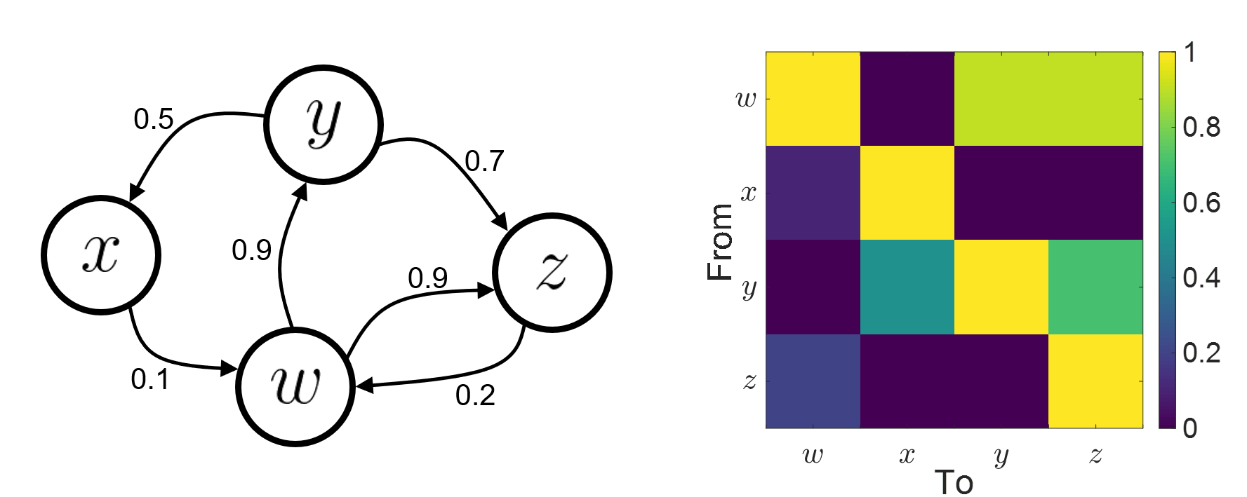
Sensors or sources: The time series used for connectivity analyses can be from sensor data (EEG/MEG signals) or from source time series (brain voxels or scouts).
Directed vs. non-directed: The direction of interactions between signals (as a measure of statistical causation) is estimated with directed metrics. Non-directed metrics produce symmetrical connectivity graphs/matrices: the connectivity measure "from Signal
latex error! exitcode was 2 (signal 0), transscript follows:to Signal
latex error! exitcode was 2 (signal 0), transscript follows:" is identical to the connectivity measure "from Signal
latex error! exitcode was 2 (signal 0), transscript follows:to Signal
latex error! exitcode was 2 (signal 0), transscript follows:".
Experimental condition: Depending on the neuroscience question, connectivity analyses can be performed on resting-state or task (e.g., ongoing or trial-based) data.
Full (NxN) vs. seeded (1xN) connectivity: In a full connectivity analysis, the connectivity metric is computed for all the possible pairs of nodes between N time series (noted N×N here). Alternatively, seeded connectivity (noted 1×N) is measured between one time series of interest (a seed, e.g., one brain region or a behavioral marker) and N other regions/time series.
Time-frequency transformations: Some connectivity metrics rely on a time-frequency representation of the signals. These latter are obtained with approaches such as the short-time Fourier transform, Hilbert transform, or Morlet wavelets.
Just as in other areas of electrophysiology studies, connectivity analyses need to beguided by mechanistic hypotheses concerning the expected neurophysiological effects.
Sensor-level analyses
Their anatomical interpretation is limited and ambiguous.
Sensor data is affected by field spread and volume conduction of brain activity across the scalp/sensor array. Hence, activity from one single brain area is picked up at multiple, possibly distant sensor locations. Connectivity measures may show strong interactions between sensor time series, which may be wrongly interpreted as inter-regional brain connections.
Source-level analyses
Connectivity measures between source time series are neuroanatomically interpretable and can be derived across participants.
We recommended that the outcomes of sensor and source connectivity analyses are mutually compatible; see (Lai et al., 2018).
Full-brain connectomes
Whole-brain connectivity analyses at the typical resolution of cortical surfaces in Brainstorm involve thousands of source locations, making the N×N derivations impractical. For instance, 15000 cortical vertices would yield a connectivity matrix of 15000x15000x8 bytes = 1.6 GB. If unconstrained cortical sources are used and coherence is computed across 50 frequency bins, the memory allocation increases to 45000x45000x50x8 = 754 GB per participant/condition/trial/etc. Reducing the N (via e.g., cortical parcellations, ROIs) may be required for practical reasons, depending on computing resources.
Regions of interest
Grouping individual brain sources into ROIs, defined on the cortical surface or in the brain volume helps contain the computational resources required for connectivity analyses (see above). ROIs can be defined based on neuroscience priors and the purpose of the study (Schhoffen and Gross, 2009). You may consider:
Study priors from the literature in your field, specific working hypotheses in terms of neuro-anatomical brain structures expected to be involved.
Association with a non-neuronal signal (e.g., cortico-muscular coherence).
Signal strength, by defining ROIs from brain regions with strongest activity in current data.
Whole-brain cortical parcellation to reduce N.
The tutorial Corticomuscular coherence explains the computation of connectivity measures constrained and unconstrained brain maps for these cases:
One signal x full-brain source maps: link
One signal x scouts: link
ROI-based connectomes, i.e., scouts x scouts: link
Studies have reported similarities and differences between electrophysiological connectomes (from MEG/EEG) and fMRI connectomes. See how the electrophysiological connectomes provide unique insights on how functional communication is implemented in the brain in Sadaghiani et al., 2022.
On whole-brain connectivity analyses and the issue of circular analysis, please see Kriegeskorte et al., 2009.
Pre-requisites
Here we focus on the specifics on connectivity analyses with Brainstorm. Please make sure you are familiar with Brainstorm and go through all introduction tutorials first, before following the present tutorial.
We first use simulated, synthetic data to emphasize the theoretical aspects of each connectivity metric with respect to groundtruth outcomes. Real, empirical MEG data are featured later in the tutorial (same auditory oddball dataset as in the other tutorial sections).
Let's start by creating a new protocol in the Brainstorm database:
Select the menu File > Create new protocol > type in "TutorialConnectivity" and select the options:
Yes, use protocol's default anatomy,
No, use one channel file per condition.
Right-click on the TutorialConnectivity folder > New subject > Subject01
Simulated data
To compare connectivity metrics, let's use synthetic time series simulated with known ground truth interactions. We will use a multivariate autoregressive (MVAR) model that consists of the following three signals:
Signal 1: two oscillatory (rhythmic) components: One at 10 Hz (alpha band), and a stronger peak at 25 Hz (beta band).
Signal 2: Same as Signal 1, with the strongest peak at 10 Hz.
Signal 3: Same as above, with the two components (10 and 25 Hz) of same magnitude.
The 25-Hz component of Signal 3 will be driven in part by the 25-Hz component of Signal 1 (denoted Signal 1>>Signal 3).
Let's now generate the three time series:
In the Process1 tab, leave the file list empty and click on the button [Run]
Select process: Simulate > Simulate AR signals.
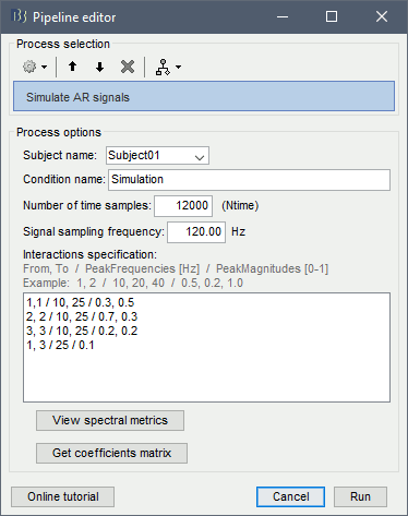
Process options:
Subject name: Target subject for the simulated signals: Select Subject01.
Condition name: Target folder where to store the simulated data in your database: Set to Simulation.
Number of time samples for each simulated time series: Set to 12,000.
Sampling frequency (Fs): Set to 120 Hz.
Interaction specifications: Spectral parameters for the signal components and their interactions in the MVAR model: From, To / Peak frequencies [Hz] / Peak relative magnitudes [0-1]
Set to:1, 1 / 10, 25 / 0.3, 0.5 2, 2 / 10, 25 / 0.7, 0.3 3, 3 / 10, 25 / 0.2, 0.2 1, 3 / 25 / 0.1
Display the groundtruth spectral metrics of the MVAR-generated time series: transfer function, cross-spectral power density, magnitude square coherence, directed transfer function (DTF) and partial directed coherence (PDC). The transfer function (
latex error! exitcode was 2 (signal 0), transscript follows:
) characterizes the relationships between signals in the frequency domain. It is a non-symmetric representation, which enables the identification of causal dependencies between signal components. The auto-transfer functions (shown in the graphs along the diagonal below) display the power spectra of each signal. The off-diagonal representations display the interactions between each pair of signals (see Signal 1 >> Signal 3 above). Here, we see the transfer function from signal 1 to signal 3. These transfer functions are our ground truth for connectivity values.
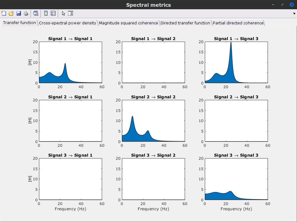
Get coefficients matrix: Shows the coefficients related to the MVAR model. These coefficients can be used in the process Simulate > Simulate AR signals (ARfit) to simulate the same model.
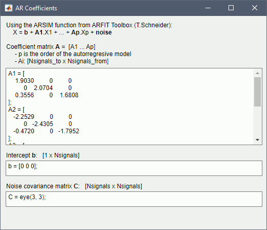
Execution:
Click Run to generate the time series with the MVAR model.
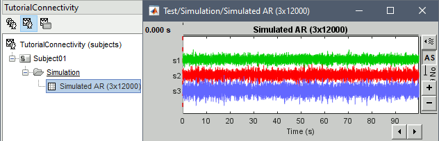
In the next sections, we will compute different connectivity metrics from these synthetic time series. Drag and drop the simulated data in the Process1 tab, click on [Run] (
 ) to open the Pipeline editor, and select the connectivity metric.
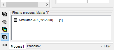
This tutorial illustrates the computation of full connectivity graphs (Process 1: NxN). It is also possible to obtain connectivity measures between one of the time series of a given data file and the other time series in the same file (use Process1: 1xN), or between time series from two different data files (use Process2: AxB), as shown further below.
References used:
This process relies on the ARSIM function from the ARFit toolbox:
https://github.com/tapios/arfitNeumaier A, Schneider T
Estimation of parameters and eigenmodes of multivariate autoregressive models
ACM Transactions on Mathematical Software, 2001Schneider T, Neumaier A
Algorithm 808: ARfit – A Matlab package for the estimation of parameters and eigenmodes of multivariate autoregressive models
ACM Transactions on Mathematical Software, 2001
Correlation
Correlation is a relatively simple, non-directed connectivity metric of association between two time series. It is relatively limited without further preprocessing of the input time series: correlation is sensitive to volume conduction and is not frequency specific.
Process options
Process Connectivity > Correlation NxN:
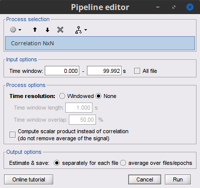
Time window: Time segment of the signals for connectivity analysis. Select: All file.
Time resolution: Select None
Windowed: correlation is computed in windows of a given length with a certain overlap percentage
None: correlation is computed using the entire time series
Compute scalar product: If left unchecked, the mean of the time series is subtracted before computing the correlation. Leave it unchecked.
Output options: Select Estimate and save separately for each file.
Result visualization
The results are stored as a N×N connectivity file, with a new icon
 . Right-click for display options:
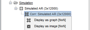
Display as graph: Plots the connectivity graph using a chord diagram where the color of the edges shows the value of the connectivity metric. See the connectivity graph tutorial for a detailed explanation of the options of this visualization.
Display as image: Plots the connectivity measures in an adjacency matrix.
Display fibers: Displays source connectivity edges as virtual white fiber tracts, as shown here.
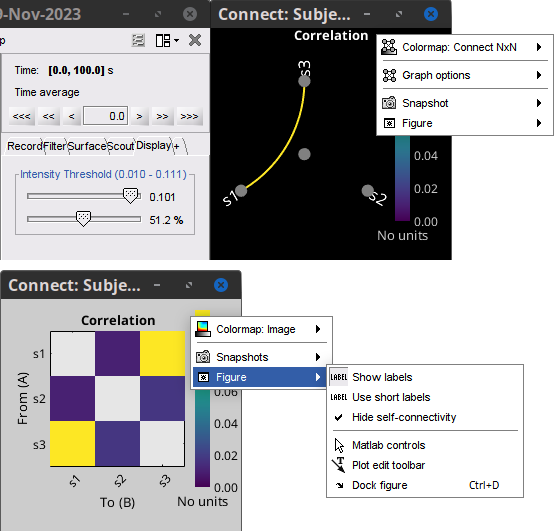
Display options:
Show labels: Click on the figure to display the names of the times series and the connectivity values in the figure legend. To display the labels corresponding to each column and row: right-click on the figure > Figure > Show labels. If the time series names are too long, use the option Use short labels.
Hide self-connectivity: In a square NxN connectivity matrix, the diagonal values correpond to the values of the connectivity metric between a time series and itself. These self-connectivity values are typically much higher than the other values of the matrix. When checked, these values are hidden so that to display the off-diagonal values more clearly.
Colormap: By default, the NxN colormap is configured to display the absolute values of the connectivity measures. Correlation values may be positive or negative. To display the negative values, make sure to change the colormap configuration: right-click on the figure > Colormap > Uncheck Absolute values.
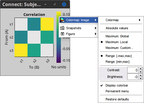
Coherence
Coherency or complex coherence,
latex error! exitcode was 2 (signal 0), transscript follows:, is a complex-valued metric that measures the linear relationship of two signals in the frequency domain. Magnitude square coherence (MSC),
latex error! exitcode was 2 (signal 0), transscript follows:, or coherence, measures the covariance of two signals in the frequency domain. For a pair of time series
latex error! exitcode was 2 (signal 0), transscript follows:and
latex error! exitcode was 2 (signal 0), transscript follows:, with spectra
latex error! exitcode was 2 (signal 0), transscript follows:and
latex error! exitcode was 2 (signal 0), transscript follows:, the MSC is defined as:
latex error! exitcode was 2 (signal 0), transscript follows:
Two related measures, which address the problem of volume conduction, are imaginary coherence (Nolte et al., 2004),
latex error! exitcode was 2 (signal 0), transscript follows:, and lagged coherence (Pascual-Maqui, 2007),
latex error! exitcode was 2 (signal 0), transscript follows:, which are defined as:
latex error! exitcode was 2 (signal 0), transscript follows:
where
latex error! exitcode was 2 (signal 0), transscript follows:and
latex error! exitcode was 2 (signal 0), transscript follows:are the imaginary and real parts of a complex number, respectively.
Note that the cross-spectrum (
latex error! exitcode was 2 (signal 0), transscript follows:) and the power spectral densities (
latex error! exitcode was 2 (signal 0), transscript follows:and
latex error! exitcode was 2 (signal 0), transscript follows:), and as consequence also coherency (
latex error! exitcode was 2 (signal 0), transscript follows:) can be obtained through different time-frequency decomposition methods (such as: Hilbert transform, wavelet transform and short-time Fourier transform), and for different time resolutions (per sample, windowed and entire file).
Process options
Process Connectivity > Coherence NxN:
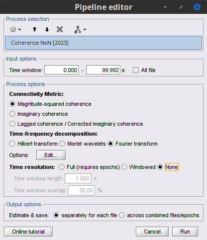
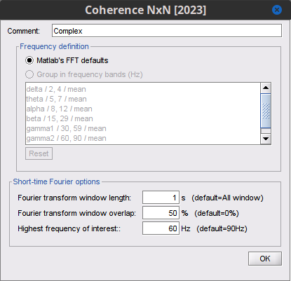
Time window: Segment of the time series used for the connectivity analysis. Select All file.
Connectivity metric shows variants of coherence measures. Select: Magnitude squared coherence.
Time-frequency decomposition selection of the time to time-frequency transformation. Select: (short-time) Fourier transform.
Options [Edit] shows the options of the selected time-frequency transformation.
Window length: Duration in seconds for the spectrum estimation. Set to: 1s.
Overlap: Percentage of overlap between consecutive sliding time windows. Set to: 50%.
Highest frequency: After the computation, removes all the frequencies above this threshold, mostly for visualization purposes. The value needs to be <= Fs/2. Set to: 60 Hz.
Time resolution selection of the time resolution. Select: None.
Output options: Select Estimate and save separately for each file.
Result visualization
Coherence is frequency specific: a connectivity graph and a connectivity matrix are produced for each frequency bin of the spectrum. Right-click on the coherence result file to show display options:
Display as graph: Plots a connectivity graph for each frequency bin.
Display as image: Plot a connectivity matrix for each frequency bin.
Power spectrum: Plot coherence as a function of frequency, between each time series.
Open the 3 types of visualization: they are linked by clicking on the spectral representation of the coherence, which will change the current frequency bin and update the connectivity measures displayed in the graph and matrix. The value of the current frequency bin can also be changed in the Time panel.
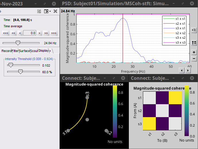
Other variants of coherence can be derived following the above procedure. The figures below display the coherence spectra obtained from the imaginary coherence (left) and the lagged coherence (right) measures.
|
|
|
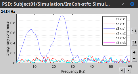
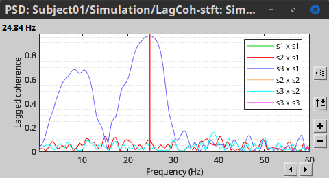
Granger causality
Granger causality (GC) is a measure of directed functional connectivity based on the Wiener-Granger causality framework. GC measure linear dependencies between time series, and tests whether the prediction of the future of signal
latex error! exitcode was 2 (signal 0), transscript follows:(approximated by a linear autoregressive model) is improved by considering signal
latex error! exitcode was 2 (signal 0), transscript follows:(also approximated by a linear autoregressive model). If there is such improvement, one concludes that signal
latex error! exitcode was 2 (signal 0), transscript follows:has a Granger causal effect on the other signal. In sum, some independent information from the past of signal
latex error! exitcode was 2 (signal 0), transscript follows:improves the prediction of the future of signal
latex error! exitcode was 2 (signal 0), transscript follows:, with respect to only observing its past
latex error! exitcode was 2 (signal 0), transscript follows:. GC takes nonnegative values; its is zero when no Granger causality can be attributed. The term independent means that GC is invariant with the scale of the input signals
latex error! exitcode was 2 (signal 0), transscript follows:and
latex error! exitcode was 2 (signal 0), transscript follows:.
In its simplest (unconditional) form, Granger causality indicates directionality but not true causality.
For example, if a variable
latex error! exitcode was 2 (signal 0), transscript follows:is causing both
latex error! exitcode was 2 (signal 0), transscript follows:and
latex error! exitcode was 2 (signal 0), transscript follows:, but with a smaller delay for
latex error! exitcode was 2 (signal 0), transscript follows:than for
latex error! exitcode was 2 (signal 0), transscript follows:, then the GC measure between
latex error! exitcode was 2 (signal 0), transscript follows:and
latex error! exitcode was 2 (signal 0), transscript follows:would show a non-zero GC for
latex error! exitcode was 2 (signal 0), transscript follows:-->
latex error! exitcode was 2 (signal 0), transscript follows:, even though
latex error! exitcode was 2 (signal 0), transscript follows:is not truly causing
latex error! exitcode was 2 (signal 0), transscript follows:(Bressler and Seth, 2011).
Spurious causalities like in the example above, may be removed by using the conditional GC approach in which the common dependencies (available in the data) are conditioning out. For example above, the conditional GC measures causality between
latex error! exitcode was 2 (signal 0), transscript follows:and
latex error! exitcode was 2 (signal 0), transscript follows:considering
latex error! exitcode was 2 (signal 0), transscript follows:in the modelling, this is to say
latex error! exitcode was 2 (signal 0), transscript follows:-->
latex error! exitcode was 2 (signal 0), transscript follows:|
latex error! exitcode was 2 (signal 0), transscript follows:(where '|' means 'conditioned on') would be close to zero. (Barnett and Seth 2014).
Conditional GC is the recommended approach.
See Granger causality - mathematical background for a more complete background.
Process options
Process Connectivity > Bivariate Granger causality NxN
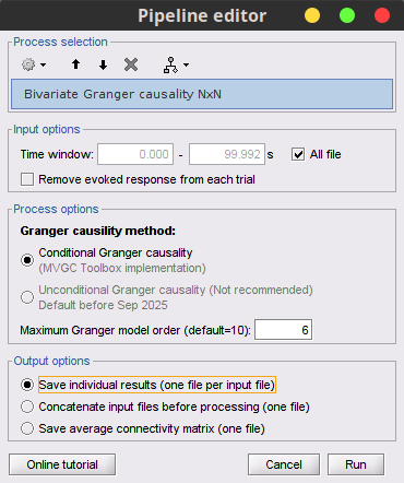
Time window: Time segment of the time series used for the connectivity analysis. Select All file.
Remove evoked response: This option is recommended by some authors as it satisfies the zero-mean stationarity of the GC model, but does not account for trial-to-trial variability; see (Wang et al., 2008). Leave it Unchecked.
GC method: Select if conditional or unconditional GC will be used.
Maximum Granger model order: The most common criteria used to define the order of the autoregressive models used by GC to approximate the input time series are the Akaike’s information criterion, the Bayesian-Schwartz’s criterion, and the Hannan-Quinn criterion. Low model orders will yield coarse approximations of the input time series. High model orders may yield spurious GC connectivity estimates. The simulated time series were created with an AR model of order 4; please use a maximum Granger model order of 6. When unconditional GC is selected, the order of the model is defined using the AIC, and is lesser or equal to input in this parameter.
Output options: Select Save individual results.
Results visualization
The connectivity matrix (left panel below) is not symmetric because GC values are direction specific. The upper right elements of the matrix indicate there is a GC influence from signal 1 to signal 3. In the connectivity graph (right panel below) the directionality is shown with an arrowhead at the center for the arc connecting two nodes.
|
|
|
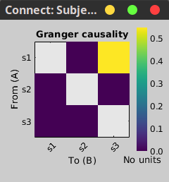
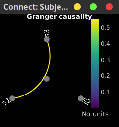
Spectral Granger causality
The Spectral Granger causality is a measure of directed functional connectivity that was developed to indicate frequency specific influences between time series (Dhamala et al., 2008).
Process options
Process: Connectivity > Bivariate Granger causality NxN.
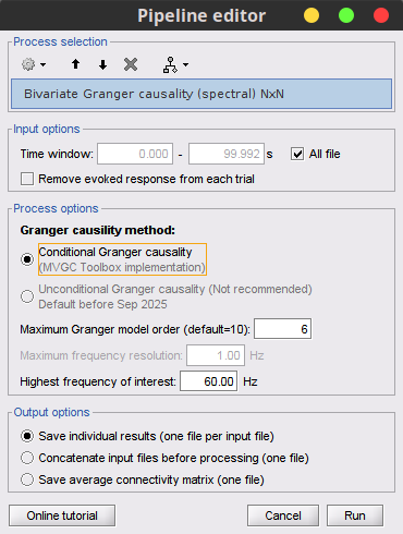
. Here we used the same parameters as with GC plus two two extra parameters specific to spectral GC:Maximum frequency resolution: Width of frequency bins in PSD estimation. Set to 1 Hz. Not used for conditional spectral GC.
Highest frequency: computes GC values under the specified frequency. Should be set <= Fs/2. Use: 60 Hz.
Result visualization
As with coherence, spectral GC can be plotted as a function of frequency. The display below shows a peak around 25 Hz that corresponds to the expected causal interaction of Signal 1 on Signal 3.
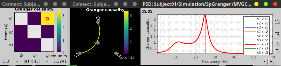
Envelope correlation
In the time-frequency tutorial, we have introduced Morlet wavelets and the Hilbert transform as methods to decompose time series in the time-frequency (TF) domain.
The outcome of these two TF transformations is an analytic signal,
latex error! exitcode was 2 (signal 0), transscript follows:, which is a complex time series uniquely associated to the original data time series,
latex error! exitcode was 2 (signal 0), transscript follows:, which module
latex error! exitcode was 2 (signal 0), transscript follows:, and phase
latex error! exitcode was 2 (signal 0), transscript follows:, correspond to the instantaneous amplitude (or envelope) and instantaneous phase of the original time series
latex error! exitcode was 2 (signal 0), transscript follows:, respectively. The real part of
latex error! exitcode was 2 (signal 0), transscript follows:is the original time series
latex error! exitcode was 2 (signal 0), transscript follows:, and the imaginary part is the Hilbert transform of that same time series
latex error! exitcode was 2 (signal 0), transscript follows:.
latex error! exitcode was 2 (signal 0), transscript follows:
The analytic signal of oscillatory or narrowband signals provide meaningful and interpretable estimations of instantaneous amplitude and phase. While it is technically feasible to derive these elements from broadband time series, they would not be interpretable (see Cohen, 2014).
The instantaneous amplitude (or envelope) of the analytic signals can be used to carry out pairwise connectivity analysis with correlation. This is to say amplitude envelop correlation (AEC).
An optional step consists in orthogonalizing the pairs of amplitude envelope time series before computing the correlation. Orthogonalization is performed by first removing the real part of their coherence to reduce volume conduction (at the sensor level) or cross-talk effects (at the source level) (Hipp et al., 2012).
Process options
Process: Connectivity > Envelope Correlation N×N [2023]
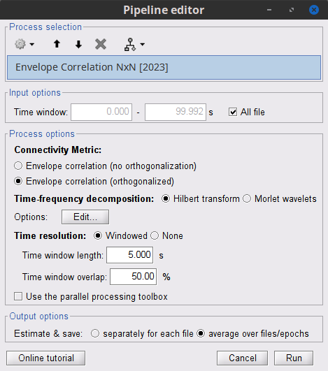
Time window: Time segment of the signal used for the connectivity analysis. Select: All file.
Connectivity measure is the connectivity metric applied to the resulting signal amplitude envelopes. Select Envelope correlation (orthogonalized).
Time-frequency decomposition: Hilbert transform or Morlet wavelets. Each method requires additional parameters that will be displayed in a separate panel after clicking on [Edit]. See the time-frequency tutorial. In the present example, we will use the Hilbert transform with the option Group in frequency bands to present the results for the canonical frequency bands. As the sampling frequency of the signals is 120Hz, thus, make sure you remove the "gamma2" band from the targeted frequency bands.
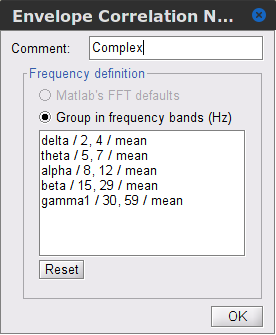
Time resolution: If Windowed, connectivity is saved for each time window. If None, the connectivity measures are averaged across all windows. Select Windowed. Set the additional parameters to define the windows:
Time window length: Duration in milliseconds over which the connectivity measure is computed. Set to 5s
Time window overlap: Percentage of overlap between consecutive time windows to compute the connectivity measure. Set to 50%.
Use the parallel processing toolbox: If available, will call Matlab's parallel processing to accelerate computations. Leave it Unchecked.
Output options: Select Estimate and save separately for each file.
For sake of comparison, we will compute AEC again, but this time changing the TF decomposition method to Morlet wavelets with Linear = 1:1:60 (frequencies from 1 to 60 Hz with 1 Hz step).
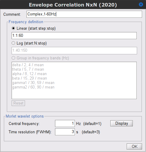
Results visualization
As with Coherence and spectral Granger causality, amplitude envelope correlations can be displayed as a function of frequency, and as a function of time if the Time resolution option was set to Windowed. Below are the AEC results obtained with the Hilbert transform (left panels) and with Morlet wavelets (right panels) for the first 5-s time window (top panels) and the 5-s last window (bottom panels).
|
First 5-s window |
|
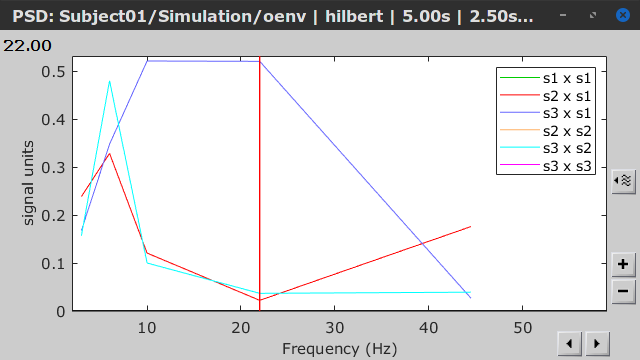
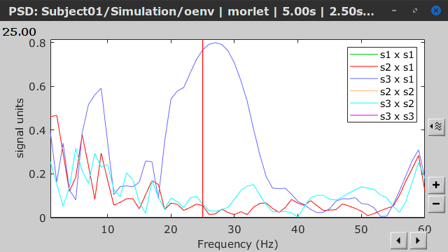
|
Last 5-s window |
|
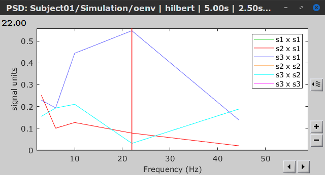
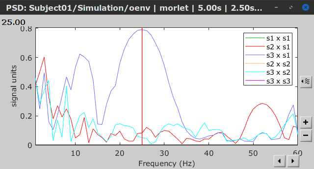
Phase-Locking Value
An alternative class of connectivity metrics considers the relative instantaneous phase between two time series as a marker of connectivity. Phase-locking or phase synchronization are two such measures (Tass et al., 1998). In principle, phase-based measures are robust against fluctuations in signal amplitude, although low signal-to-noise conditions remain challenging for these measures (Lachaux et al., 1999; Mormann et al., 2000).
The phase-locking value (PLV) is a popular metric defined as the length of the average vector of many unit vectors whose phase angle corresponds to the phase difference between two time series (Tass et al., 1998). If the distribution of the phase difference between the two signals is uniform, the length of such an average vector will be 0. If the phases of the two signals are strongly coupled, the length of the average vector will be close to 1. For event-related studies, we would expect phase differences across trials to be uniformly distributed, unless the phase of the brain signals is locked to the event onset, which would then indicate a form of phase locking between the two time series. Considering a pair of narrow-band analytic signals
latex error! exitcode was 2 (signal 0), transscript follows:and
latex error! exitcode was 2 (signal 0), transscript follows:, obtained from the Hilbert transform (see above):
latex error! exitcode was 2 (signal 0), transscript follows:
with:
latex error! exitcode was 2 (signal 0), transscript follows:
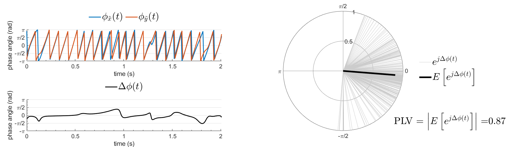
Several variants of PLV have been contritributed. Brainstorm features
ciPLV (Bruña 2018) and wPLI (Vinck 2011) variants contributed to Brainstorm by Daniele Marinazzo.
PLV values tend to be overestimated when derived from few (<50) time samples. As a consequence, when comparing PLV values between conditions, please make sure that they are derived from about the same number of samples in each condition.
Process options
Process: Connectivity > Phase locking value NxN
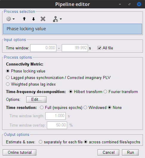
Time window: Time segment of the signal used for the connectivity analysis. Select All file.
Connectivity metric shows variants of phase locking measures. Select: Phase locking value.
Time-frequency decomposition method for time-frequency transformation. Select: Hilbert transform.
Options [Edit] shows the options of the selected time-frequency transformation.
Frequency bands: Used for the time-frequency transformation with the Hilbert transform method. See the time-frequency tutorial. In this example, the sampling frequency of the signals being 120Hz, please remove the "gamma2" band.
Time resolution selection of the time resolution. Select: None.
Output options: Select Save across combined files/epochs.
Results visualization
PLV is frequency resolved, and here was computed for the delta, theta, alpha, beta and gamma1 bands. With the simulated data, we expect a higher PLV value in the beta band (15 to 29 Hz), between Signal 1 and Signal 3. This is indeed our observation, with a peak at 22 Hz (center of beta band) in the PLV spectrum (left). The same is true for ciPLV (center) and wPLI (right).
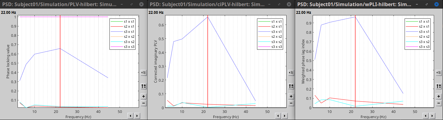
Phase-Transfer Entropy
Phase transfer entropy (PTE) is a directed connectivity metric that quantifies the transfer entropy (TE) between two instantaneous phase time series (Lobier et al., 2014). Similar to GC, TE estimates whether including the past of both source and target time series influences the ability to predict the future of the target time series. In PTE, if a phase signal
latex error! exitcode was 2 (signal 0), transscript follows:causes the signal
latex error! exitcode was 2 (signal 0), transscript follows:, the mutual information, between
latex error! exitcode was 2 (signal 0), transscript follows:and the past of
latex error! exitcode was 2 (signal 0), transscript follows:i.e.
latex error! exitcode was 2 (signal 0), transscript follows:is larger than the mutual information of
latex error! exitcode was 2 (signal 0), transscript follows:, the past of
latex error! exitcode was 2 (signal 0), transscript follows:i.e.
latex error! exitcode was 2 (signal 0), transscript follows:and
latex error! exitcode was 2 (signal 0), transscript follows:. This relationship can be represented on the Venn diagram below, where
latex error! exitcode was 2 (signal 0), transscript follows:and
latex error! exitcode was 2 (signal 0), transscript follows:, indicate mutual information and the individual entropies, respectively. PTE values are positive and unbounded.
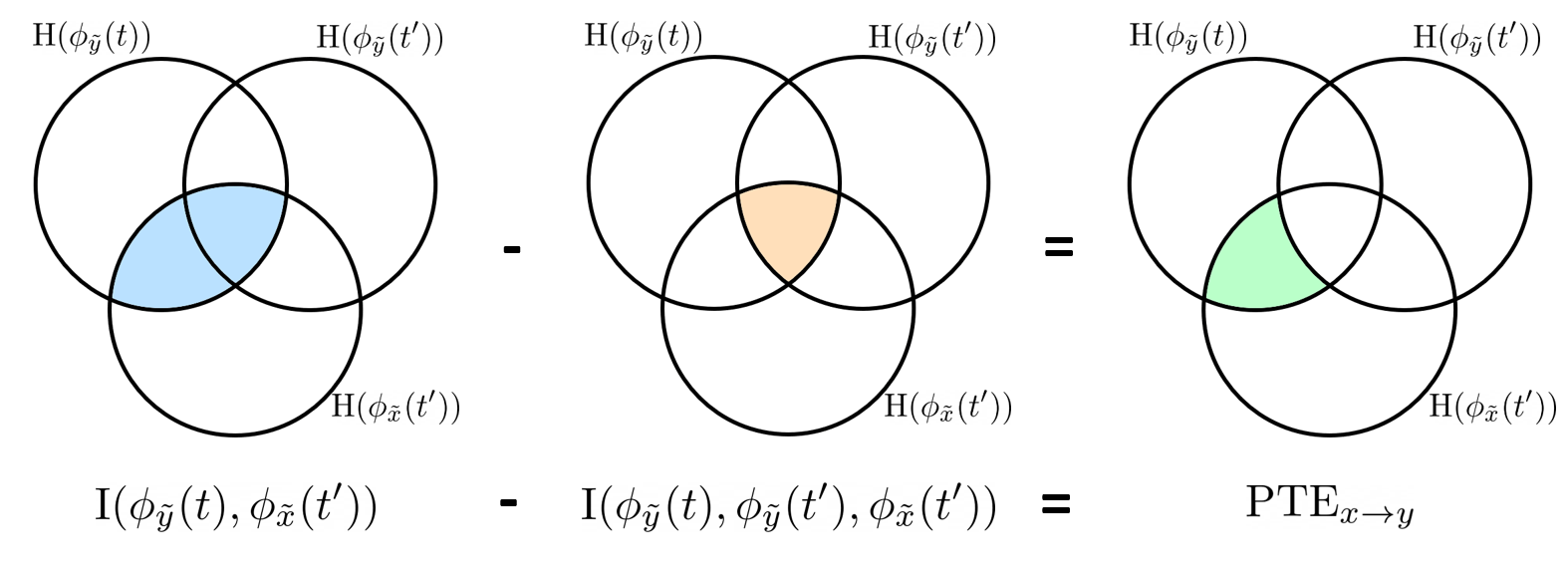
Process options
Process: Connectivity > Phase Transfer Entropy NxN
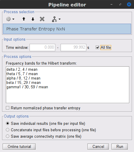
Time window: Time segment of the signal used for the connectivity analysis. Select All file.
Frequency bands: Used for the time-frequency transformation with the Hilbert transform method. See the time-frequency tutorial. In this example, as the sampling frequency of the signals is 120 Hz, make sure the "gamma2" band is removed from the option.
Return normalized phase transfer entropy: Divides each directional PTE value between two signals by the sum of both directional PTE values for those two signals. Uncheck this option
Output options: Select Save individual results.
Results visualization
Here we computed PTE for the delta, theta, alpha, beta and gamma1 bands. From the synthetic data used here, we expect to observe a higher PTE value in the beta band, From Signal 1 To Signal 3. This is indeed shown with a peak at 22 Hz (center of beta band) in the PTE spectrum.
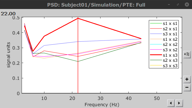 .
.
Summary: connectivity methods
The following table list the available connectivity metrics in Brainstorm and their description.
Metric |
1×N |
N×N |
Directionality |
Freq resolved |
Time resolved |
Function |
Info |
Correlation |
✅ |
✅ |
❌ |
❌ |
✅ |
bst_corrn.m |
|
Coherence |
✅ |
✅ |
❌ |
✅ |
✅ |
bst_cohn.m |
|
Granger causality |
✅ |
✅ |
✅ |
❌ |
❌ |
bst_granger.m |
|
Spectral Granger causality |
✅ |
✅ |
✅ |
✅ |
❌ |
bst_granger_spectral.m |
|
Envelope Correlation (2023) |
✅ |
✅ |
❌ |
✅ |
✅ |
bst_henv.m |
|
Phase locking value |
✅ |
✅ |
❌ |
✅ |
✅ |
bst_connectivity.m |
|
Phase transfer entropy |
❌ |
✅ |
✅ |
✅ |
❌ |
PhaseTE_MF.m |
Thresholding of connectivity estimates
Interactive tools
Brainstorm provides tools to apply empirical thresholds to display the resulting connectivity estimates. Interactions can be filtered interactively based on their magnitudes, the distance between the nodes of the graph or their category. See the tutorial: Connectivity graphs.
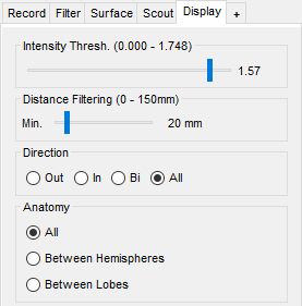
Threshold by percentile
The process Test > Threshold by percentile allows the selection of the top n% connectivity estimates in a single input file.
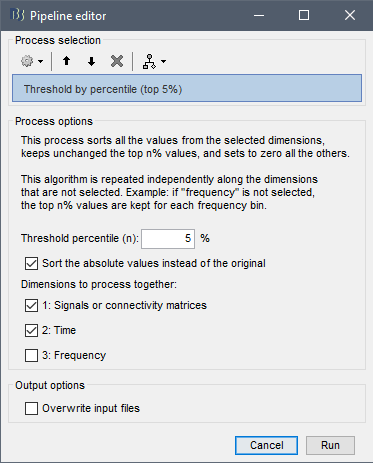
All connectivity estimates (left panel below). The top-5% connectivity matrix (right panel below) only keeps the 5 percentile of all the connectivity estimates.
|
|
|
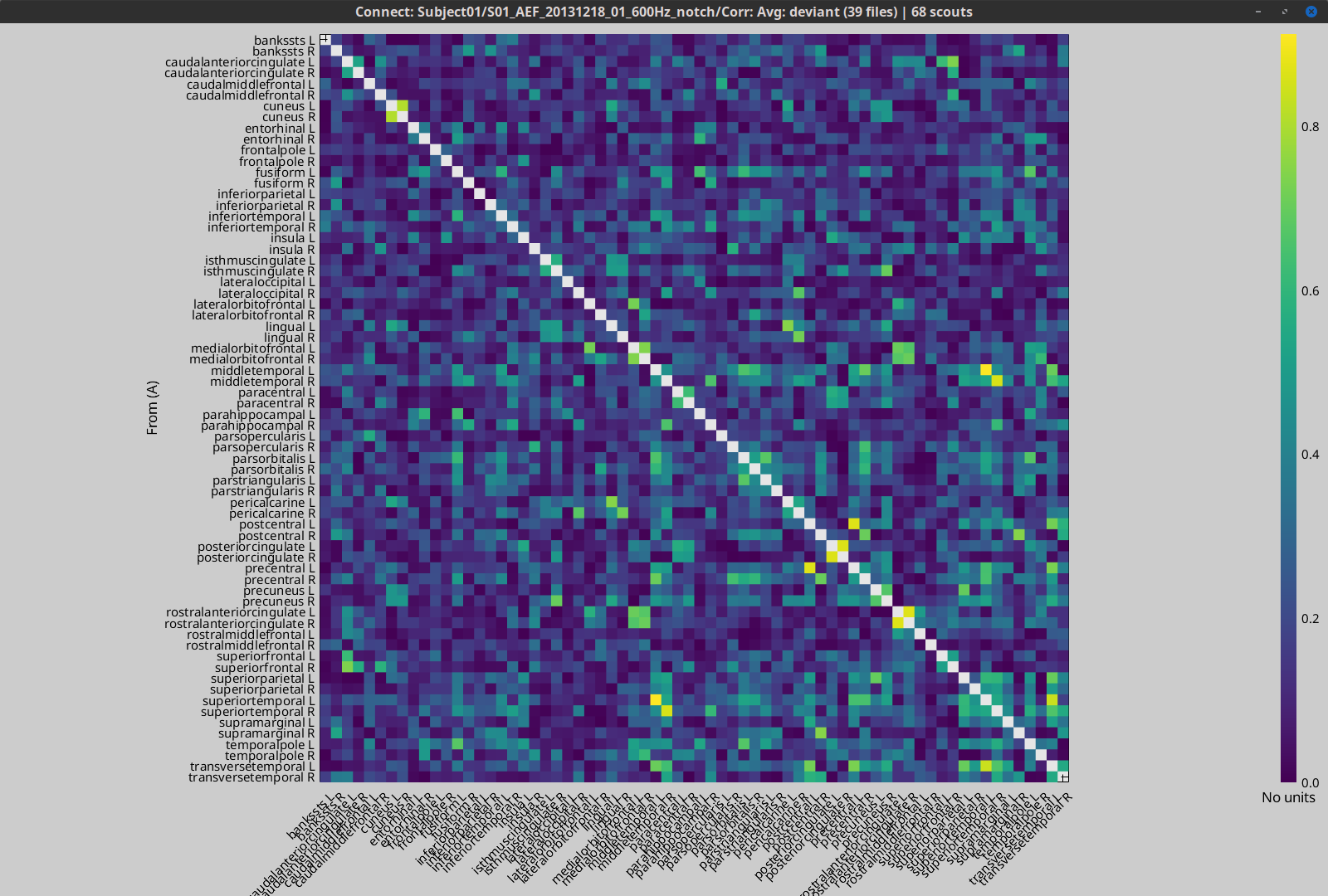
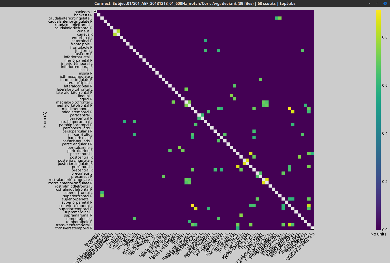
Statistical significance
Inference based threshold can be derived to assess the statistical significance of the connectivity estimates, for instance using non-parametric paired permutation tests.
Connectivity outcomes can be computed for different experimental conditions, or between an active state and a baseline. Non-parametric paired permutation tests are available in Brainstorm to compare between two groups of repeated measures. More information in the Statistics tutorial.
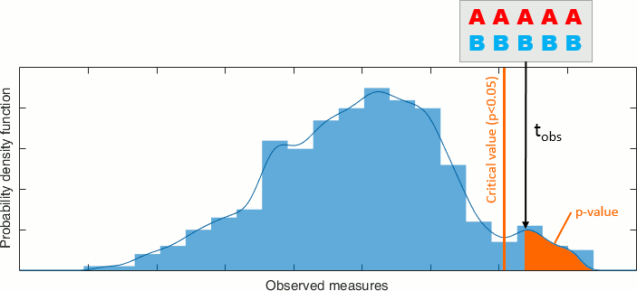
On the hard drive
File name
The connectivity file structure is an extension of the time-frequency structure. The file names start with timefreq_, followed by connect1 (1xN) or connectn (NxN or AxB), the connectivity method and a time stamp. Example: timefreq_connectn_corr_220120_1350.mat.
File structure
Right click on the first connectivity file computed > File > View file contents.
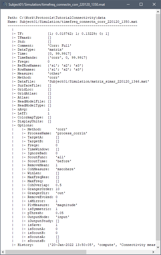
The data structure is the same as for Brainstorm time-frequency files. Only the fields specific to connectivity analyses are documented below:
TF: [Nr x Ntime x Nfreq] array containing all connectivity values. The connectivity matrix R computed in bst_connectivity.m between two sets of signals A and B, is optimized and saved in the TF variable. The size of the R matrix is [Na x Nb x Ntime x Nfreq]. The relation between Na x Nb and Nr depends on the type of optimization in the file. See details below.
RefRowNames: Cell-array of strings {Na x 1}. Labels of the rows of the connectivity matrix R (Y axis in the image display, with the label From). In the case of a AxB process, these labels are the names of the signals extracted from the first list of files (FilesA).
RowNames: Cell-array of strings {Nb x 1}. Labels of the columns of the connectivity matrix R (X axis in the image display, with the label To). In the case of a AxB process, these labels are the names of the signals extracted from the second list of files (FilesB).
Freqs: Double [1 x Nfreq] for a simple list of frequencies; or cell-array {Nfreq x 3} if using frequency bands, where each line represents a band {'band_name', 'frequency definition', 'function'}
Time: [1,Ntime] for time-resolved files; [1,2] for files with no data dimension (e.g. correlation). When no time is available, this variable describes the time segment from which the connectivity measure was computed.
Options.isSymmetric: Boolean indicating whether the matrix R saved in the TF field is symmetric (e.g. NxN correlation or coherence) or not (e.g. Granger causality). If the R matrix is symmetric, it is saved in a compressed format, with only the values from lower triangular matrix.
Connectivity matrix encoding
Let's consider the structure TfMat, loaded from a connectivity file, for example by right-clicking on the file > File > Export to Matlab. The connectivity matrix R can be obtained with function GetConnectMatrix. The size of R is [Na x Nb x Ntime x Nfreq].
R = bst_memory('GetConnectMatrix', TfMat);If the matrix is not symmetrical (i.e., not compressed): for each time and frequency, the list of values from the first dimension of the TF variable is reshaped into a 2D matrix: [Na x Nb].
If the matrix is symmetrical and compressed: only the lower triangular matrix is saved in the TF variable. The full matrix is first reconstructed with function process_compress_sym>Expand, then reshaped into [Na x Nb].
Saving the connectivity matrix R back in the TF variable is possible by reshaping to [Nx1] (R(:)) and then compressing again the matrix:
TfMat.TF = process_compress_sym('Compress', R(:));
Additional documentation
Related tutorials
Articles
Nolte G, Bai O, Wheaton L, Mari Z, Vorbach S, Hallett M.
Identifying true brain interaction from EEG data using the imaginary part of coherency.
Clinical Neurophysiology. 2004 Oct;115(10):2292–307.Pascual-Marqui RD.
Coherence and phase synchronization: generalization to pairs of multivariate time series, and removal of zero-lag contributions.
arXiv preprint arXiv:0706.1776. 2007 Jun 12.Bressler SL, Seth AK.
Wiener–Granger causality: a well established methodology.
Neuroimage. 2011 Sep 15;58(2):323-9.Barnett L, Seth AK.
The MVGC multivariate Granger causality toolbox: A new approach to Granger-causal inference.
Journal of Neuroscience Methods. 2014.Dhamala M, Rangarajan G, Ding M.
Estimating Granger causality from Fourier and wavelet transforms of time series data.
Physical review letters. 2008 Jan 10;100(1):018701.Hipp JF, Hawellek DJ, Corbetta M, Siegel M, Engel AK.
Large-scale cortical correlation structure of spontaneous oscillatory activity.
Nature neuroscience. 2012 Jun;15(6):884-90.Tass P, Rosenblum MG, Weule J, Kurths J, Pikovsky A, Volkmann J, et al.
Detection of n : m Phase Locking from Noisy Data: Application to Magnetoencephalography.
Phys Rev Lett. 1998 Oct 12;81(15):3291–4.Bruña R, Maestú F, Pereda E
Phase locking value revisited: teaching new tricks to an old dog
Journal of Neural Engineering, Jun 2018Vinck M, Oostenveld R, van Wingerden M, Battaglia F, Pennartz CM
An improved index of phase-synchronization for electrophysiological data in the presence of volume-conduction, noise and sample-size bias
Neuroimage, Apr 2011Lobier M, Siebenhühner F, Palva S, Palva JM.
Phase transfer entropy: a novel phase-based measure for directed connectivity in networks coupled by oscillatory interactions.
Neuroimage. 2014 Jan 15;85:853-72.Barzegaran E, Knyazeva MG.
Functional connectivity analysis in EEG source space: The choice of method
Ward LM, editor. PLOS ONE. 2017 Jul 20;12(7):e0181105.Lai M, Demuru M, Hillebrand A, Fraschini M.
A comparison between scalp- and source-reconstructed EEG networks.
Sci Rep. 2018 Dec;8(1):12269.Schoffelen J-M, Gross J.
Source connectivity analysis with MEG and EEG.
Hum Brain Mapp. 2009 Jun;30(6):1857–65.Kriegeskorte N, Simmons WK, Bellgowan PSF, Baker CI.
Circular analysis in systems neuroscience: the dangers of double dipping.
Nat Neurosci. 2009 May;12(5):535–40.Cohen MX.
Analyzing Neural Time Series Data: Theory and Practice. MIT Press; 2014.Sadaghiani S, Brookes MJ, Baillet S.
Connectomics of human electrophysiology.
NeuroImage. 2022 Feb;247:118788.Sporns O.
Networks of the Brain. MIT Press; 2016.
Forum discussions
Granger causality: https://neuroimage.usc.edu/forums/t/12506
Coherence on single trials: https://neuroimage.usc.edu/forums/t/22726
Coherence and PLV: https://neuroimage.usc.edu/forums/t/33379
Removing ERP response for PLV: https://neuroimage.usc.edu/forums/t/32665
Connectivity of subcortical ROIs: https://neuroimage.usc.edu/forums/t/33479
Non-zero diagonals with unconstrained sources: https://neuroimage.usc.edu/forums/t/33700
Coherence/Lagged coherence vs. Envelope correlation/Lagged coherence: https://neuroimage.usc.edu/forums/t/lagged-coherence/39440
Scripting
The following script from the Brainstorm distribution reproduces the analysis presented in this tutorial page: brainstorm3/toolbox/script/tutorial_connectivity.m
TODO
Raymundo, Sylvain
- Read data: Can we find something more meaningful than what we compute in the example in the dataset? A full connectome in a task vs. baseline maybe?